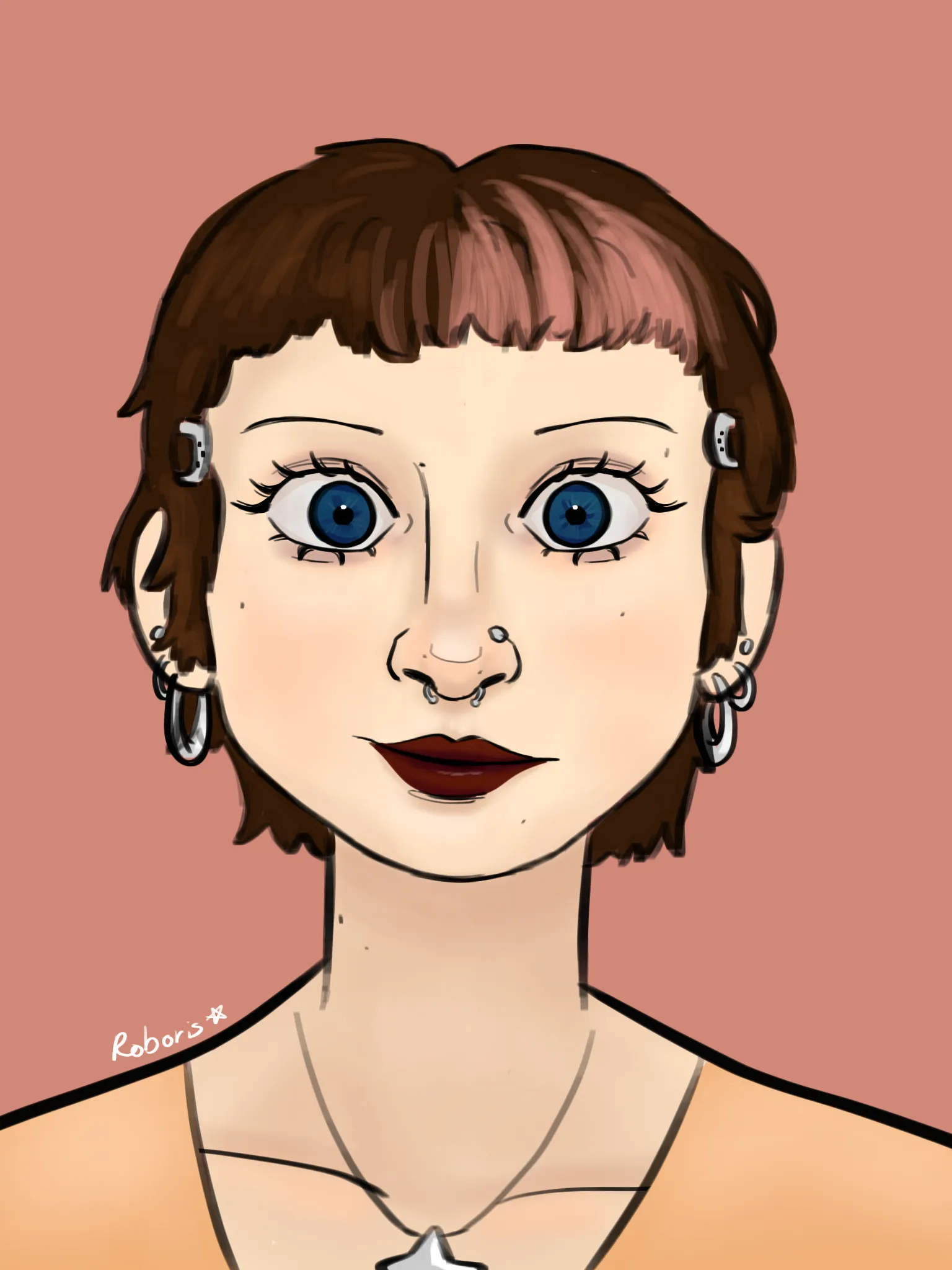
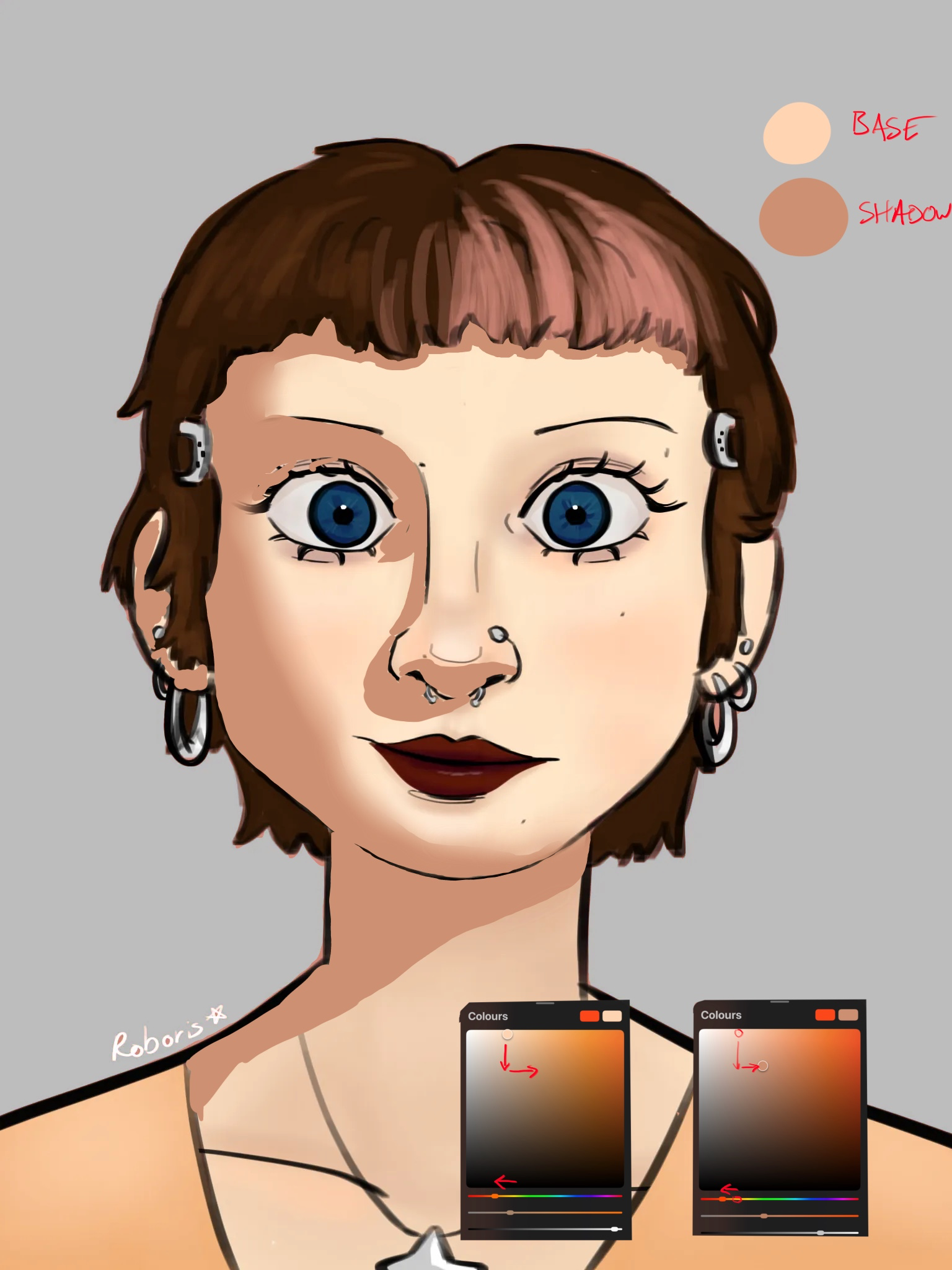

Hi, This is a lovely illustration, I really like it. It’s very stylised so I don’t want to comment on anatomy. The reason it looks ‘flat’ is just due to a lack of contrast between your base tones and your shadows. The easiest way to create depth in your work is with light and shadow. There is a push-pull effect between shadows and highlights. Shadows push objects into the canvas, highlights pull them forward. The greater the distance in value between the shadow and the highlight, the more depth you will create. The easiest way to select a good shadow tone is to take your base tone, make it darker and more saturated and then move the hue towards the red (For a highlight you do the opposite). I’m not an expert on colour theory, and there’s a lot more to choosing colours, but this is a method that will serve you well. In terms of where to place shadows, be wary of instagram face. That’s beauty shots where the model is very well lit from all sides. It’s a lighting method that’s designed to make someone look very youthful but it removes the shadows. It’s great for instagram models, not so good for us artists. I would recommend finding a good lighting model. You can find images of different lighting schemes on google, there’s also apps using the asario head where you can place the light source wherever you want it. Having good reference will help a lot in placing shadows and highlights. What I’ve done is very rough. I’ve only changed her shadow skin tone, imagining the light coming from the upper right. I also changed the background colour to a complementary shade that is desaturated. Your original colour was very close in hue to the rest of the image so your character wasn’t really standing out. Hope that helps
Anstriche (1)
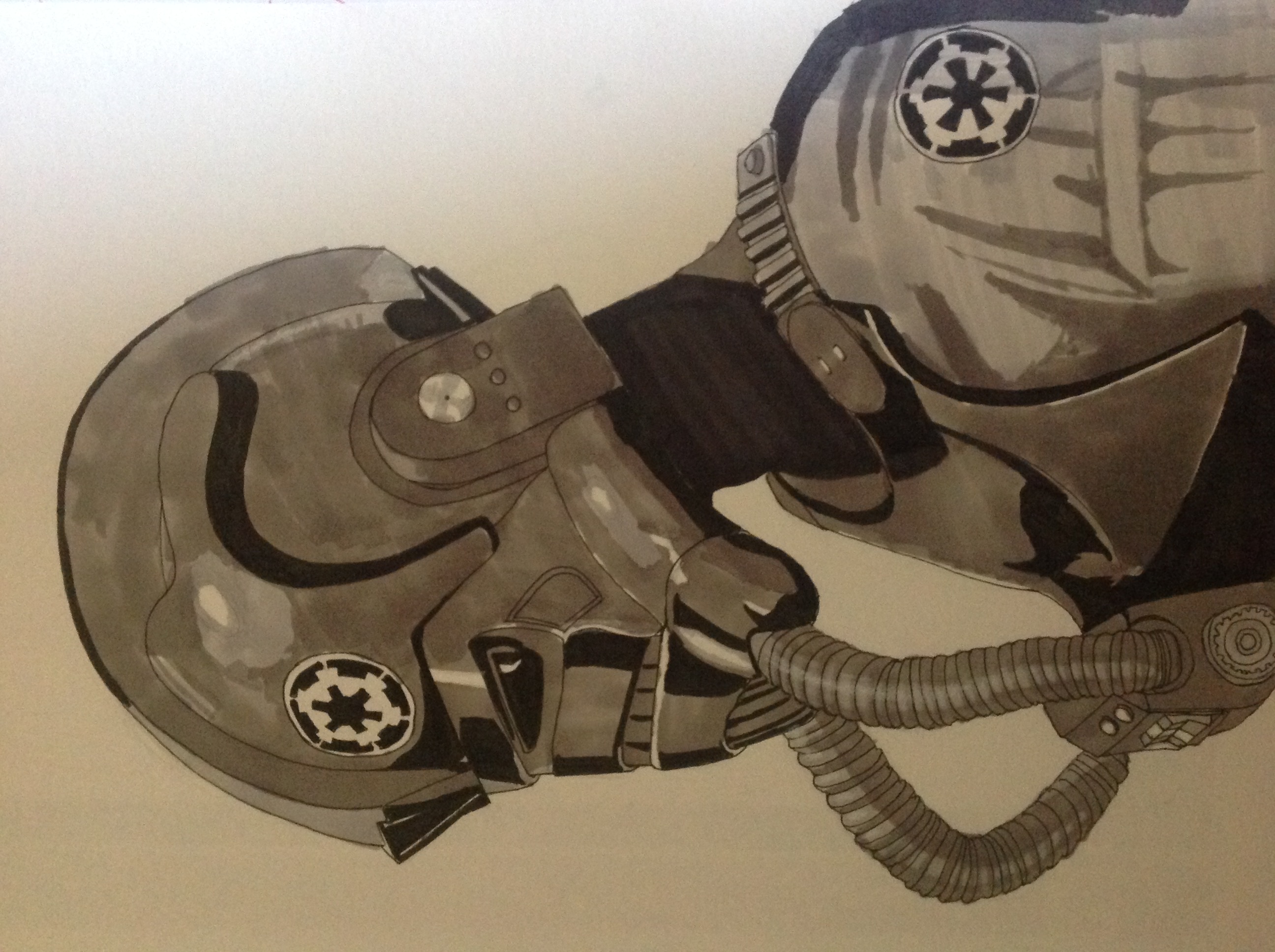
My Artwork
Künstlernotiz:
I'm struggling with form&depth, light/color, anatomy