Feedback speichern?
Melde dich an, um dein Feedback an einem Ort zu haben. Ihr Feedback ist privat statt öffentlich.
Anstriche
Paintover Notes
Wähle einen Lack
Wähle einen Avatar, um seine Notizen zu sehen und zu besprechen.
Ebenfalls Schwierigkeiten beiPorträts?
Verbessere deine Ähnlichkeit und Gesichtsproportionen, Lesezeit: 3 Minuten
How to Draw Portraits: A Step-by-Step Guide for Beginner Artists
Master portrait drawing by progressing through head structure, simplified features, anatomy, stylistic exploration, observation practice, and imaginative creation.
Portraits
Möchtest du jemandem helfen, der noch immer wartet?
June 30 Sketchbook Pages Challenge
Noch keine Antwort
6/13/2026
rndm stuff again
vor 1 Stunde
Ansehen
June 30 Sketchbook Pages Challenge
Noch keine Antwort
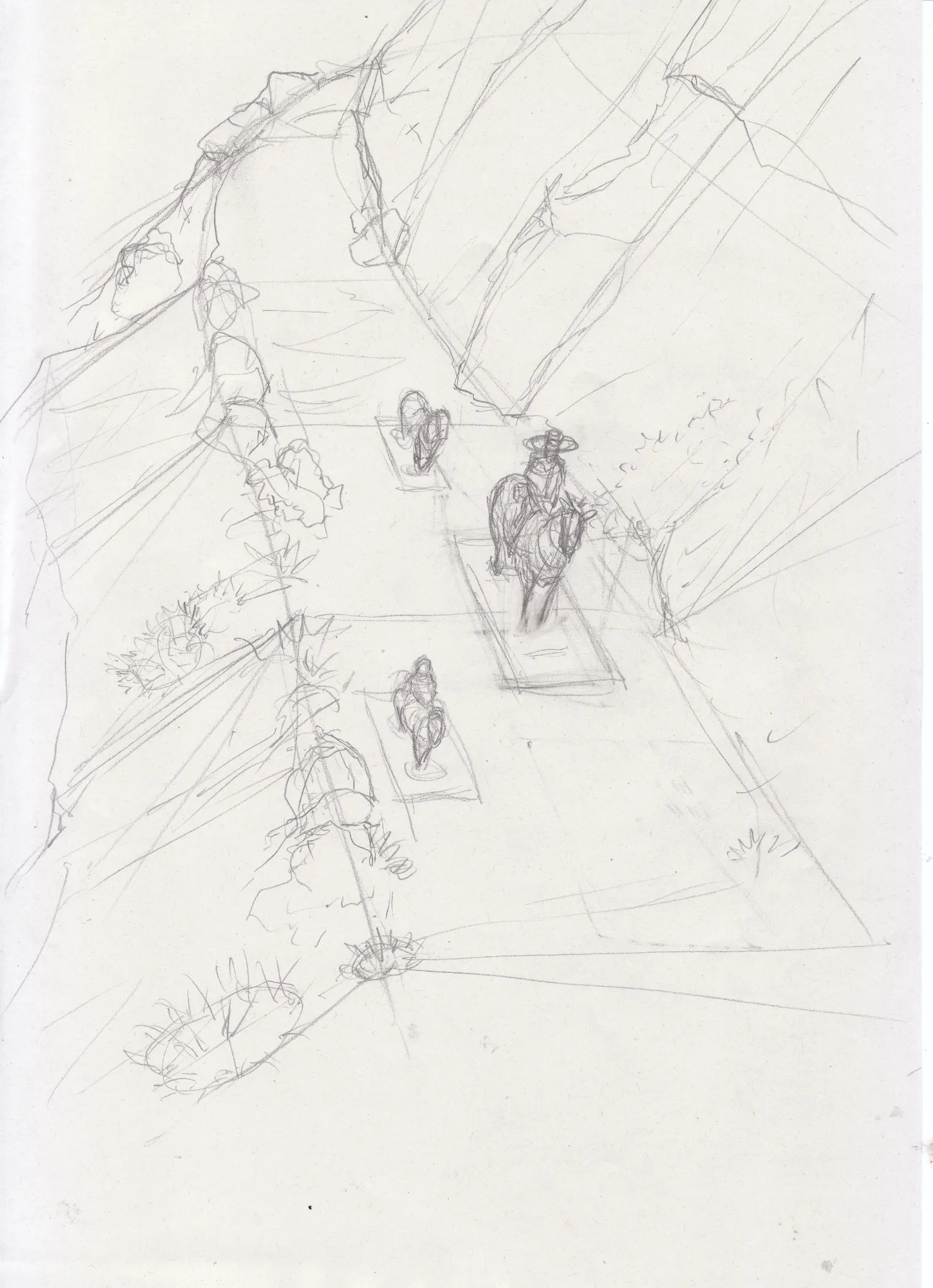
Barren hillside
I am not sure that figures are correctly placed on the ground/support.
vor 1 Stunde
Ansehen
June 30 Sketchbook Pages Challenge
Noch keine Antwort
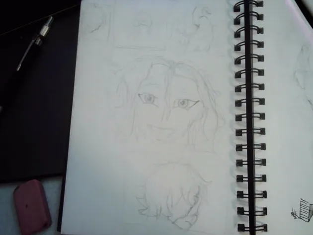
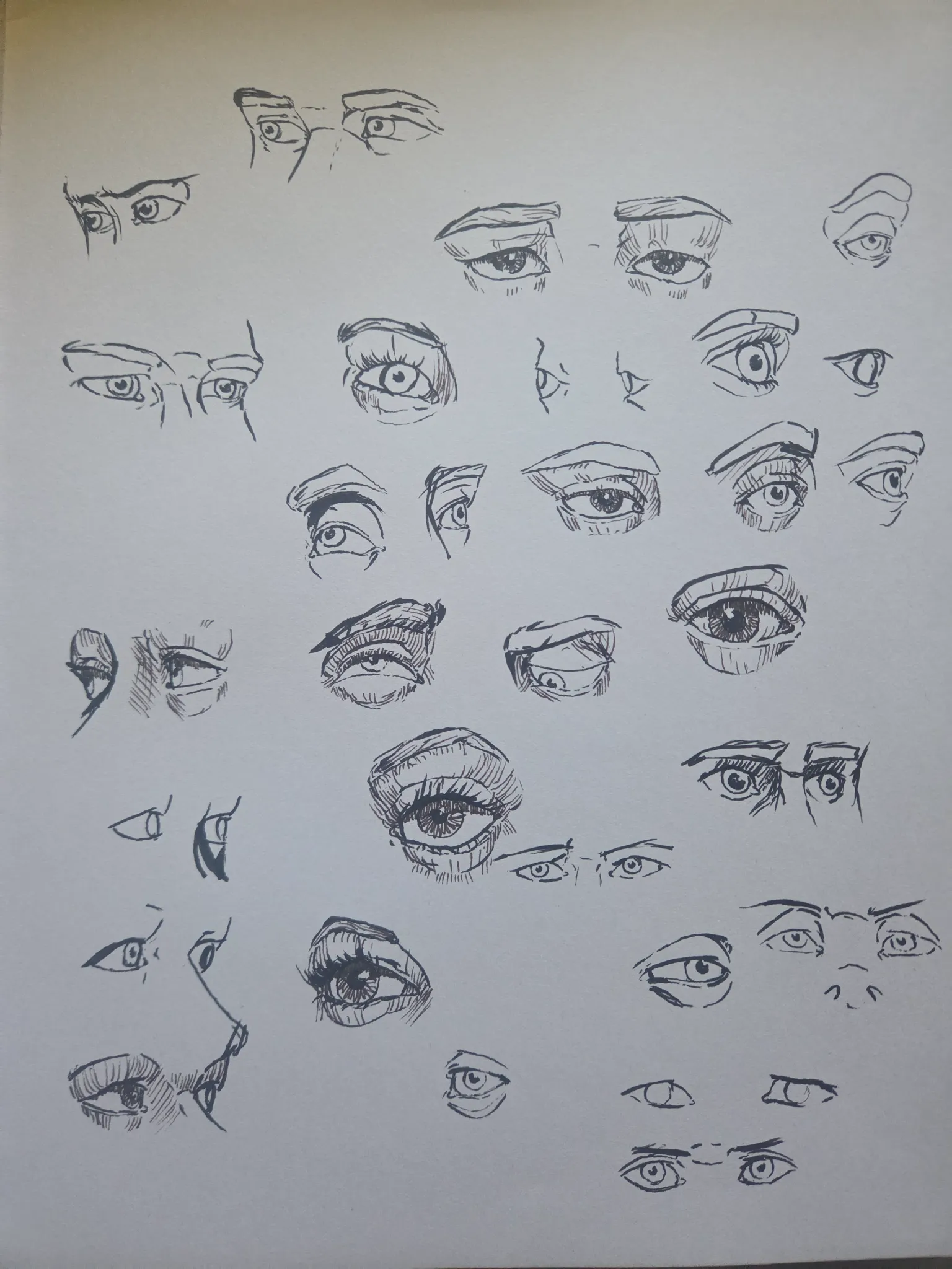
Sketch 12 - eyes
Some eye practice.
vor 4 Stunden
Ansehen
Figure
Noch keine Antwort
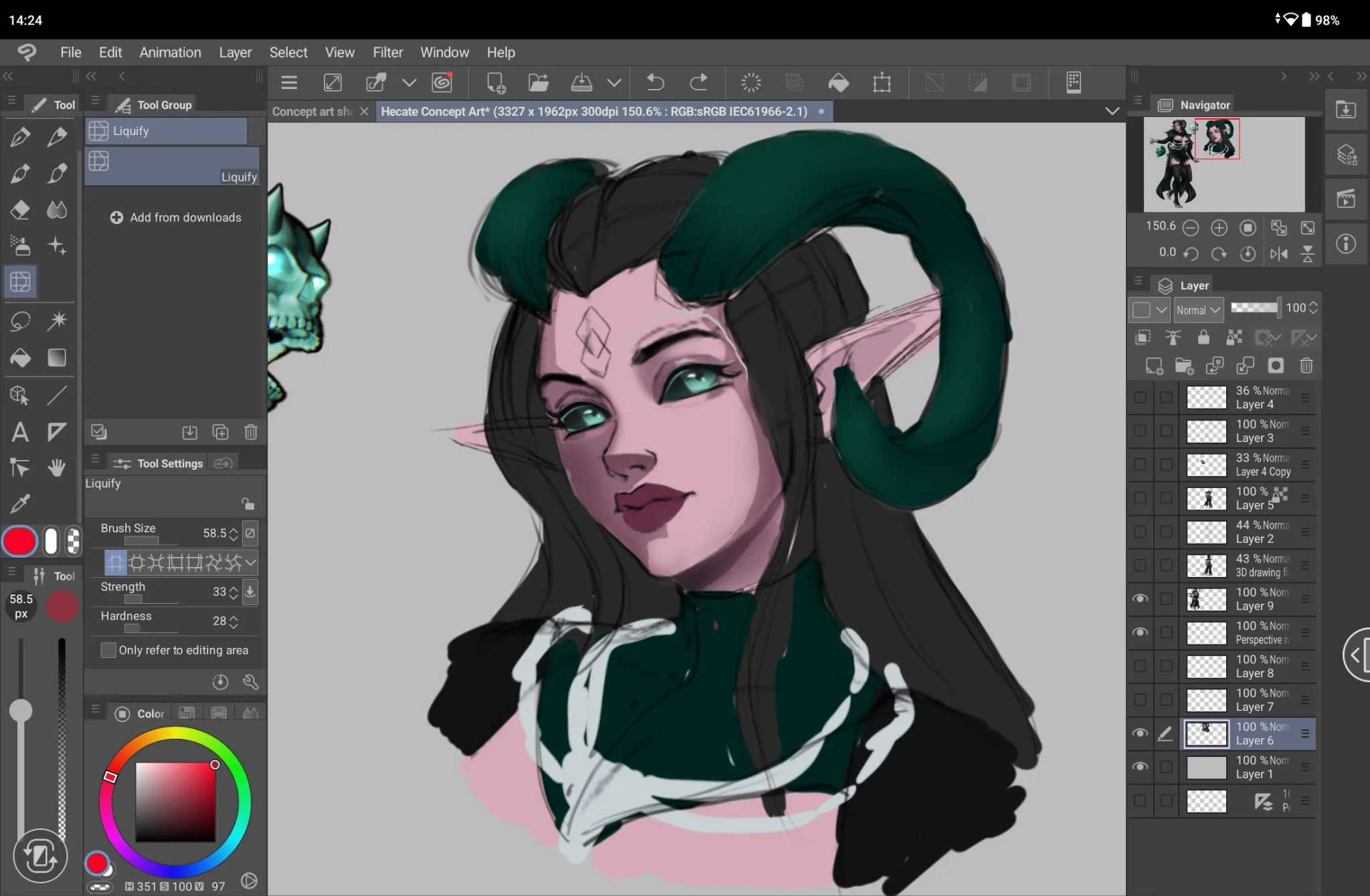
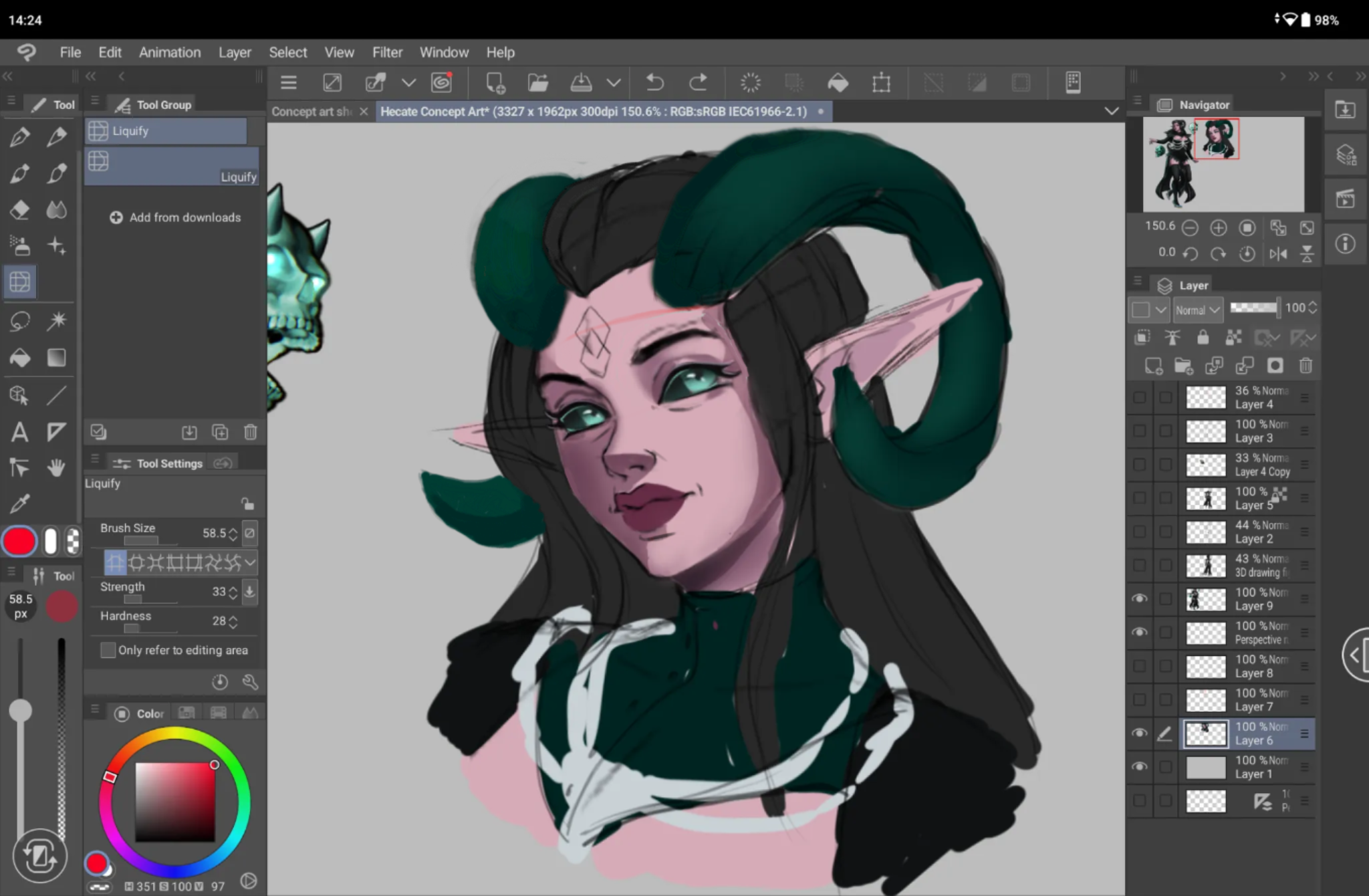
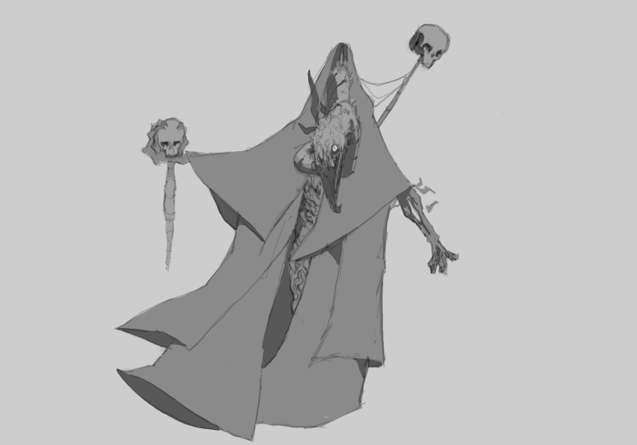
Bird Person
I can’t get the values right I want the character to have a harsh overhead lighting but i keep making it look very dull. Also having a hard time conveying depth, I’d like the head to look more like it’s coming at you but I’ve just made the center very cluttered
vor 6 Stunden
Ansehen
June 30 Sketchbook Pages Challenge
Noch keine Antwort
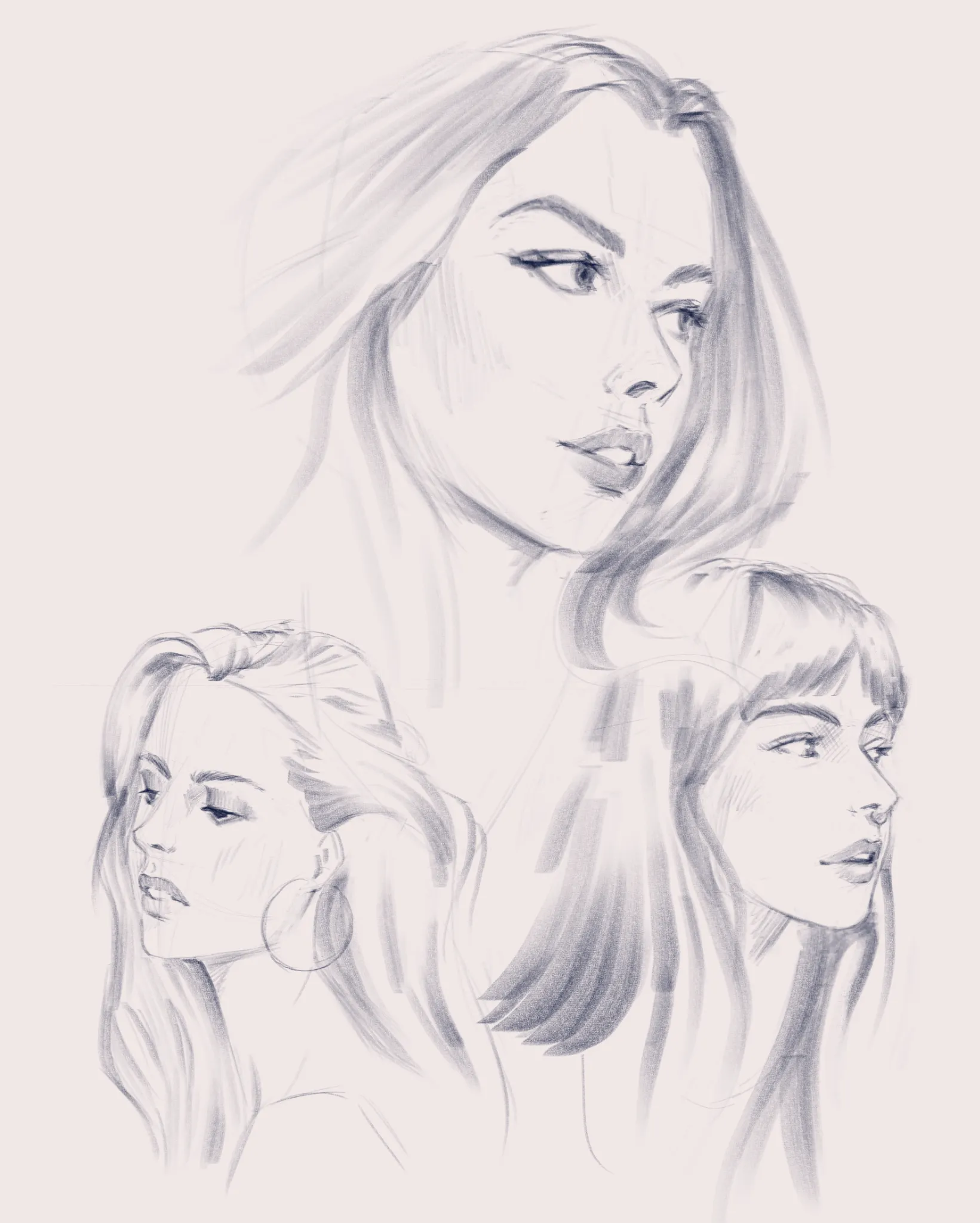
13th June Submission
Wanted to draw faster but ended up doing more detail than intended. Will zoom out more next time. Also, finally got some sleep :)
vor 6 Stunden
Ansehen
June 30 Sketchbook Pages Challenge
Noch keine Antwort
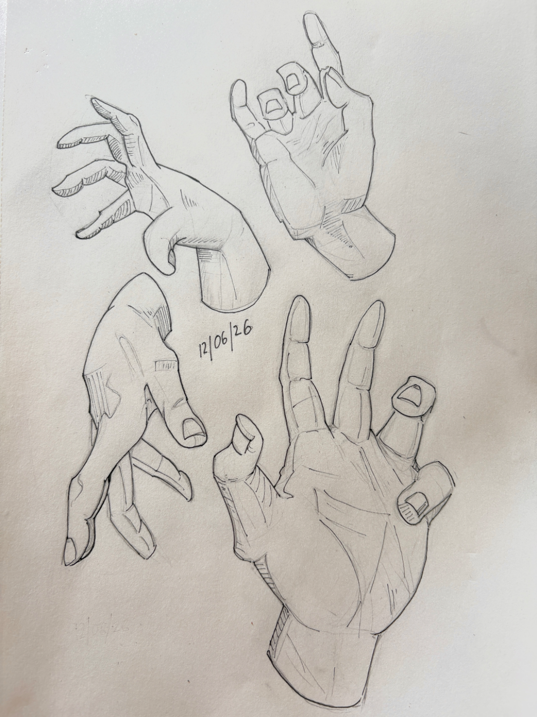
6/30
I just keep drawing hands. Kind of like this one!
vor 8 Stunden
Ansehen

Figure
Noch keine Antwort
Hiyuki (Wuthering Wave)
Hi everyone, i just want to know every mistakes and how could I improve this drawing. Any feedback are appreciated, thanks
vor 8 Stunden
Ansehen
Perspective and Form
Noch keine Antwort
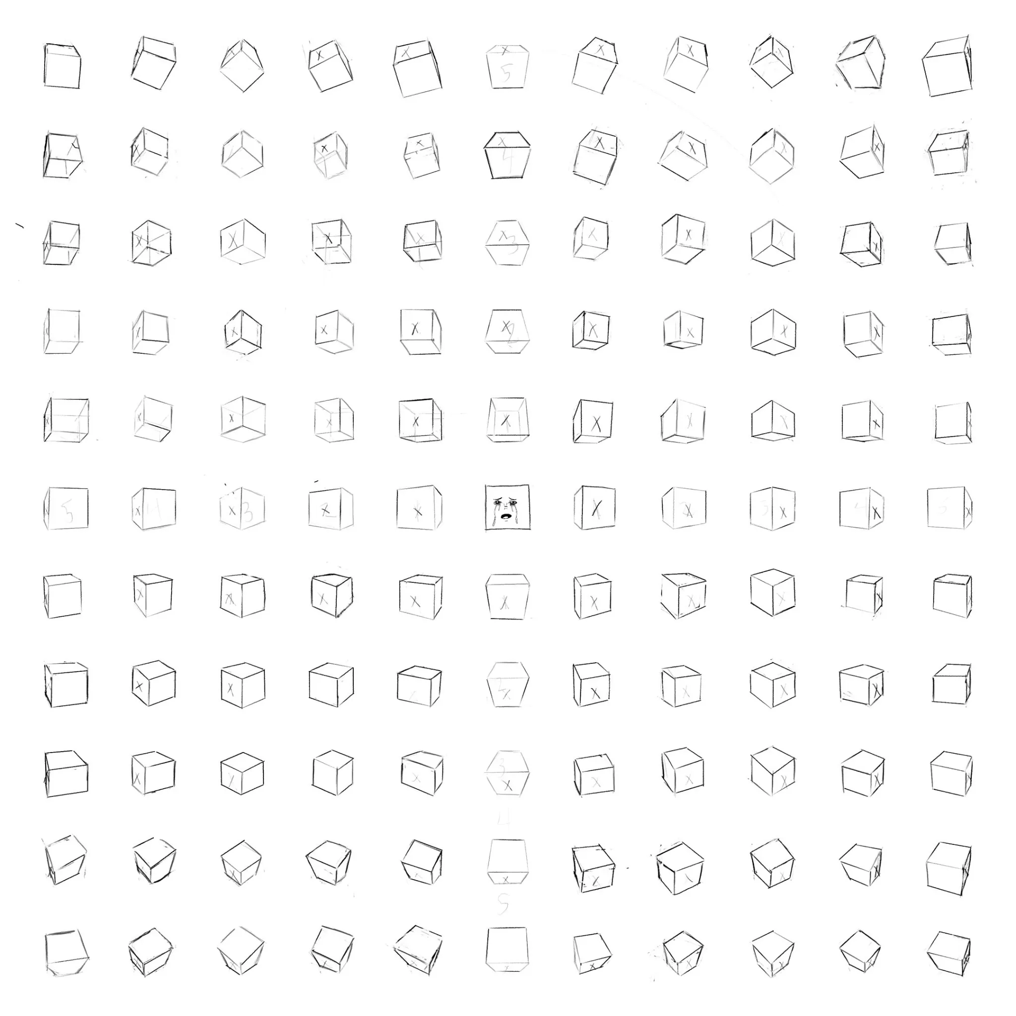
Perspective Right of Passage
Having lots of growth, but I feel like the "perimeter ring" (Top, bottom, and side rows) of cubes trying to capture that last rotation before looking straight on again is my weak point. I think I was struggling trying to understand just how "closed" angles were supposed to be on the side with higher convergence, and with the size I was drawing at there was extreme warping that was happening.
vor 8 Stunden
Ansehen
Perspective and Form
Noch keine Antwort
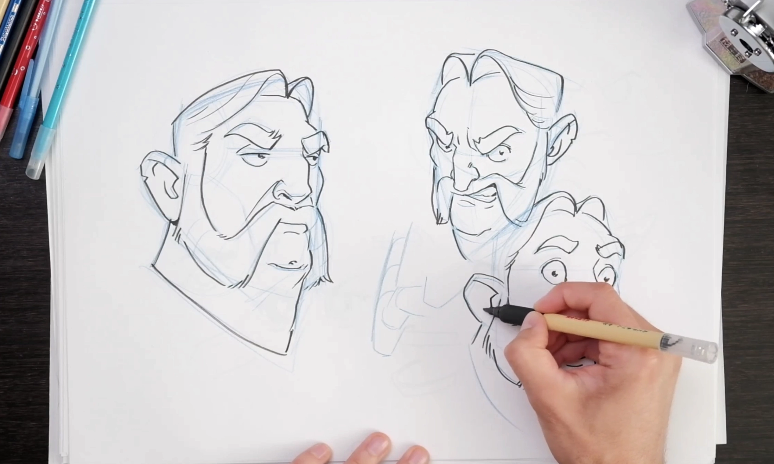
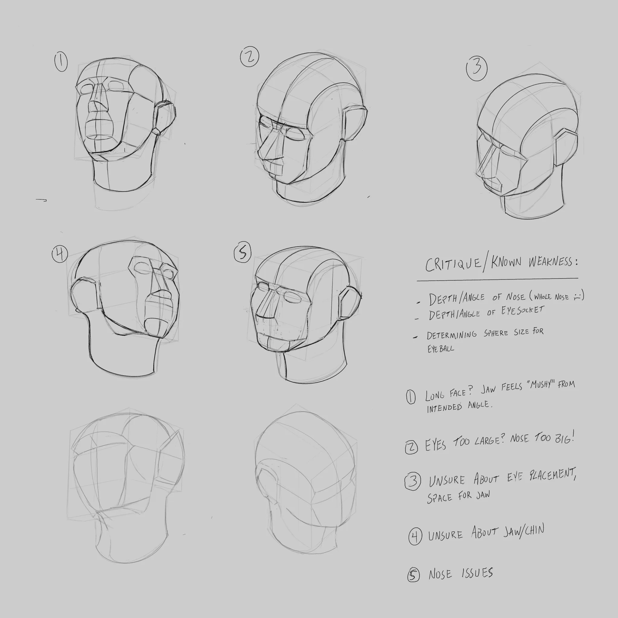
HeadConstruction_Practice
Taking my first attempts at heads in perspective/trying to figure out the planes I am still struggling with perspective elements (especially the placement of the nose). Being new to the exercise I am looking for outside feedback more familiar with the construction methodology that has a better eye for how I might approach the exercise!
vor 9 Stunden
Ansehen