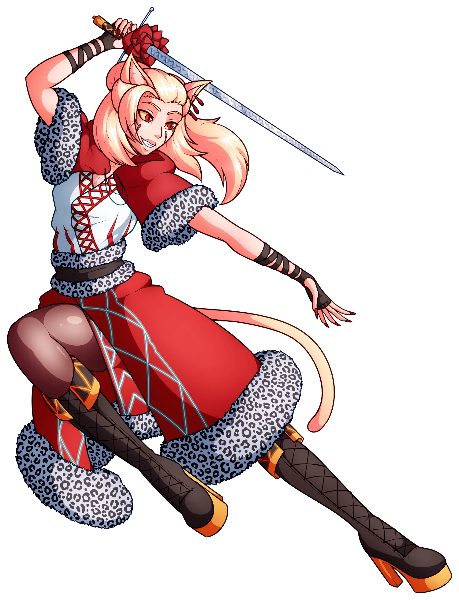
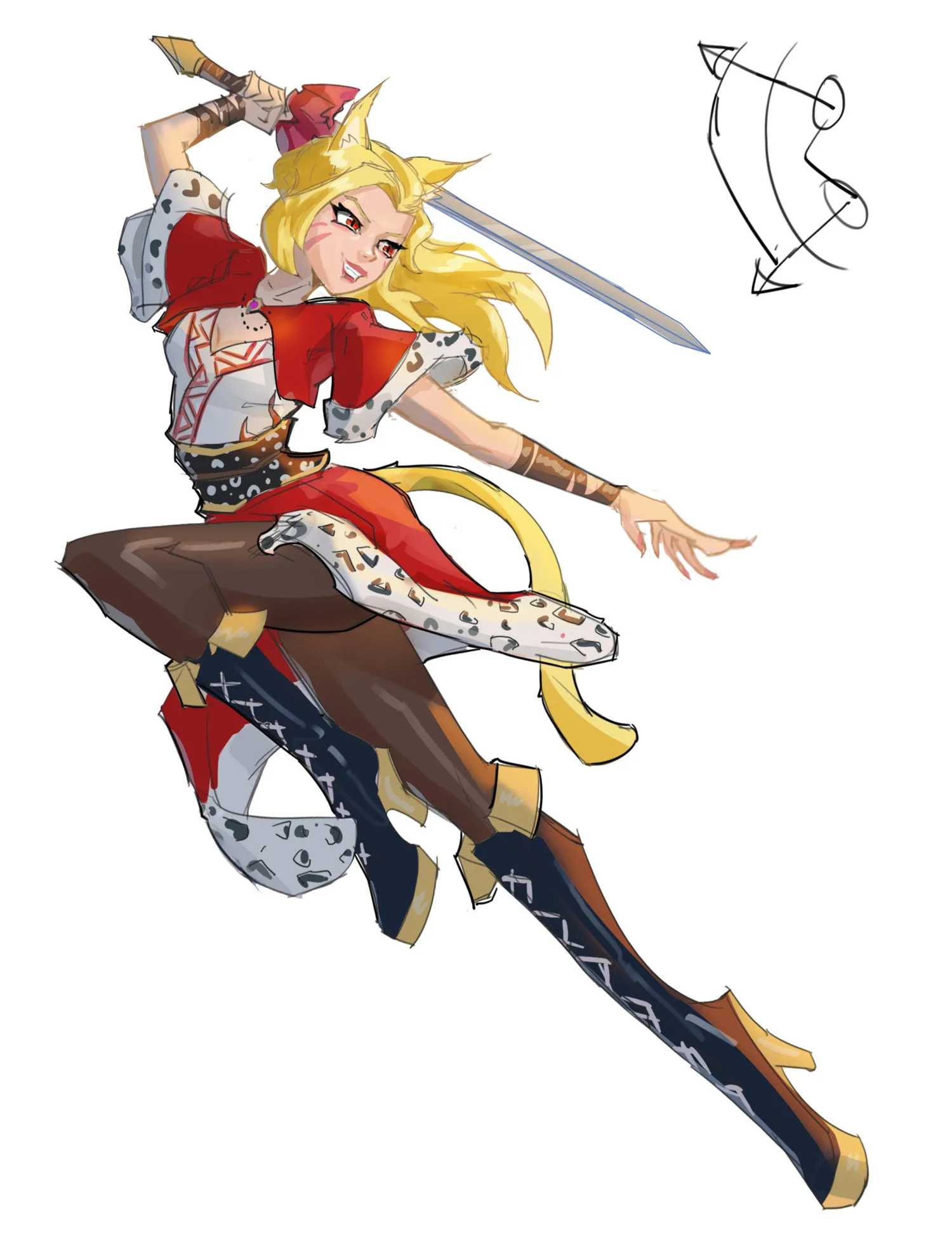


Hey there! Really love the energy in this piece and the bold colors of the outfit. It’s a super dynamic character concept with a lot of charm! You mentioned struggling with perspective, anatomy, lighting, and line quality—honestly, I completely understand. I am very bad with anatomy, lighting, and line quality myself! It is a constant learning process for all of us, so we are definitely in the same boat. I did a quick paintover just to share a few structural tricks that help me when I get stuck on those exact same things! The Power of Contrapposto: To make the pose feel less stiff, I tried pushing a concept called contrapposto. This is where the angle of the shoulders tilts in the opposite direction of the hips, creating a fluid, dynamic S-curve (which I sketched in the top right corner!). To really force that twisting motion, I actually switched the legs in my sketch so her left leg is in front. Of course, you can absolutely keep your original pose with the right leg forward! I just wanted to show how shifting the weight and twisting the torso can make her look like she's in active mid-strike. Wrapping the Form: To help with depth and perspective, try thinking of the limbs as simple 3D cylinders moving through space. Wrapping your costume details (like the fur trim and boot laces) completely around those 3D forms is a great shortcut to sell depth without having to be an anatomy master. Line Quality Trick: Since we both struggle with line quality, a really helpful trick during the inking phase is to drop down to a much smaller brush size overall. From there, you can use even thinner, lighter lines for all the inner details (like clothing folds or facial features), and reserve slightly thicker lines exclusively for the outer silhouette. This naturally pops the character off the background and cleans up the interior reads! You have a fantastic eye for character design. Keep up the awesome work, and I hope seeing this different structural approach gives you some fun ideas to experiment with!
Anstriche (1)
My Artwork
Künstlernotiz:
I'm struggling with perspective, form&depth, anatomy, line quality