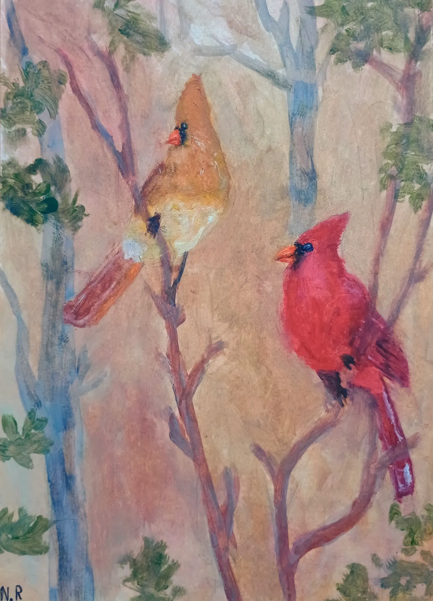
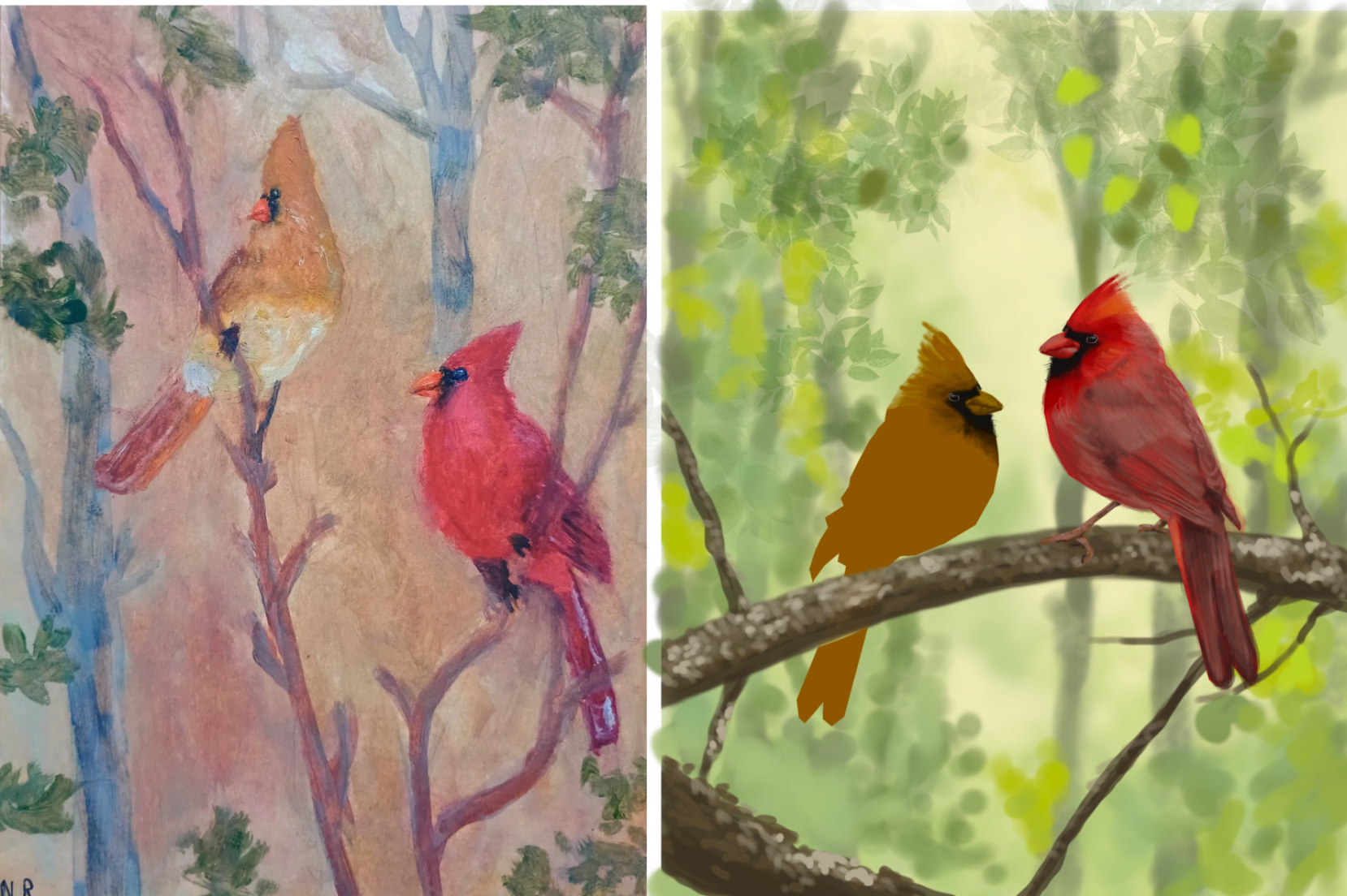

I think you have a nice piece here. To make the birds more of a focal point I would subdue the background. In order to do that you could first of all choose a more cool and less saturated( more muted gray tone) complimentary color to the birds. I went with a more cool grey green to compliment the red/warm color of the birds. This background could be similar to what you have, with mottled soft out f focus look in cool gray greens. Then as you come forward you can use much more saturated and dark colors on the branches that the birds are on. This will create the depth you need here. Then go to town on the details in the birds! This is where you spend the time to get you darks and work up values and nice crisp highlights which will add even more depth as well as give the viewer a nice crisp focal point on the birds. I hope you can see how i did that in my example on the red bird details. These details are best painted from dark to light building up layer upon layer of ever brighter values finishing with the brightest highlights. Hope this helps give you ideas to practice.
Anstriche (1)
Canary birds
Künstlernotiz:
How to add more depth and more dynamic colour while trying to BE realistic and what else could i improve