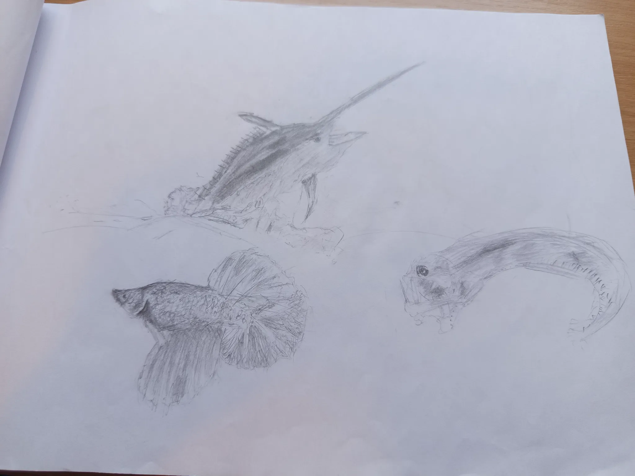
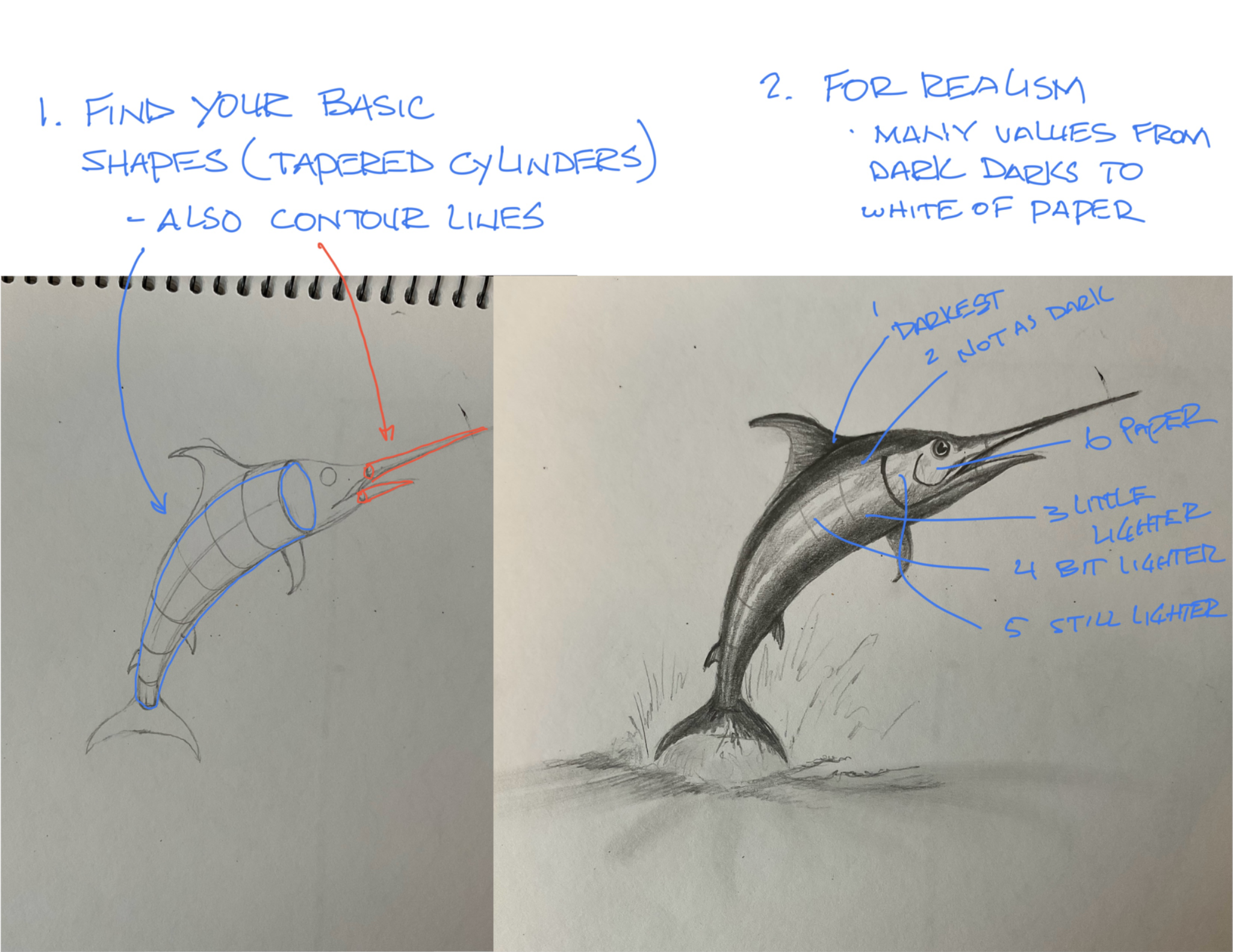

Let’s talk about values and form. When you look at your pencil values I see 2 different shades and then the white of the paper. For realism you should strive for at least 5 values from the white of the paper to the darkest dark. As far as form goes. Try to start with the basic forms that make up the silhouette of the thing you are drawing. For the swordfish, I see tapered cylinders. Once you have the basic shapes you can start to put in your values starting with the lights shades you see leaving some of the white of the paper for the brightest highlights. Then just keep adding darks as you see them in reference. The basic idea is as the form curves away from the light it will get darker. Hope this helps.
Anstriche (1)
Fish
Künstlernotiz:
I got some fish and if you find something fishy please tell me, your feedback will be appriciated