Tu veux enregistrer ton avis ?
Enregistrez tous vos commentaires au même endroit sur votre compte. Vos commentaires seront privés et non publics.
Tu as aussi besoin d'aide avecle rendu ?
Améliore tes valeurs et tes mélanges, 3 min de lecture
Easy Art Pen & Ink Rendering Techniques
Master pen and ink rendering through four progressive exercises: build value scales, shade basic forms, study organic objects, and create imaginary inventions using texture and light.
Rendering
Tu aimerais aider quelqu’un qui attend encore ?
Animals
Pas encore de réponse
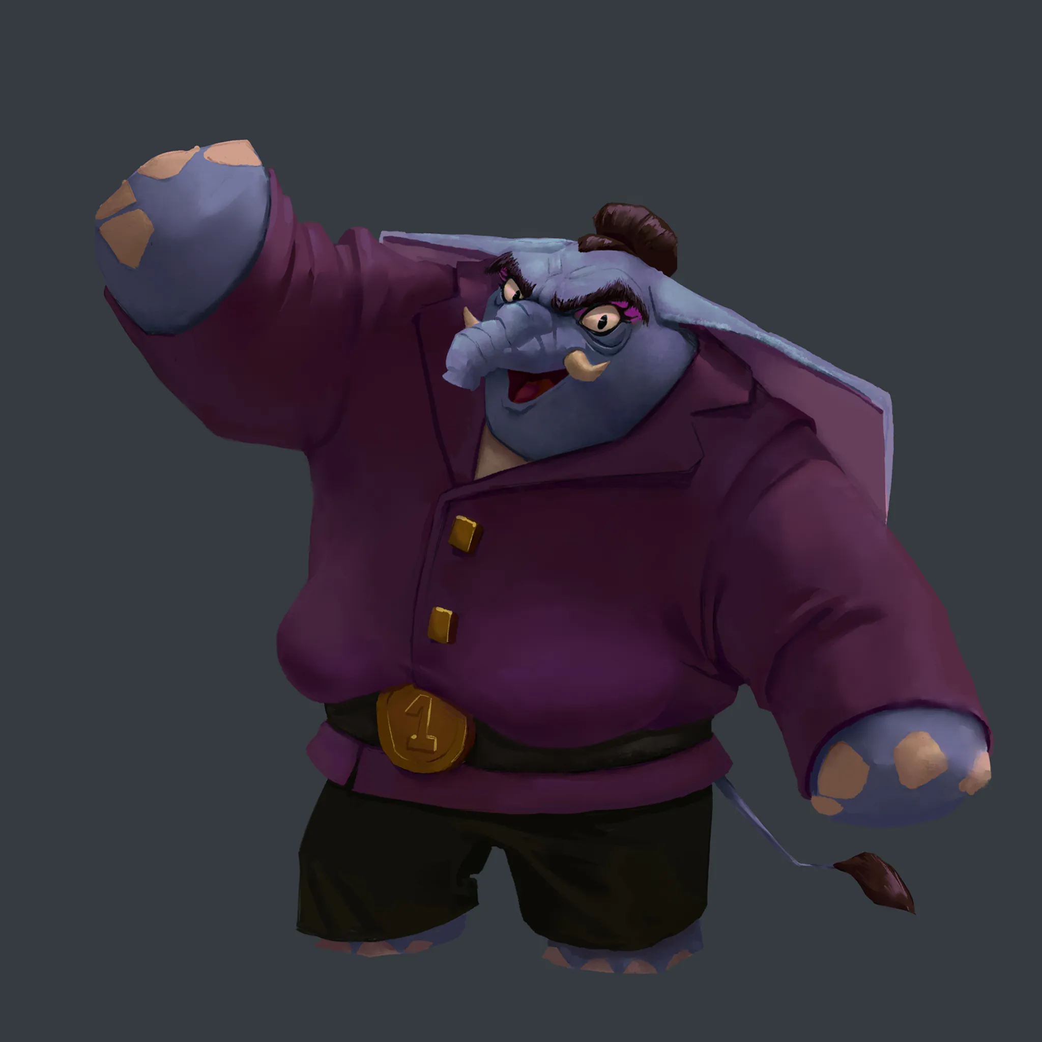
Trunchbull
I have this project of putting Matilda's (from Roald Dhal) characters in an anthropomorphic animal world. Here is TrunchBull. I think my shapes could be improved but I'm not really sure how. I would love to have your take on this !
Il y a 1 heure
Vue
Portraits
Pas encore de réponse
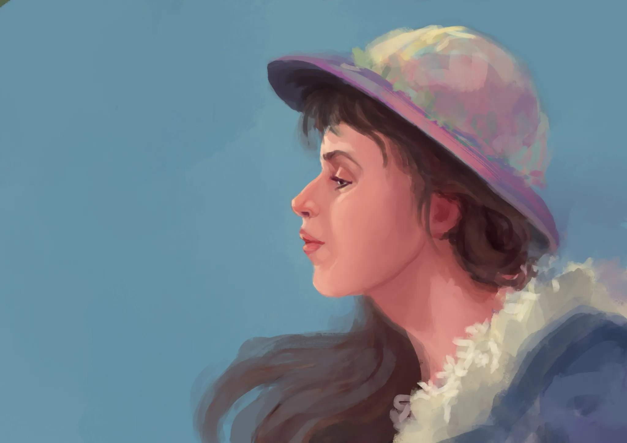
color practice
thats an imaginary portrait practice. i m trying to get out of my comfort zone which is grayscale first>hues later and try to paint directly with color. but she looks lifeless.i want to keep the overall saturation but cant find how to balance it .is it the colors?the planes?wrong anatomy?all of the above? thanks!
Il y a 1 heure
Vue
Rendering
Pas encore de réponse
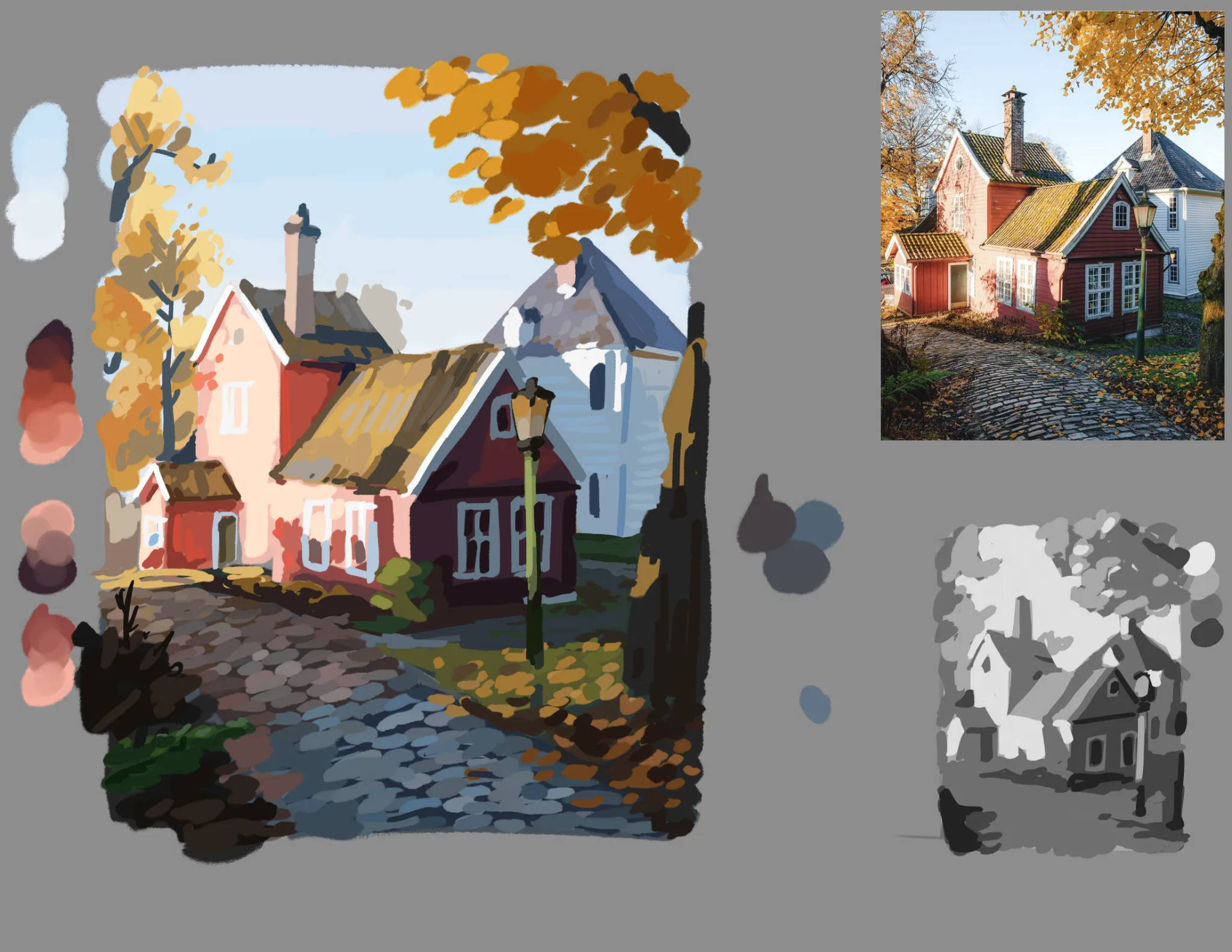
referenced painting study
I'm having a hard time grouping my value zones in a clear and concise way, I can't seem to include reflected light and hue changes (particularly in the cobblestone path here, and some foliage details) without complicating and overworking the values.
Il y a 4 heures
Vue
Environment
Pas encore de réponse
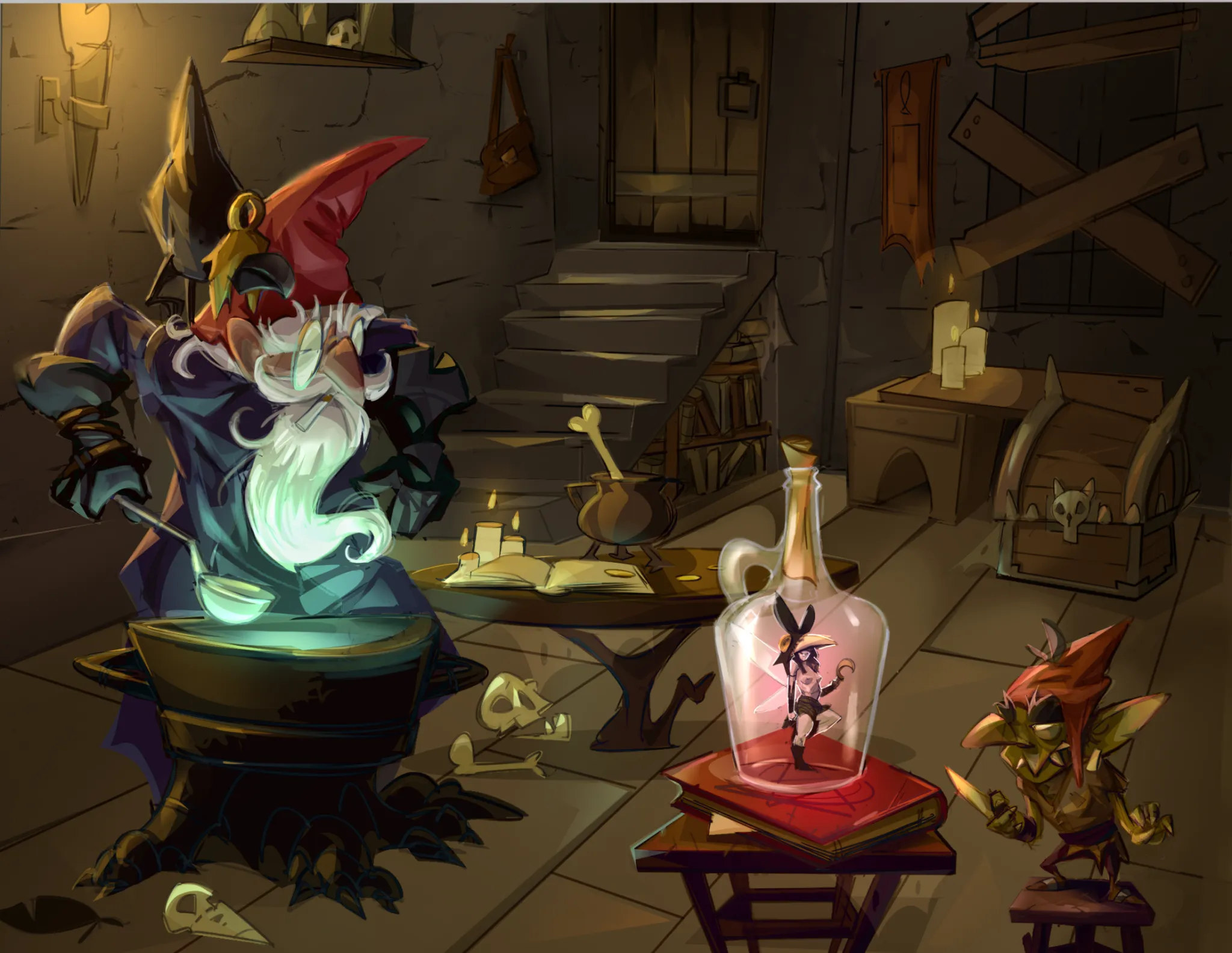
Undecided
So, I was too deep in to go back to perspective Im just cheat and render it out. Sorry Fosco - When I start the next one im gonna really lean into the horizon line and vanish points. Try get some feedback on it early when its still sketch phase.
Il y a 10 heures
Vue
July Before & After Art Challenge
Pas encore de réponse
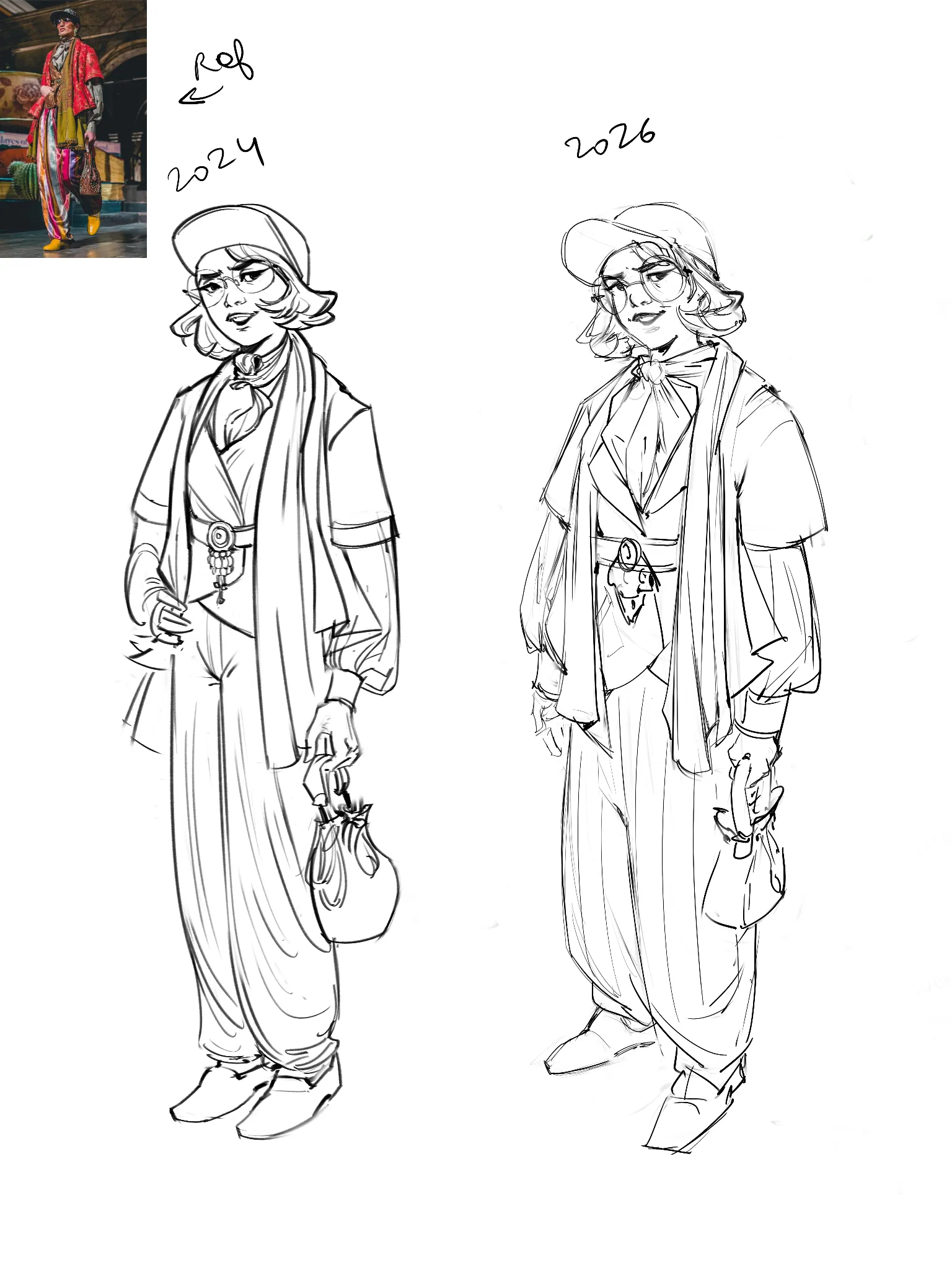
24-26
Still a looooong way to go but nice to see the distance covered so far :)
Il y a 12 heures
Vue
Portraits
Pas encore de réponse
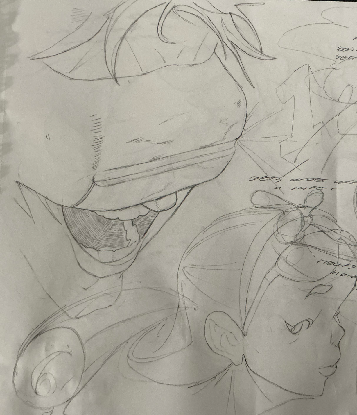
OPTIC BLAST!
Cyclops from x-men! uuuhhh i started with the silhouette first (kind of a sloppy move on my part). Actually, this whole drawing is pretty much based on my intuition, so yeah, the proportions and everything under the visor are gonna be pretty inconsistent, especially considering the angle. Didn't do too bad on the hair and line variation, tho. Oh yea, and there's a face from imagination on the bottom right. Also, have y'all read the remastered x-men manga yet. Im enjoying it so far. Thanks for the feedback!
Il y a 12 heures
Vue
Rendering
Pas encore de réponse
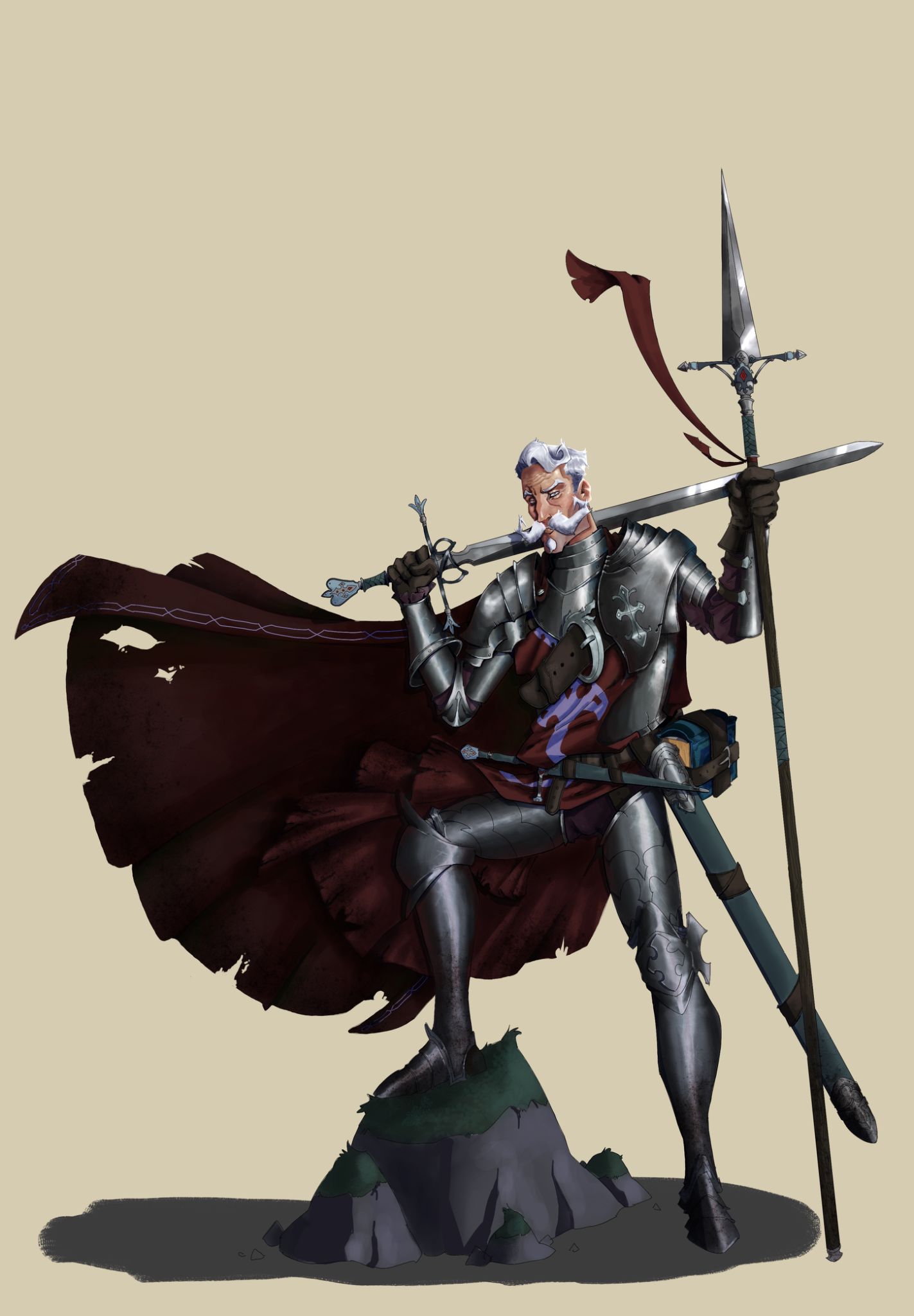
Don quijote polish
I got some feedback in a Discord server, but it’s not here. Since im treating this website as a kind of journal, ill upload. I worked on the material separation, render of the face and tried to make the metal armor more beliavable. I think it’s a good improvement. Still, it could allways be better.
Il y a 13 heures
Vue
August Smaugust Challenge
Pas encore de réponse
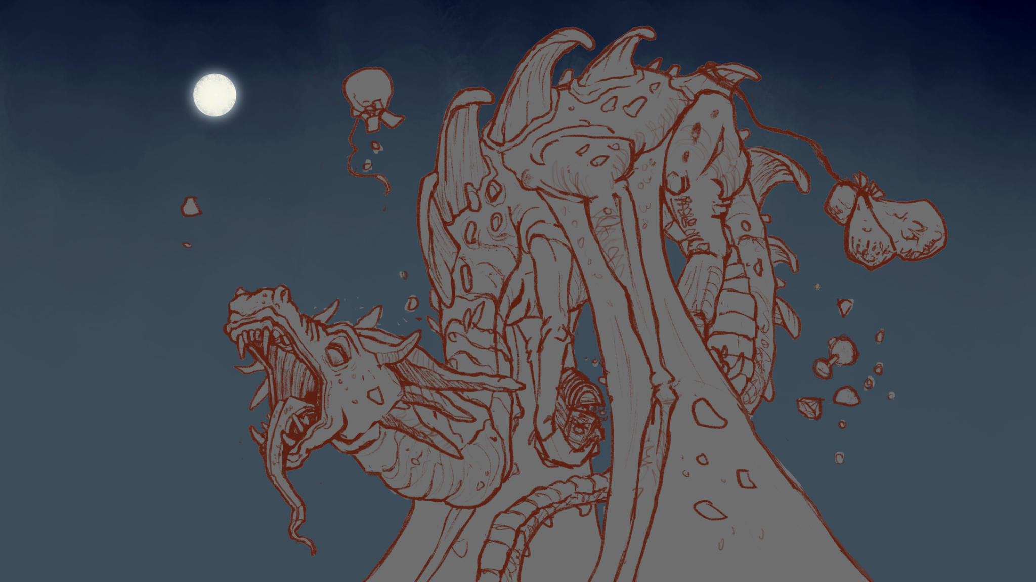
Sleepy Hoarder
1. Definitely struggled with the back feet being hidden but still managing to draw convincible forms. 2. Even with the perspective grid I think I did a poor job of nailing that yawning snout - referred to yawning lions for reference. The other entries are fantastic!
Il y a 14 heures
Vue
Figure
Pas encore de réponse
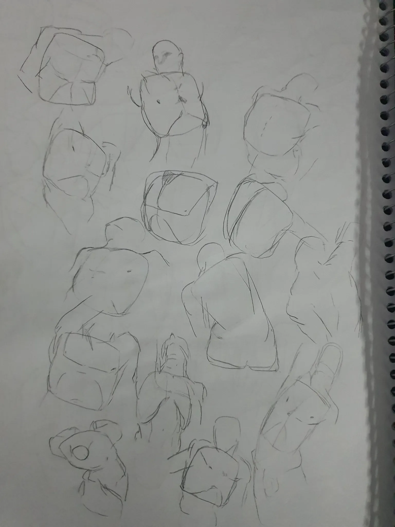
Need help with the form/proportions of the Upper torso.
How do I improve the form or proportions of the torso? I feel like something is off about the upper torso's that I'm drawing, I'm mainly just drawing a roundish sort of square for the base of the torso, and adding the chest over it, and just indicating the ribs.
Il y a 19 heures
Vue