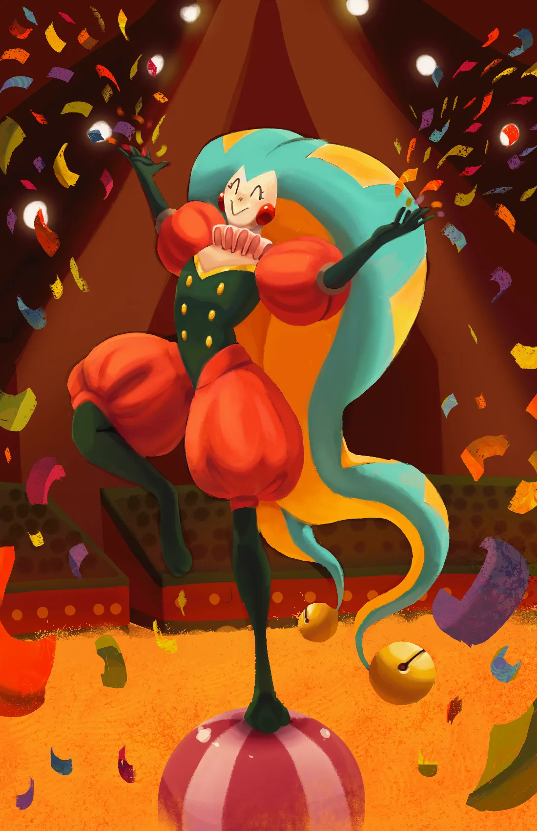
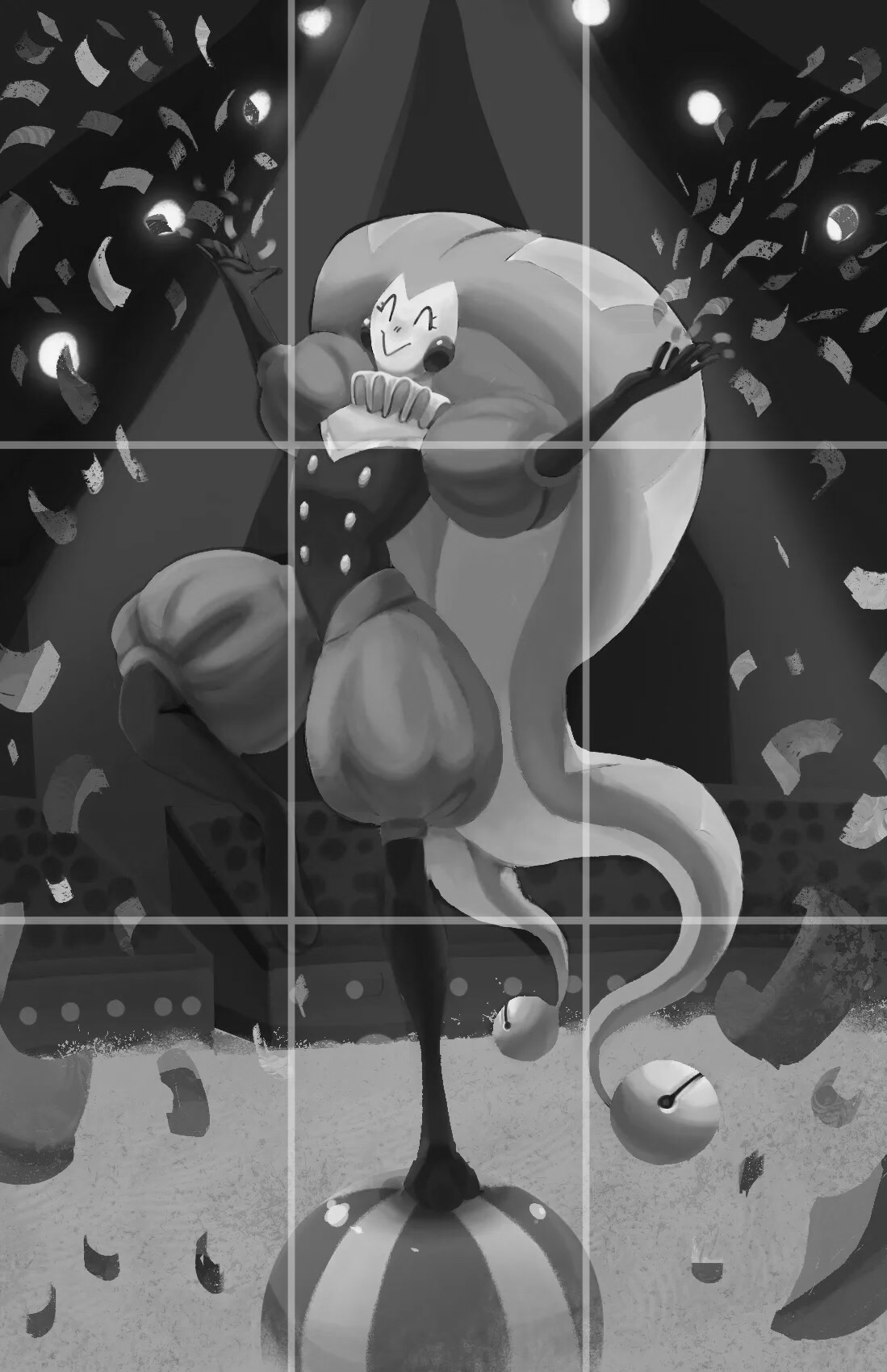
first, i would like to say great job on the composition front. the lines from the overhead tent (and the general directionality of the confetti being thrown) do a great job of helping to center the focal point of the illustration, which is your character bobo. also, the drawing makes decent use of the rule-of-thirds grid for portrait paintings (the focal point of the face and upper body is near the center on the top horizontal line, the stadium seats hew nicely to the bottom horizontal line, and points of interest are generally placed on or near perpendicular intersections of horizontal and vertical lines). additionally, the flurry of details flanking either side of the piece help center bobo further (as does the fact that bobo is perfectly balanced on what appears to be a symmetrical ball). with regard to your question about lighting, one thing that i would recommend that has really helped me is a trick that is available on many digital painting softwares: the saturation blend mode. in order to make sure that none of your illustrations have too many dark values (or too many light values, or too many of any type of values that you want to avoid), create a layer on top of all your other layers, set the blend mode to saturation, and color that topmost layer pitch black. this allows you to see how dark each of the values are in your painting (on a scale of pure white to pure black). in addition to watching for values that might be too dark or too light, this also serves the additional function of letting you check for appropriate levels of contrast and visual distinguishability. if two objects with similar values are right next to each other, it may make it difficult for the viewer to distinguish one form from another (especially important when you have certain items in the foreground and others in the background). for example, the values used for bobo's legs are similar to the values used for coloring the stadium seating, which could make that part of the illustration a bit more difficult to discern. perhaps changing the type of green that bobo is wearing to a lighter shade would be helpful in distinguishing that part of the form. having objects with contrasting values next to (or overlaying) each other is a nice way to make sure that your art reads correctly, and it's also just a good use of contrast in general (contrast, after all, often tends to make pieces more interesting—especially when that contrast helps clarify what the viewer is observing). i've included a draw-over that's just the original image with a rule-of-thirds grid and a saturation layer applied; hopefully, this helps show visually what i've written above. really nice job making this illustration, friend ❤
Participez à la discussion
Inscrivez-vous pour donner votre avis sur cette œuvre.