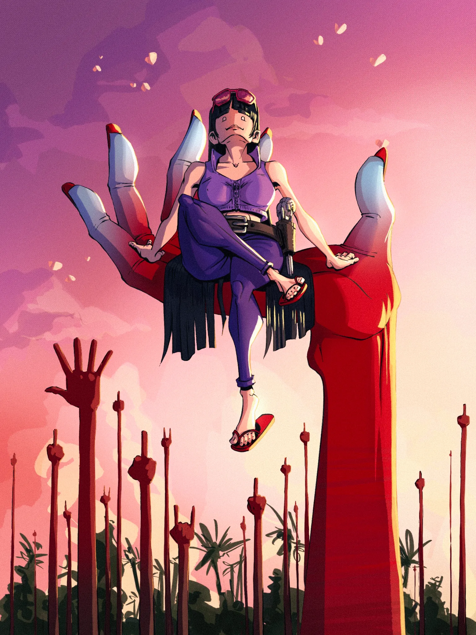
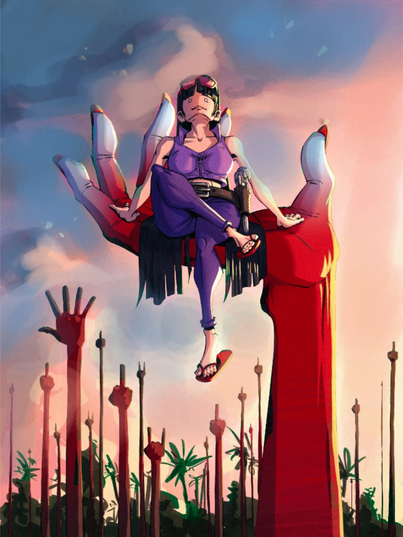
Hello Hello! Cool idea to show Nico Robin! I very much like the graphical approach with a mix of painting for background.Conflict is created by the sky's color scheme merging with character. We want to add blue tones to counterbalance the picture's overall warmth (even the purple is on the warm side). In this manner, you can make cloud forms that are easier to see. You can maintain the clouds' current forms. In general, I would also add more blue to shadows. In a real-life scenario, light fades, leaving behind the last of the sun's bright rays before everything falls in the cool blue tones of the night. There are chilly shadows in the middle that are progressively losing warmth toward the edges, making room for intense light—almost like a highlight. To achieve that lovely gradation over the entire piece of art, I would advise adding more midtones. Hope it helps!
Participez à la discussion
Inscrivez-vous pour donner votre avis sur cette œuvre.