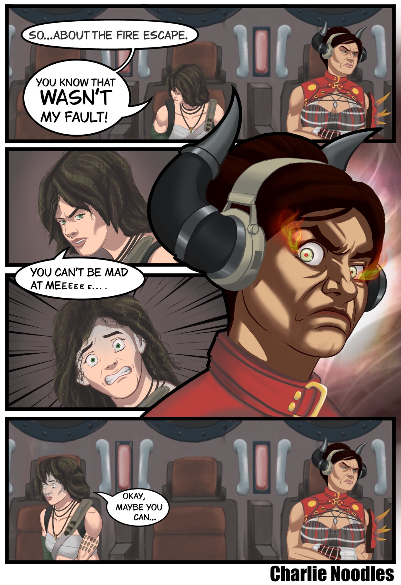
Hi Hi! Looks nice! Keep up with comics! Workflow is pretty straight forward when we talk about comics: linework, flat colors, cell shading and details. Process may differ from artist to artist so it's a matter of experimentation, lots of trials and errors. Here you have solid linework but you went in two extremes of saturation: low and high. Choose colors that are neither too light nor too dark (mid-tones) to allow for both highlighting and shading later. Generally, lower-saturated colors are easier to balance, reserving high saturation for small, high-impact accents. Make sure you keep linework and flats separated by all the way to the end. For shadows, use a hard brush; for curves, you can somewhat smooth them; and for edges, keep them sharp most of the time. Take careful note of the body's curve when positioning the shadows. Since this is how humans perceive human figures, it is essential to comprehend fundamental geometric shapes like spheres, cylinders, and squares. Plan your shadows according to the direction of the light. For faces use Asaro head to plan accurately face planes and for shadow colors pick either cold or warm colors, keep it very simple. As for extra push, you can add textures to hard surfaces and hair. It will give a nice, polished look! Hope it helps!
Participez à la discussion
Inscrivez-vous pour donner votre avis sur cette œuvre.