Tu veux enregistrer ton avis ?
Enregistrez tous vos commentaires au même endroit sur votre compte. Vos commentaires seront privés et non publics.
Peintres
Paintoover Notes
Choisir un vernis
Choisissez un avatar pour voir ses notes et en discuter.
Tu as aussi du mal avecles portraits ?
Améliore la ressemblance et les proportions du visage, 3 min de lecture
How to Draw Portraits: A Step-by-Step Guide for Beginner Artists
Master portrait drawing by progressing through head structure, simplified features, anatomy, stylistic exploration, observation practice, and imaginative creation.
Portraits
Tu aimerais aider quelqu’un qui attend encore ?
Anatomy
Pas encore de réponse
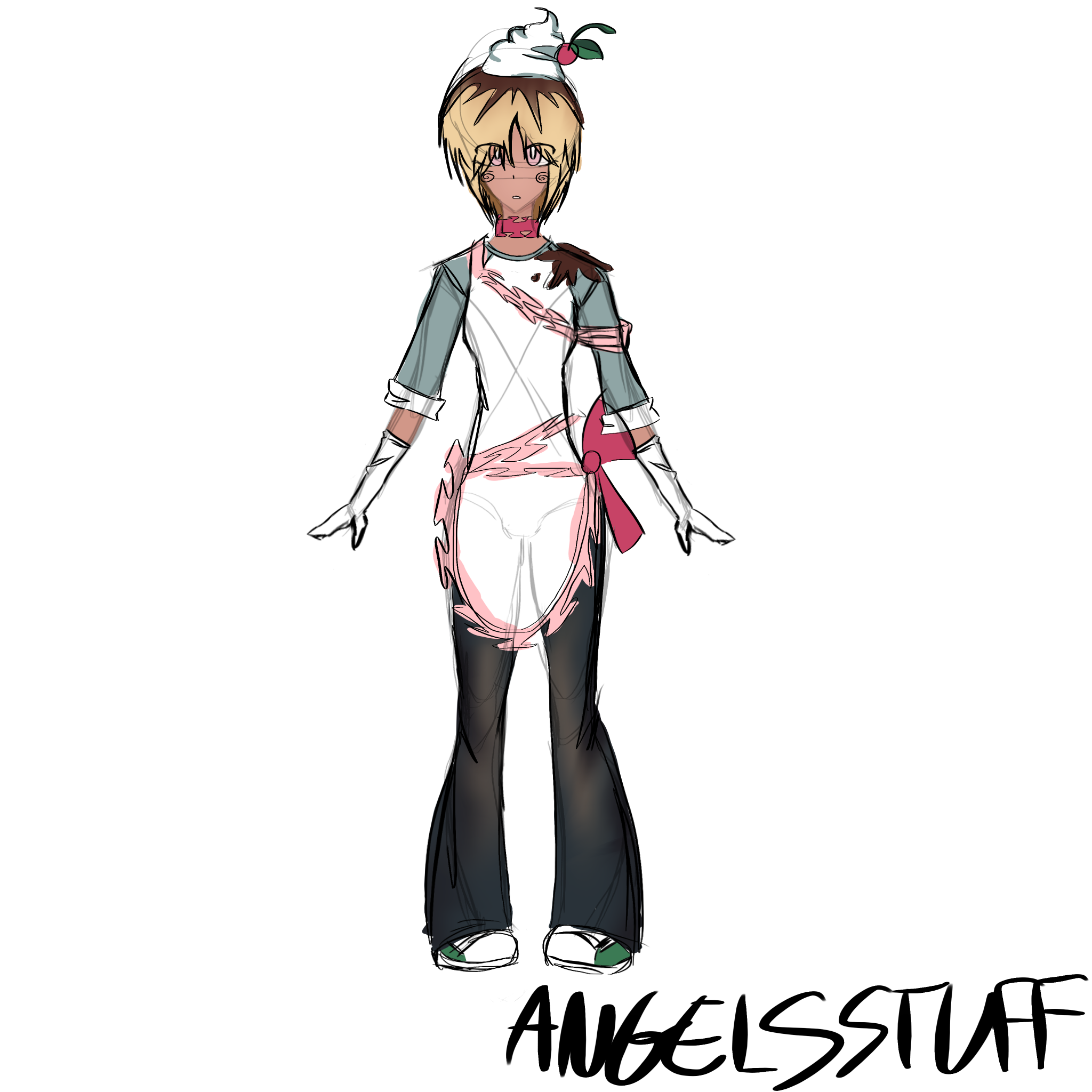
oc sketch
i just want to know if the general anatomy of this sketch makes sense, i never draw full bodies and it seems like the torso and arms in particular look a bit iffy but i cant quite put my finger on it
Il y a 13 minutes
Vue
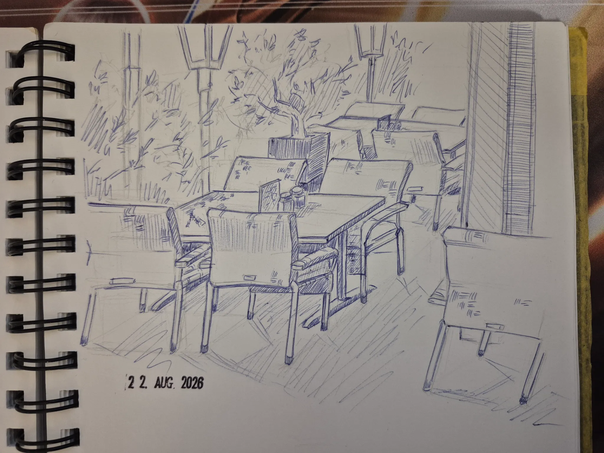
Perspective and Form
Pas encore de réponse
Observational drawing of a café
Life drawing of a café. My biggest struggle are the foliage on the left and creating a believable perspective for the back table set
Il y a 31 minutes
Vue
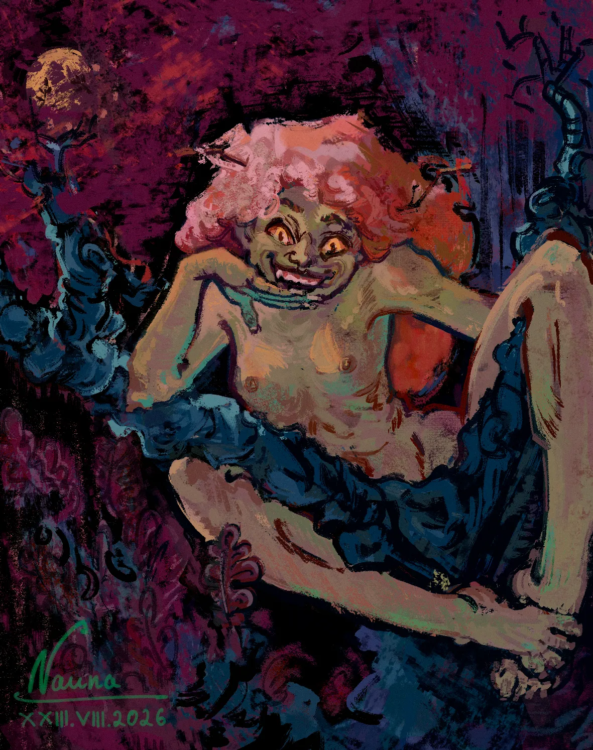
Rendering
Pas encore de réponse
Dubava from Oak woods
I can't get the lighting on the figure right, especially on the hair. I suppose my struggles are compounded by the anatomy mistakes (at least the wrist) and the fact that I added the light source long after I began rendering. On top of that, I forgot to add the second hand at the beginning, and now I have no idea how to squeeze it into the composition without making it feel too compressed."
Il y a 1 heure
Vue
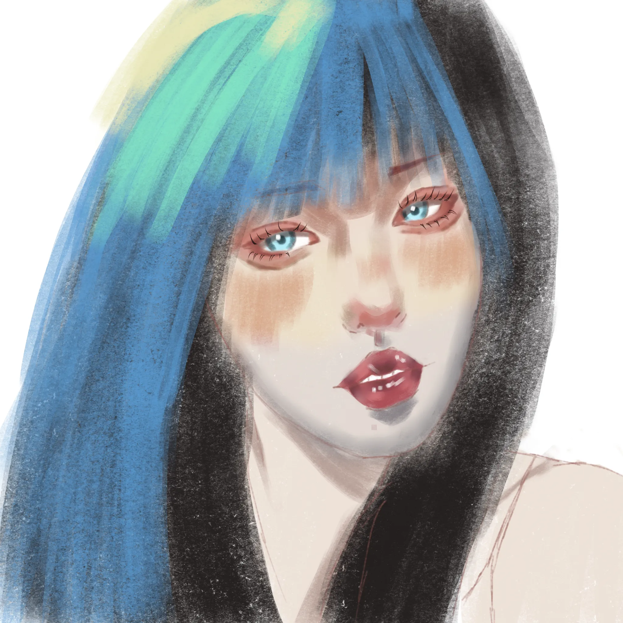
Portraits
Pas encore de réponse
Asian woman
How can I render this in a way that feels more like an Asian-inspired art style? I’m a total beginner, so this was my first real attempt at trying something like this, but I’m struggling to get the look and feel right. I’d really appreciate some constructive feedback on what I’m doing wrong, what I should focus on improving, and how I can approach the rendering differently. I’d also love recommendations for actual teaching/tutorial videos that explain the process and techniques (rather than just speedpaints). Step-by-step tutorials, explanations of brushwork, lighting, colour choices, rendering, etc. would be especially helpful.
Il y a 1 heure
Vue
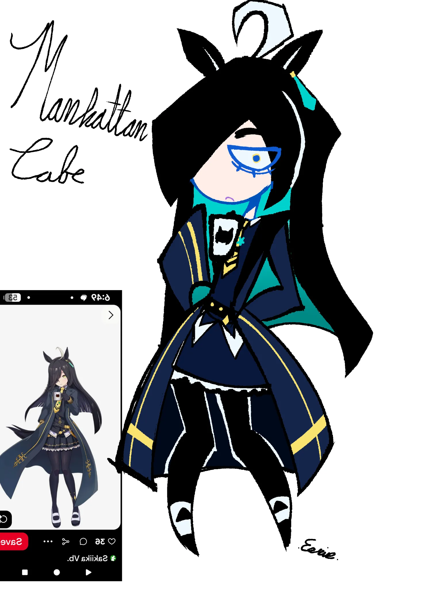
Figure
Pas encore de réponse
Stylized anatomy test
Im trying to get flowing body shapes while still adding a lot of sharp lines in my art... Idk what I can do better because this just looks super stiff
Il y a 2 heures
Vue
Animals
Pas encore de réponse
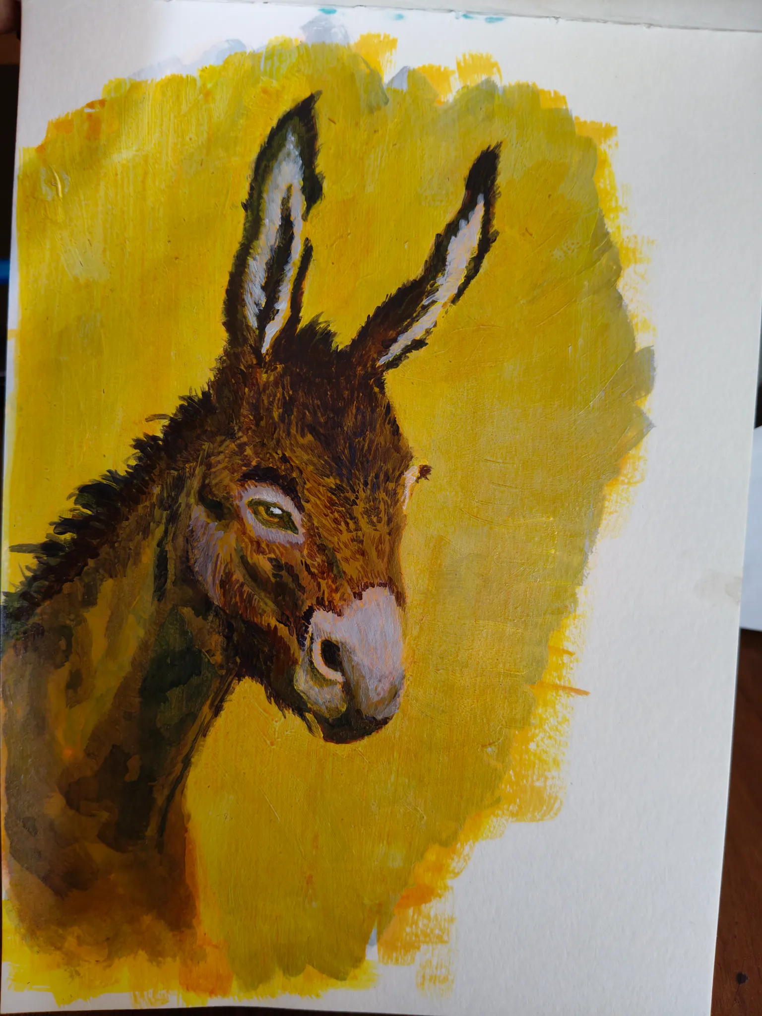
Mule
Not sure how to improve from here. Should I add more further or leave it as is
Il y a 3 heures
Vue
Perspective and Form
Pas encore de réponse
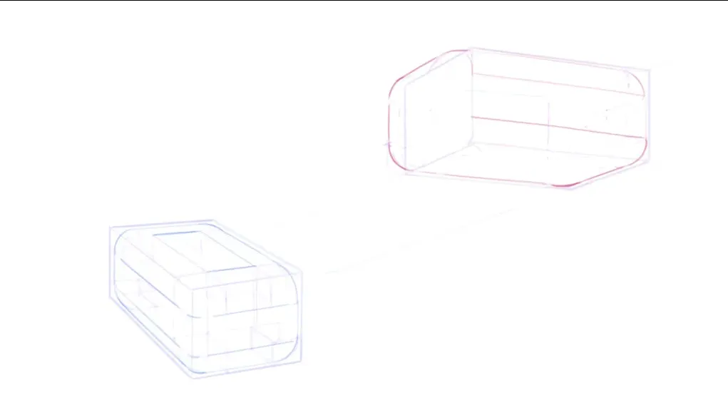
Redondeo multiple
Hi everyone, I’m in the multiple rounding section and wanted to know if you have any feedback on assignment number 3. I feel like something doesn't quite fit or seems out of place. Thanks a lot; your feedback will help me keep improving.
Il y a 4 heures
Vue
Rendering
Pas encore de réponse
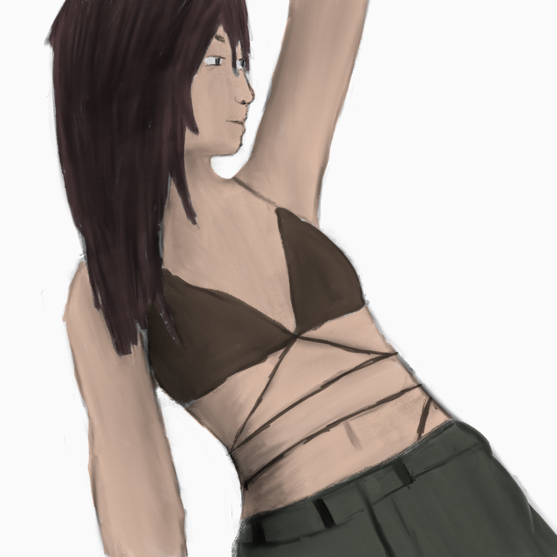
Name
I’ve been trying to learn how to use underpainting on digital but the colors always come out to bright or dull
Il y a 6 heures
Vue
Environment
Pas encore de réponse
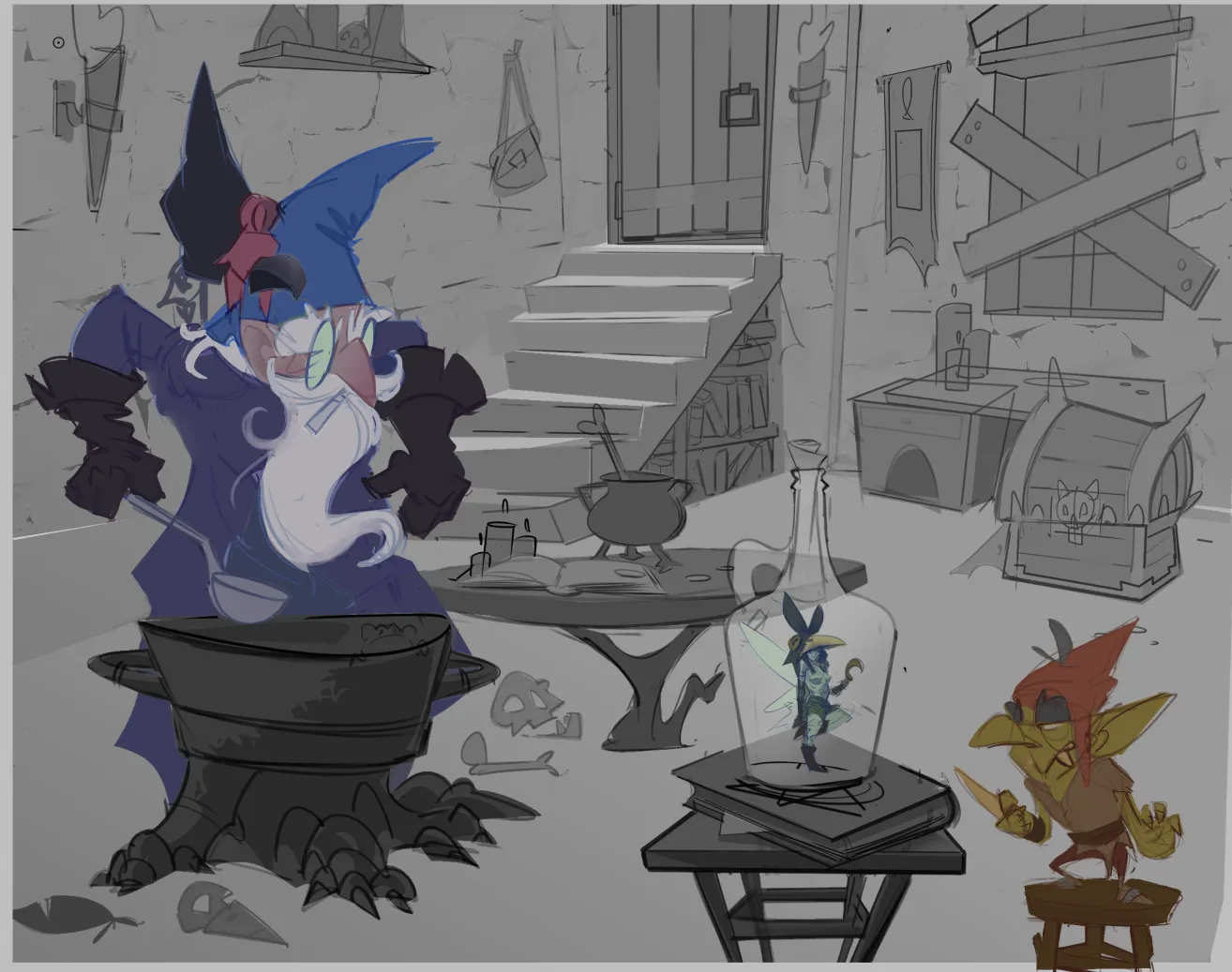
Undecided
Still going any notes, are always appreciated.
Il y a 6 heures
Vue