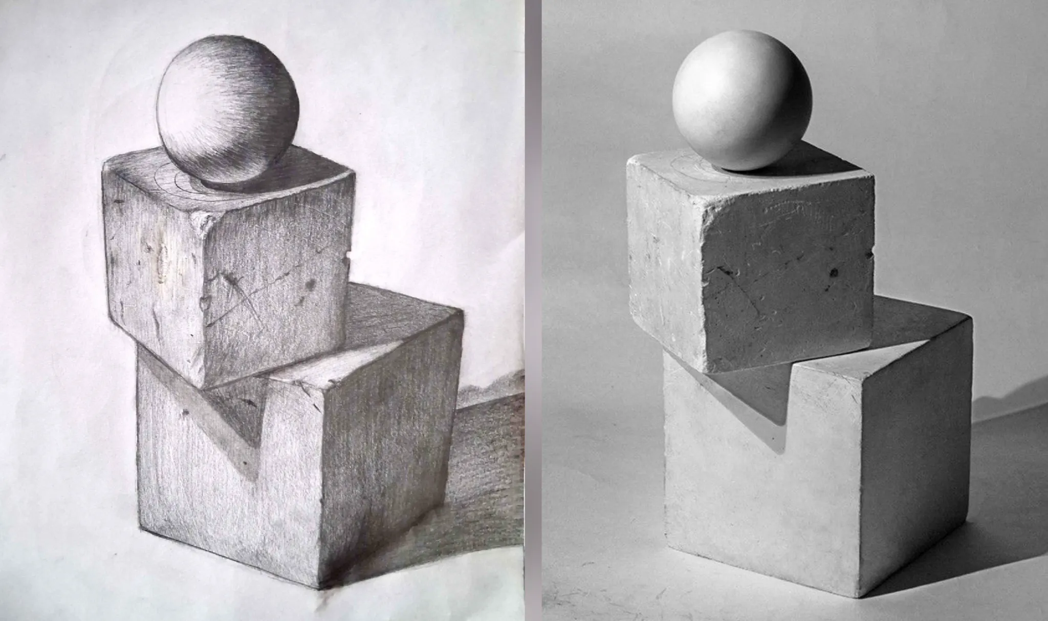
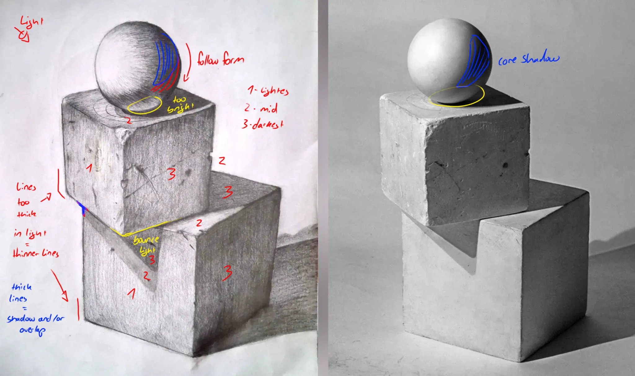

The most notable thing to me is that the shadowing on the ball doesn't follow the form. For the values I market the planes from 1 to 3 with 1 being the lightest and 3 the darkest. I sugggest filling the planes of the cube with the base value before adding detail. Work from big to small. The values also need more contrast, the lights need to be lighter and the darks darker. The last thing I noticed is the consistent line weight. Usually teachers for paintings don't want you to use lines at all you're meant to imply a plane change with shading bc there are no lines in real life, but I like lines and if you are going to use lines use the line weight to imply light and shadow. Thin lines and less detail in the light, thicker lines and more details in the shadow. Other than that, really solid work! And I hope my feedback was helpful.
Participez à la discussion
Inscrivez-vous pour donner votre avis sur cette œuvre.