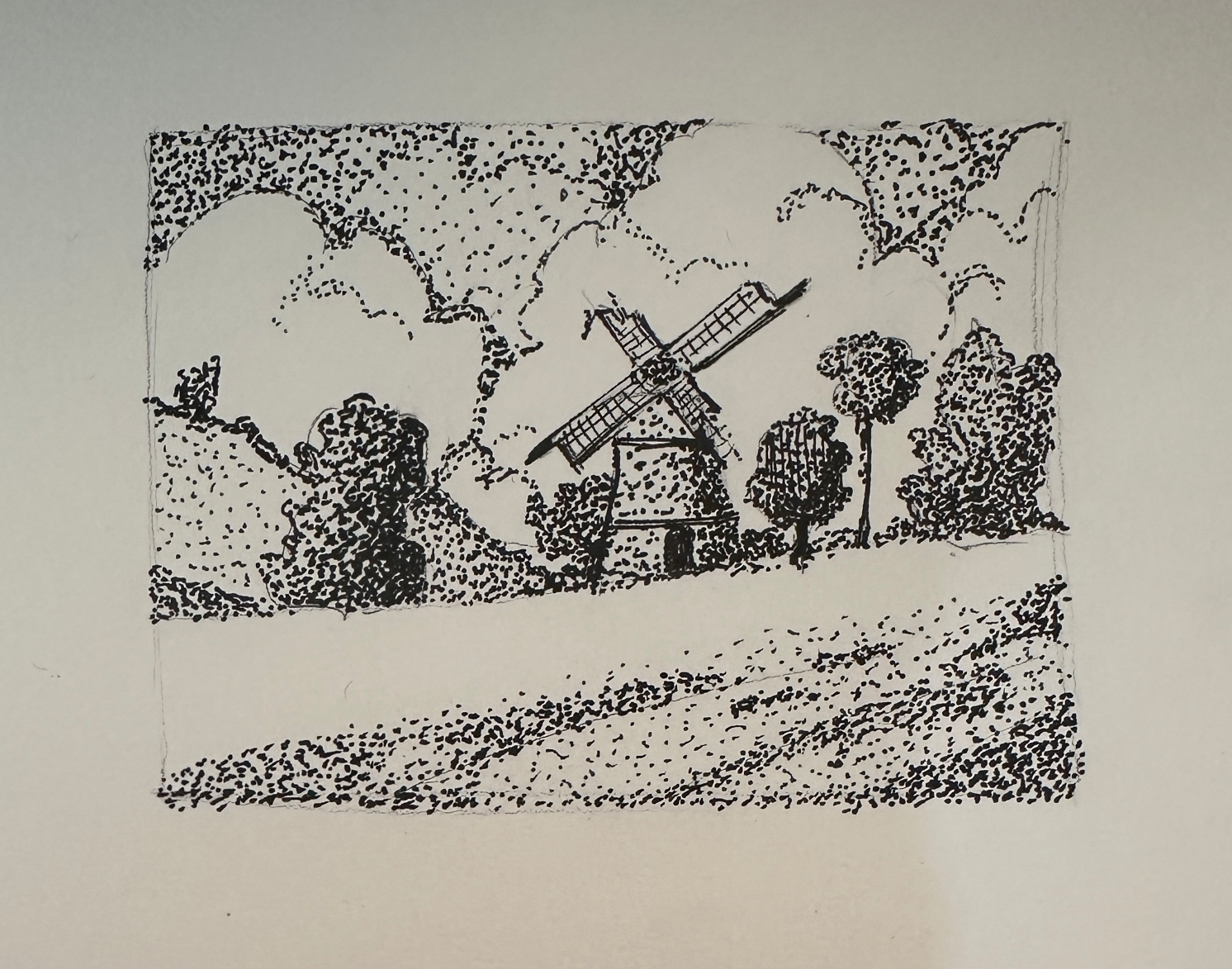
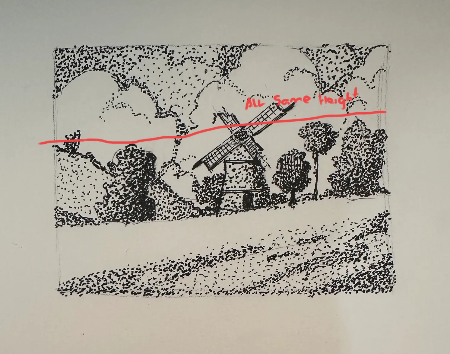
Great job! I agree with Drawerduck that you have a lot of positive aspects to this drawing. I would also agree that everything blends together regarding what is the main subject. Increasing the contrast between the windmill and the surrounding and using your blackest blacks for the windmill would help. Another way is to change the composition. I notice that roughly all the trees and the windmilll are about the same height. Also the trees have more black in them. (Either from shadow or the tree trunks.) Hence as DrawerDuck suggested punch up the contrast of the windmill with a very black door and maybe lines in the blades of the windmill. Or increase the size of the windmilll so it stands apart from the trees. If this feels too much of beating the viewer over the head because it is almost centered on the image then I would shift the image/windmill a little to the right on the paper to be more in line with the rule of thirds. Excellent job on the stippling. Overall an awesome piece. I hope you find this useful.
Participez à la discussion
Inscrivez-vous pour donner votre avis sur cette œuvre.