Tu veux enregistrer ton avis ?
Enregistrez tous vos commentaires au même endroit sur votre compte. Vos commentaires seront privés et non publics.
Tu as aussi du mal avecle dessin de personnage ?
Améliore tes proportions de personnages et tes talents en anatomie, 3 min de lecture
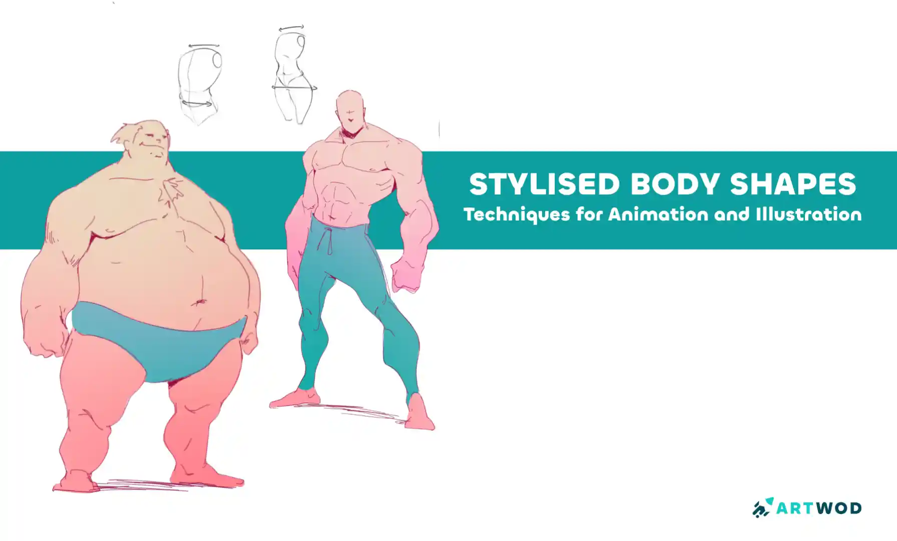
Stylised Body Shapes: Simplify and Exaggerate Figures for Animation and Illustration
Break down stylized characters into basic shapes, experiment with silhouettes, and layer anatomy to create expressive, believable designs with personality.
Figure
Tu aimerais aider quelqu’un qui attend encore ?
Portraits
Pas encore de réponse
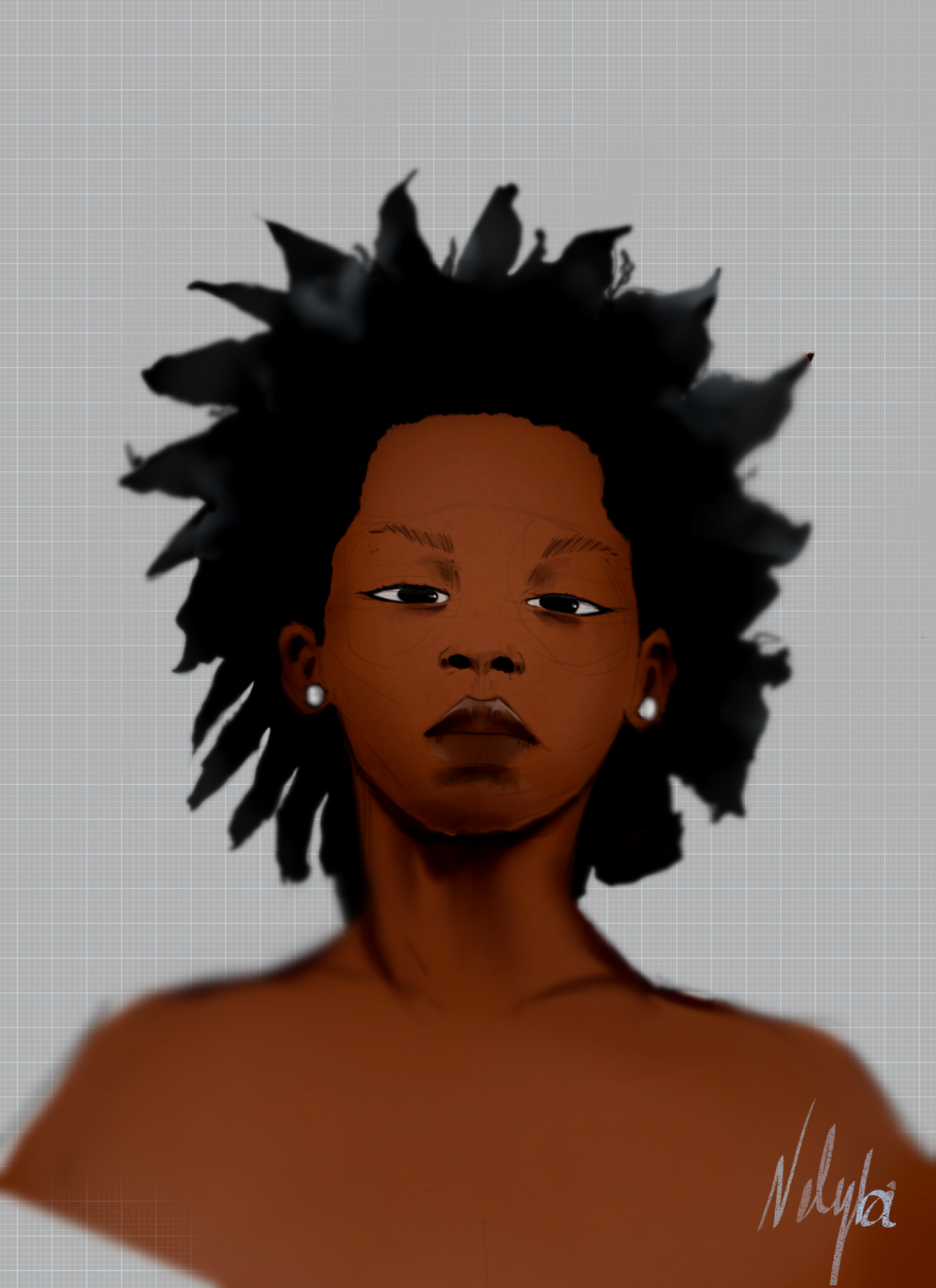
portrait
I have trouble rendering the skin properly I don't really have a process and I spoil a lot of drawing like that
Il y a 2 heures
Vue
Environment
Pas encore de réponse
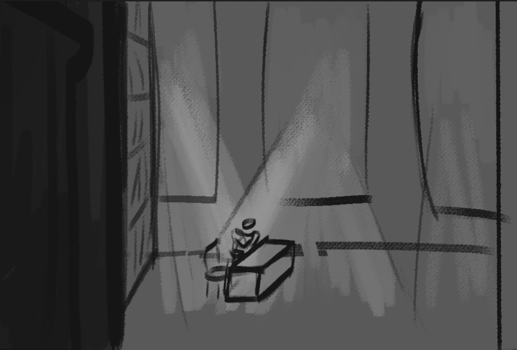
Thumbnail Trouble
I have an idea for a kinda cinematic shot (think of those Chinese artists with that bright aesthetic lighting and flowing atmosphere) of someone checking documents in their castle office. I don’t know how to best frame it. Should the character be bigger? I tried a door closeup as a foreground, a bookshelf + character as the mid and the windows plus sunlight as the background. I’d appreciate help! Thanks!
Il y a 5 heures
Vue
Figure
Pas encore de réponse
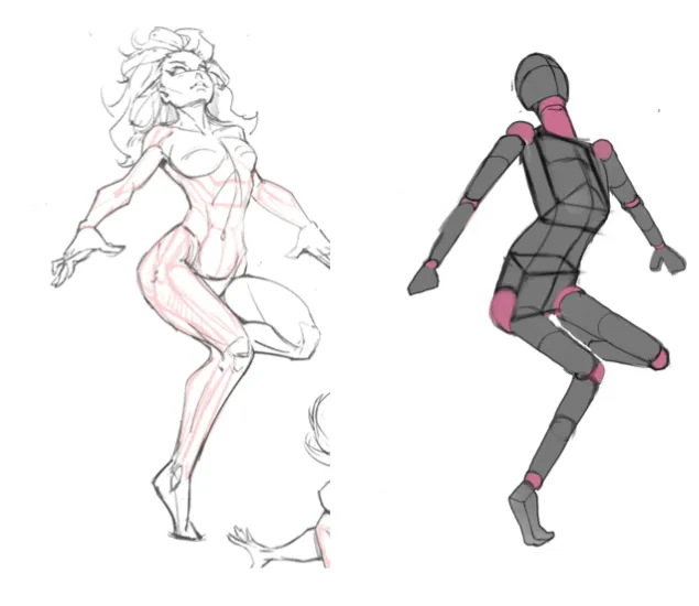
Learning mannequins
I am struggling with finding the horizon line and not quite sure how to structure my approach on learning how to draw figures. This is my workflow 1. Basic silhouette 2. Draw head, ribcage, and pelvis 3. legs and arms I struggle with drawing boxes and cylinders in perspective and how tilting affects it. I'm trying to draw my figures in 2 point perspective.
Il y a 6 heures
Vue
Portraits
Pas encore de réponse
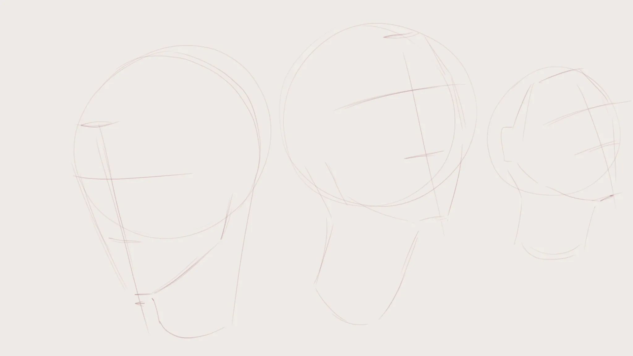
"Head grid" part 2
Made some revisions! Added a sort of plane change to indicate the form a bit better, along with some more minor changes.
Il y a 7 heures
Vue
Rendering
Pas encore de réponse
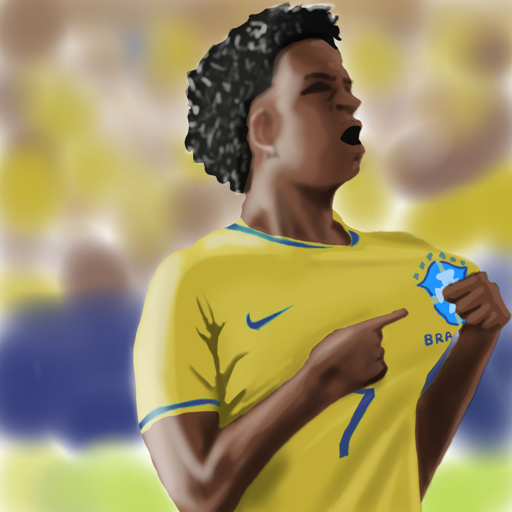
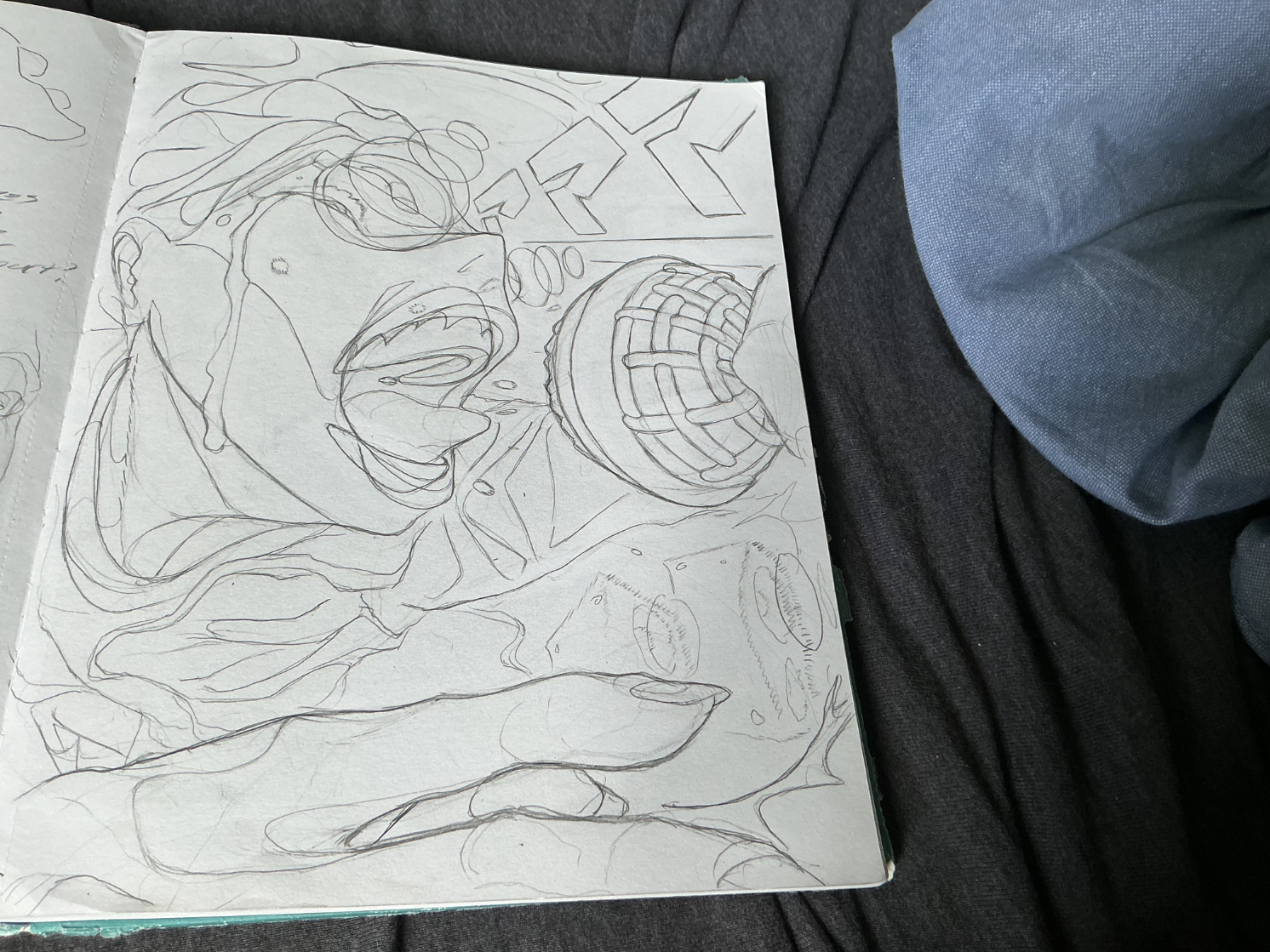
Brazil goal celebration
Messy/muddy skin colouring. Can’t seem to control it when I look to ally shadows and highlights. Also I messed up the mouth, the reference had a different expression so have to improvise.
Il y a 8 heures
Vue
Portraits
Pas encore de réponse
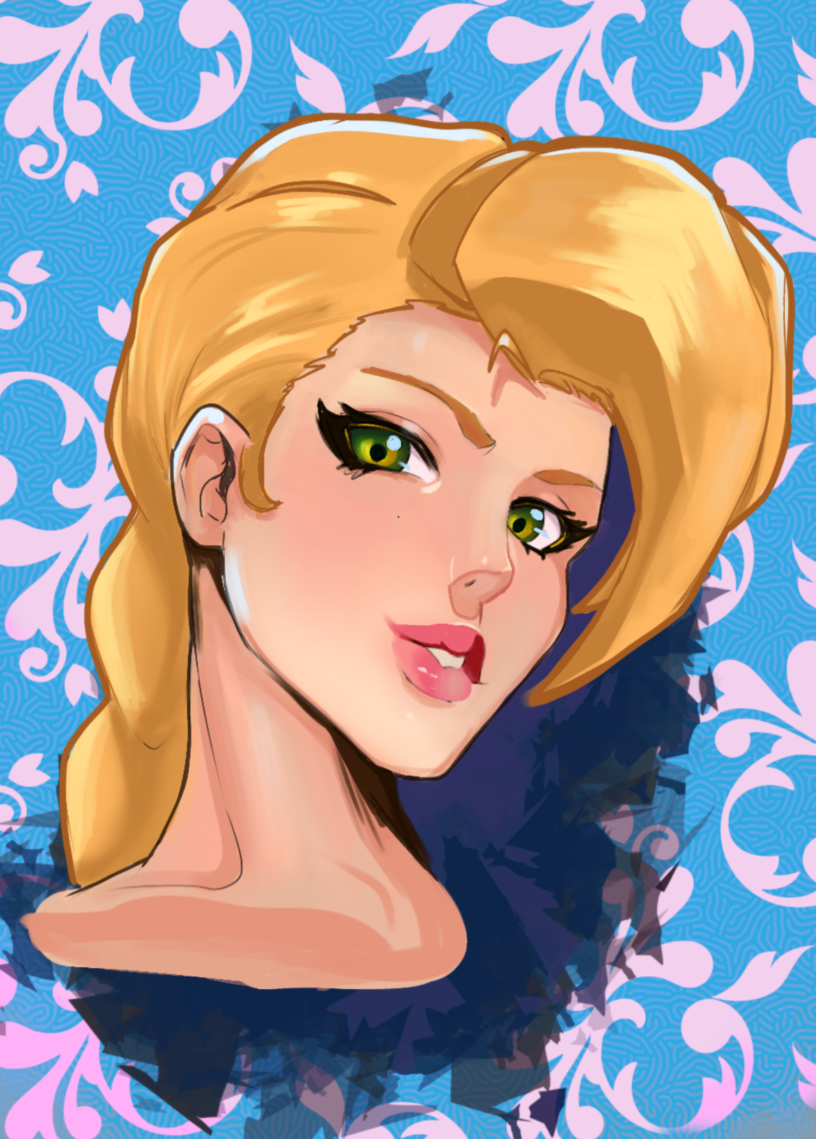
Colouring Shape Language
I’d love to know if and where I could use stronger shape language in the coloring and shading.
Il y a 8 heures
Vue
Environment
Pas encore de réponse
AAAAAAAAAAAAAAAAA
A cleaned up version of the singer guy drawing from earlier. Added the texture to the microphone. Now... I think that each metal bar is too big an exaggerated, the pros definitely could've gone smaller with the detail, and i feel like they don't wrap around the form well enough, maybe I got caught up in the detail, and maybe the eyes would be too far apart from another angle. And i drew the composition to Lead the eye to the subject, but the space doesn't feel to cluttered, does it? Please let me know!
Il y a 8 heures
Vue
Portraits
Pas encore de réponse
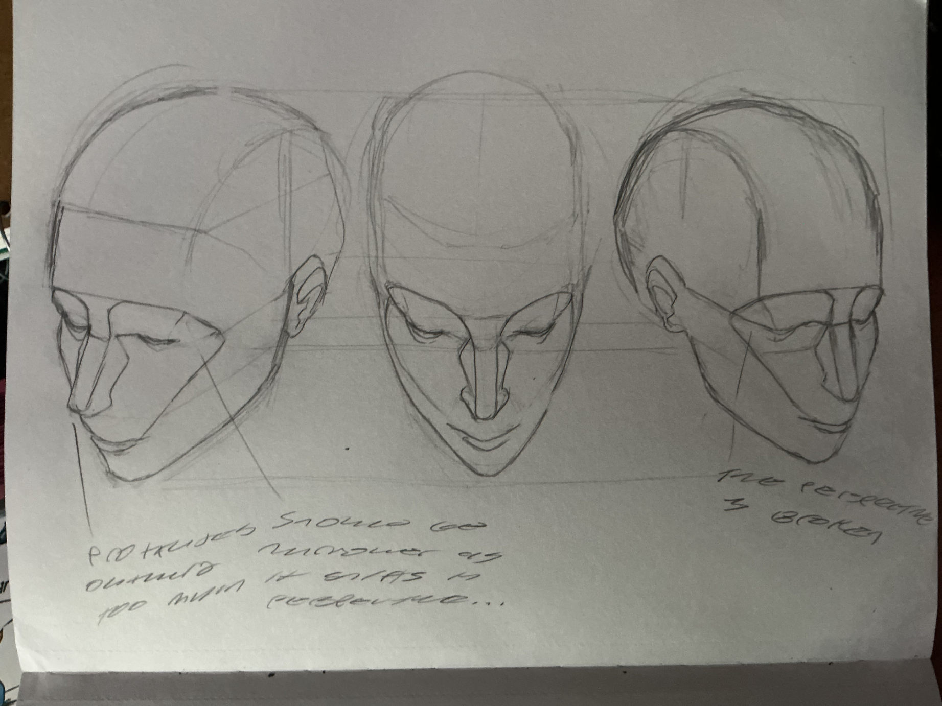
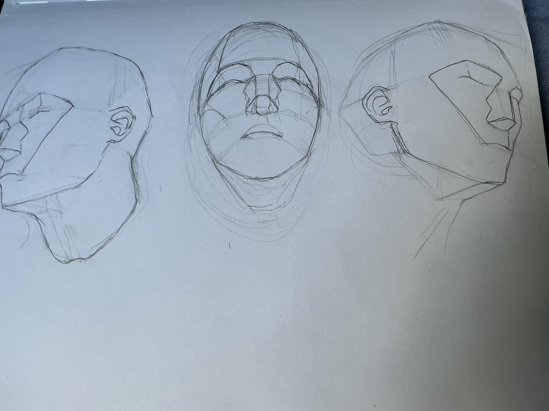
"Head Grid" Part 3!
Hey guys, i finished part 3! Realized i was kind of treating one angle like an exact copy of the other, so once I stopped doing that, I think i was on the right track. But not without mistakes! If anyone can point out inconsistencies with the structure or broken perspective, please let me know!
Il y a 8 heures
Vue
June 30 Sketchbook Pages Challenge
Pas encore de réponse
20 June submission
Working nights is hard on the creativity
Il y a 8 heures
Vue