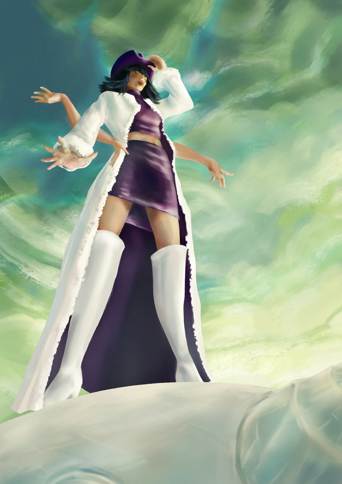
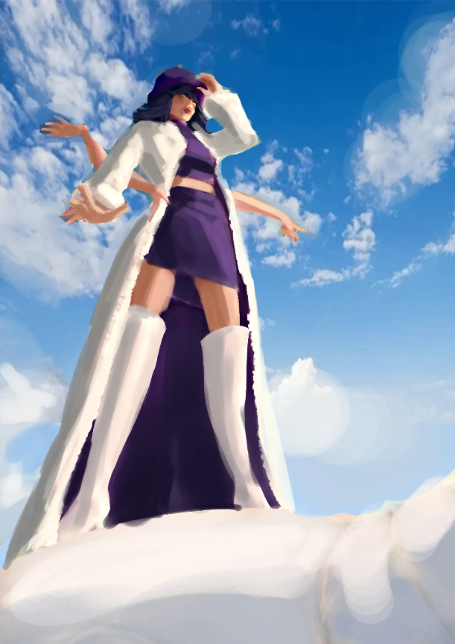
Hi hi! Dynamic perspective! I like it! You are closer to the initial idea, just need a more methodical approach. Have each step in its own layer. Avoid mixing background with figure in front when it comes to rendering. Render these elements separately for a nice,tight, cleaner look + will gain depth and volume. Along with that,it's easier to manipulate layers when they are separated. Layers can add up quickly so be sure you name them for easy organization. This is a very drastic perspective view so approaching this requires lots of referencing and help from a perspective grid. A simple, geometric mannequin can help you out on construction of the figure and self correcting in the middle of the process.Once we have solid foundation done, we move to colors. . A good render requires setting up a light source, in this case the light from the very top. Use a neutral color for the shadows (usually warm for cool light and cold for warm light), arrange the shadows on several levels, and match the character elements with the primary shadow. During the final touches, you can play around with textures on the light side of the drawing. Both must be balanced (not too dark or too saturated) over flat colors that should not be excessively bright or dark. As for the clouds: here I found an image of a similar idea. You can try that and overpaint them if you wish or use them as reference and try to be as accurate as possible. Way to go trick is to use gradient of blue for sky and have clouds on a separated layer. Hope it helps! Happy learning!
Participez à la discussion
Inscrivez-vous pour donner votre avis sur cette œuvre.