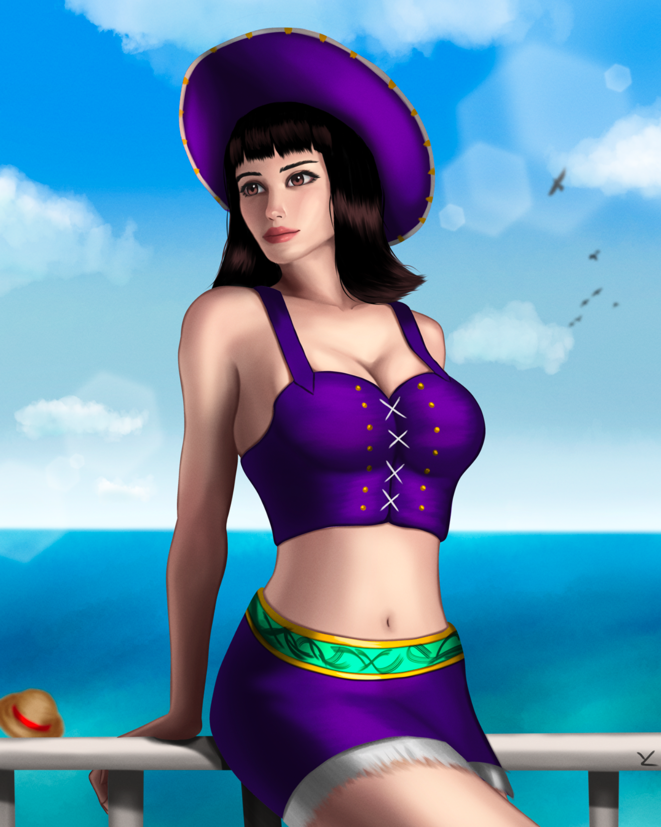
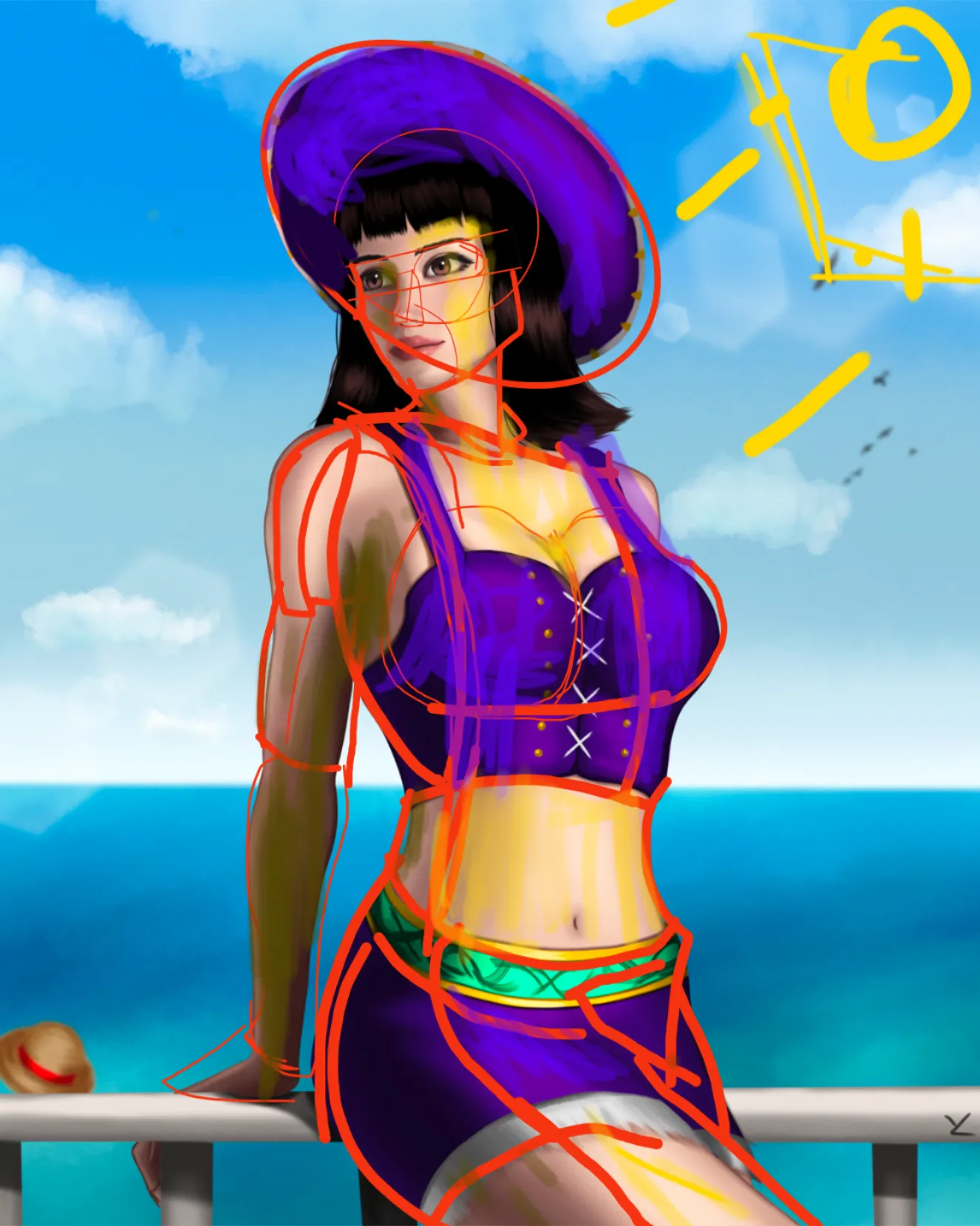
Great work, well done for the posing. For your concerns over "Depicting three dimensionality and the material " from shading, i believe that there are two things i would like to suggest, one is a tool and another is rather a suggestion that you may wish to implement and work on. For starters, the most practical tool for understanding and depicting light and shadow is Form, no surprise there :/ . What i would like to suggest is to reconsider , whether or not "Material accurate values" are truly worth it. Starting with Forms, i would like to give you a three step process for getting the values ( specifically , the light and shadow values ) correct in your artwork. The three steps are: 1. Establish the light source ( specific position and type ) . 2. Establish forms( more specific, more difficult, better result). 3. Angle comparision In the first step, we wish to first develop a idea of where exactly we want the light source to be , and be specific of what type of light it is ( 2 types, Plane source(as sun or studio light), bulb source(as a LED ) ) . Why that's important? It comes in handy in the last step for accuracy. The 2nd step, we establish our solid forms and try to be as specific as we can be about the plane changes throughout form ( Although, keeping it as simple as understandable accelerates growth). The third step, now using the angle between the light source we established , and the planes we have developed, we starts adding in the values. Don't overcomplicate around "Angles" , just think about " How much light will this plane recieve and ( important for material ) reflect " . It may be scary to start with such caution, but remember , in a artwork its all relative. Where you start doesn't matter too much, just try to develop all the other forthcoming values in correct relation to the first one. And that brings me to my initial suggestion and concern. I am observing that you have made a cery high amount of contrast in the clothing and the body of Robin , and by doing so , you have really lost the light and shadow contrast by plane changes. This have really made the artwork pretty flat ( specially compared to its potential ). And i suspects that this is done intentionally to depict the accurate "Material value" or Local value of her clothing. This is where the concept of "Compositional value" comes in. This is essentially a choice, whether you wish to be more accurate with the values ( both material and light-shadow), or you wish to use the light and shadow more true to your composition ( Composition, controlling where you wish to direct viewers eyes ) . Whether you wish to be more true to the reality, or push or pull one type of value or another for best depicting your idea . And that does not needs to be a one or another choice for a whole artwork. This is a constant choice, throughout your artwork for every part of your artwork. If you wish to be a designer, it makes more sence to be accurate. But if you are just a artist wanting to produce more intresting artworks, you may wish to explore more the concept of compositional values.
Participez à la discussion
Inscrivez-vous pour donner votre avis sur cette œuvre.