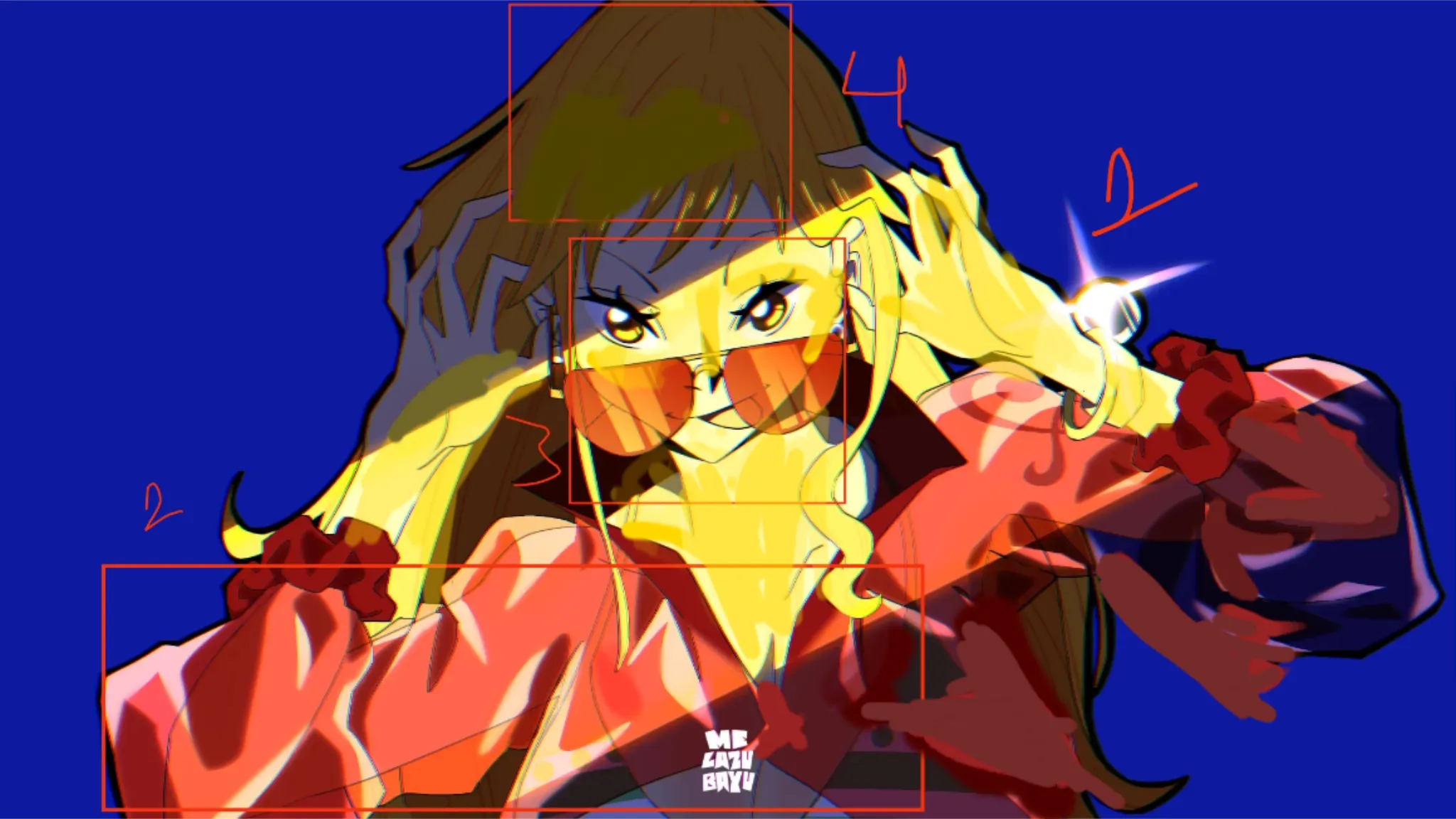
Nice idea and great execution. I really likes how you used light and shadow to create a highlight around the face. Admittingly, i would say that i myself am not the best at materials 😅, but i still have enough fundamentals to offer some help. The main trend i am observing in your artwork is that the " Relativistic lightining " is wrong for the materials. For a starter, i believe it would help if you try to think of light and shadow in terms of relativity to other objects in the scene. The main idea is that, in a given scene, things appears " Bright " or " Dim " only due to their relative value to the other objects in the scene. Now applying this concept to help in your artwork, lets first look at the " material " part you mentioned. For shading materials , we should always ve highly aware of the relativity in the ability of the material to reflect light. Science aside, just figure out which material would be the brightest when exposed to the same amount of light. And you can go as far as to label it with numbers so you remembers that as you shade. Now due to relativistic lightining principle, the lightest thing in our scene should be the glass on nami's hand band . Second should be her vinyl jacket, specially the planes of the jacket angled toward light, third, should be nami's skin itself ( she is quite fair 🥴 ). And so on. But in your artwork, you accidentally suggested that nami is fairer then vinyl jacket. So let's fix that by making her a bit dull Next is something that's not mentioned by you, but is of a greater importance for the integrity of the realisticness in your artwork. I am observing that you have highlighted parts of her hair and the jacket that are present in the dark. And as we have discussed the effect of relative values, this suggest that that part is somehow able to recieve a amount of light equal to the planes in the absolute light, which is really confusing for the audience. This really messes up the realisticness of our artwork, so let's fix that as well by just matching the value of "dark" jacket in absolue light with values of highlight in " absolute dark " . Remember this ruke for good contrast , "the darkest value in the light, ia lighter then the lightest value in the dark "
Participez à la discussion
Inscrivez-vous pour donner votre avis sur cette œuvre.