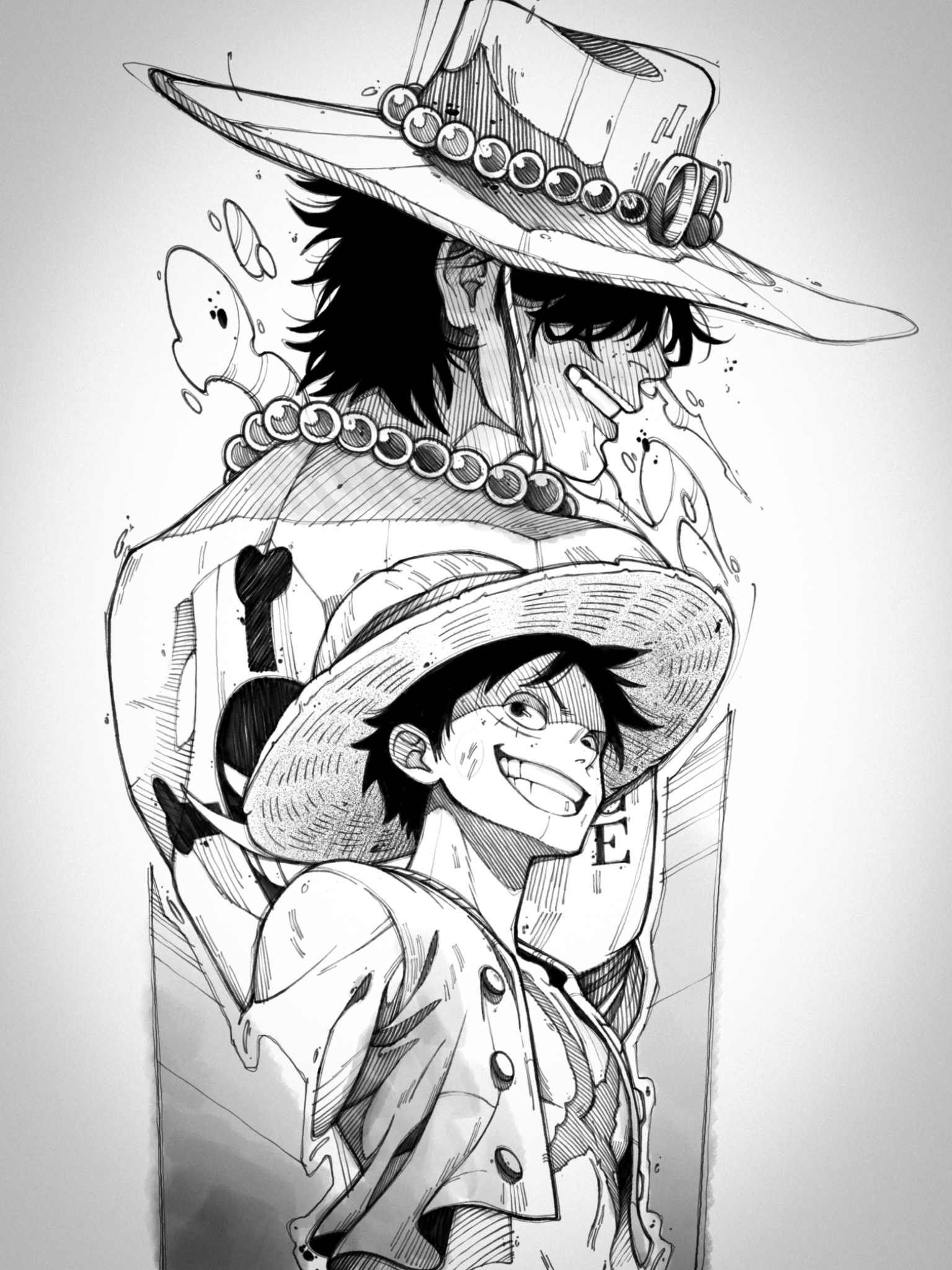
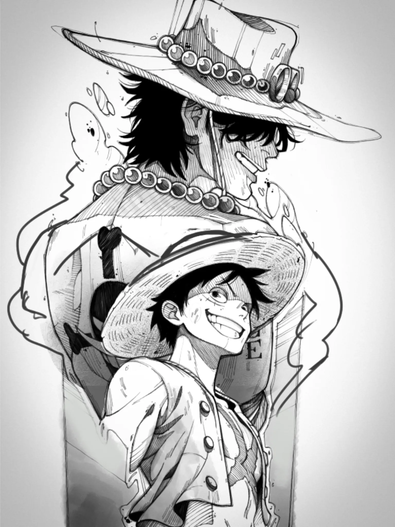
Hello hello! It appears really pleasant and nice!! Personally, I do not see many serious errors with this. It now comes down to specifics. One of them, a Luffy hat, was a little out of perspective and displayed too much. Always double-check your perspective because mistakes like these do happen. I would not make any changes to what you mentioned. Sketchy linework looks great, and I appreciate how you handle shadows and shapes. It also feels really consistent. Details and framing are things that can be pushed. How can you advance this further, you ask? For instance, we can frame both characters in a bolder shape by using the Ace flame to go from bottom to top. Look for attractive shapes in the flame, but be mindful of the amount of detail you add. Characters are already highly detailed; you can add light gray or white shapes with outlines. Think which elements can push storytelling and emotions. Also this style can work with colors so encourage you to try them out in digital edit. Hope it helps!
Participez à la discussion
Inscrivez-vous pour donner votre avis sur cette œuvre.