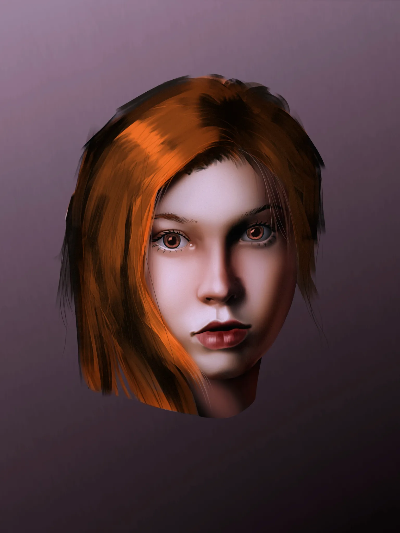
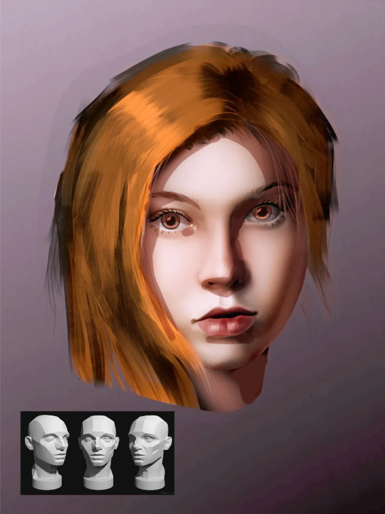
Hi Hi! Great portrait of Nami! You did a good job on capturing the face of the actress! Now, regarding the shading and colors: I started by increasing the picture's light levels and decreasing its dark levels. Overall, it was a little too dark to read the artwork. After that, I utilize colors instead of heavy black shadows. Avoid applying pure black for shadows; instead, use a neutral gray or orange tone with multiply layer for warmer shadows or a neutral gray or blue tone with the same layer type for colder shadows. Nearly all digital drawing programs have both adjustments; Photoshop was the one I used. Finding the light source would be next. It is slightly frontal positioned (leaning into 3/4). This is helpful since it makes shadow mapping easier. Always remember the planes on faces, and use the 3D Asaro head I have included in the drawing to assist yourself. In this manner, artwork will have greater volume and appear more realistic. Hope it helps! Keep up with workouts!
Participez à la discussion
Inscrivez-vous pour donner votre avis sur cette œuvre.