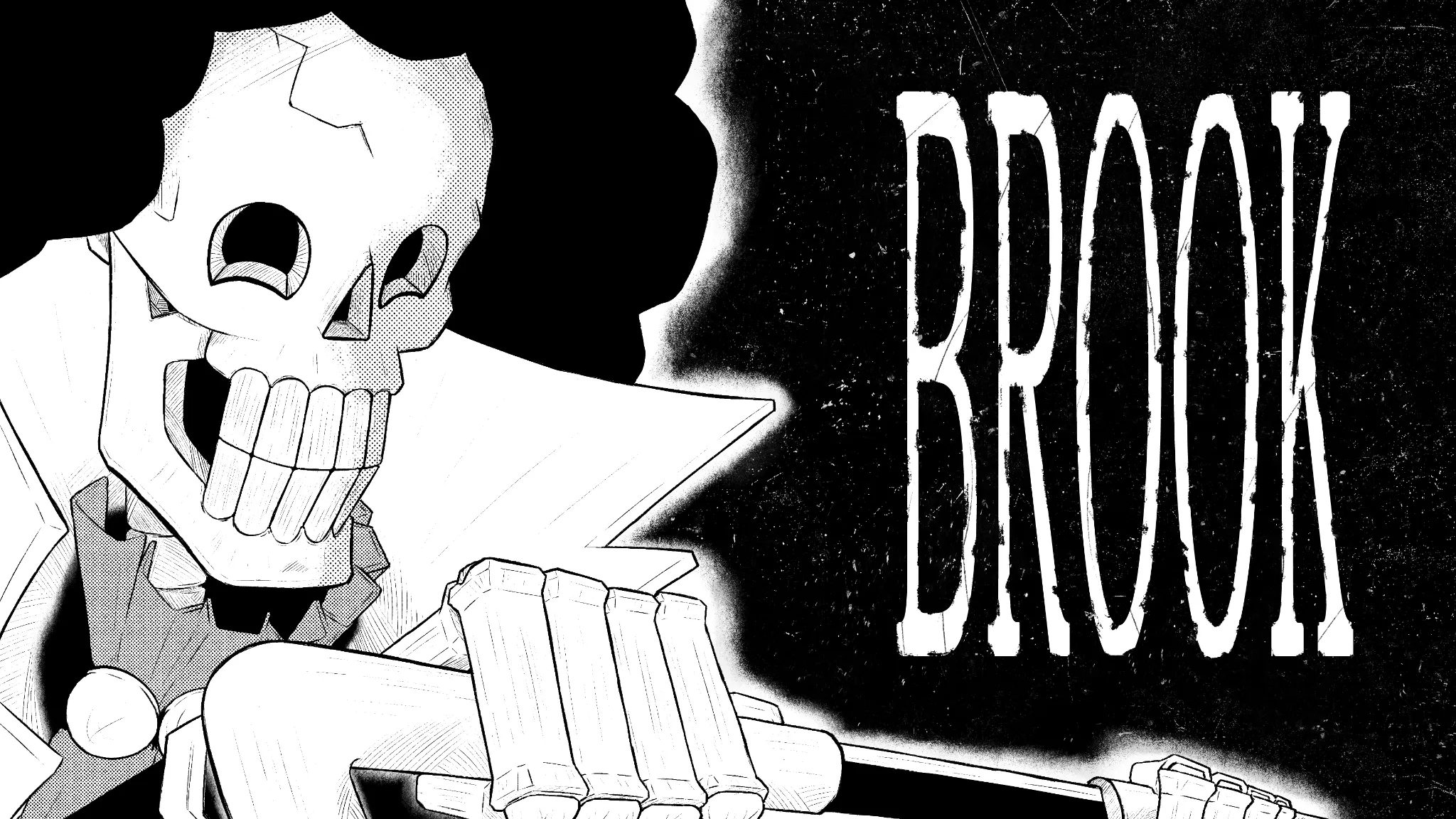
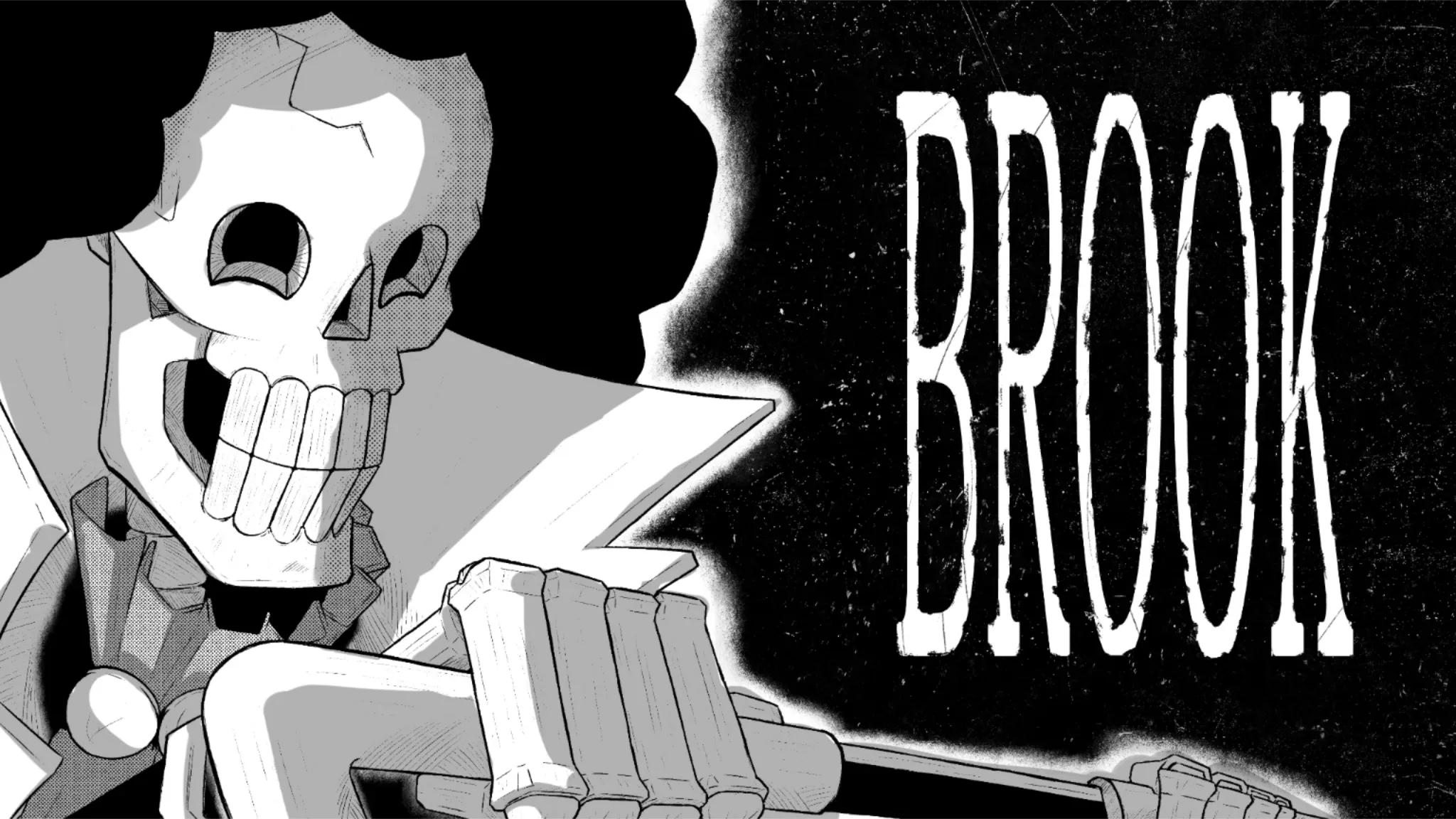
Hi Hi! I like this close up on Brook! The font you pick suits his character as well! Overall well done! You understood base inking quite well; the intricacies are what matter now. To begin with, inking necessitates a little more lineweight diversity. We imply shadows, depth, and focal points using thicker lines. You must therefore be aware of the direction of the light. In order to create gray shadows, I used some side light as an example from your drawing. Gray flats can be combined with pre-existing patterns and cross-hatching in digital media; its a common practice in digital comics. Use the big>medium>small approach to properly adjust your shadows. Large core shadows come first, followed by medium shadows for each component of the artwork (face, hair, hand, etc.), and finally small details like highlights and textures. Make sure you help yourself with manga artists you inspire for references. Study and copy their techniques to get desired inking style. Hope it helps!
Participez à la discussion
Inscrivez-vous pour donner votre avis sur cette œuvre.