Feedback speichern?
Melde dich an, um dein Feedback an einem Ort zu haben. Ihr Feedback ist privat statt öffentlich.
Anstriche
Paintover Notes
Wähle einen Lack
Wähle einen Avatar, um seine Notizen zu sehen und zu besprechen.
Ebenfalls Schwierigkeiten beiDeine Kunst?
Verbessere deine Fähigkeiten, Lesezeit: 3 Minuten
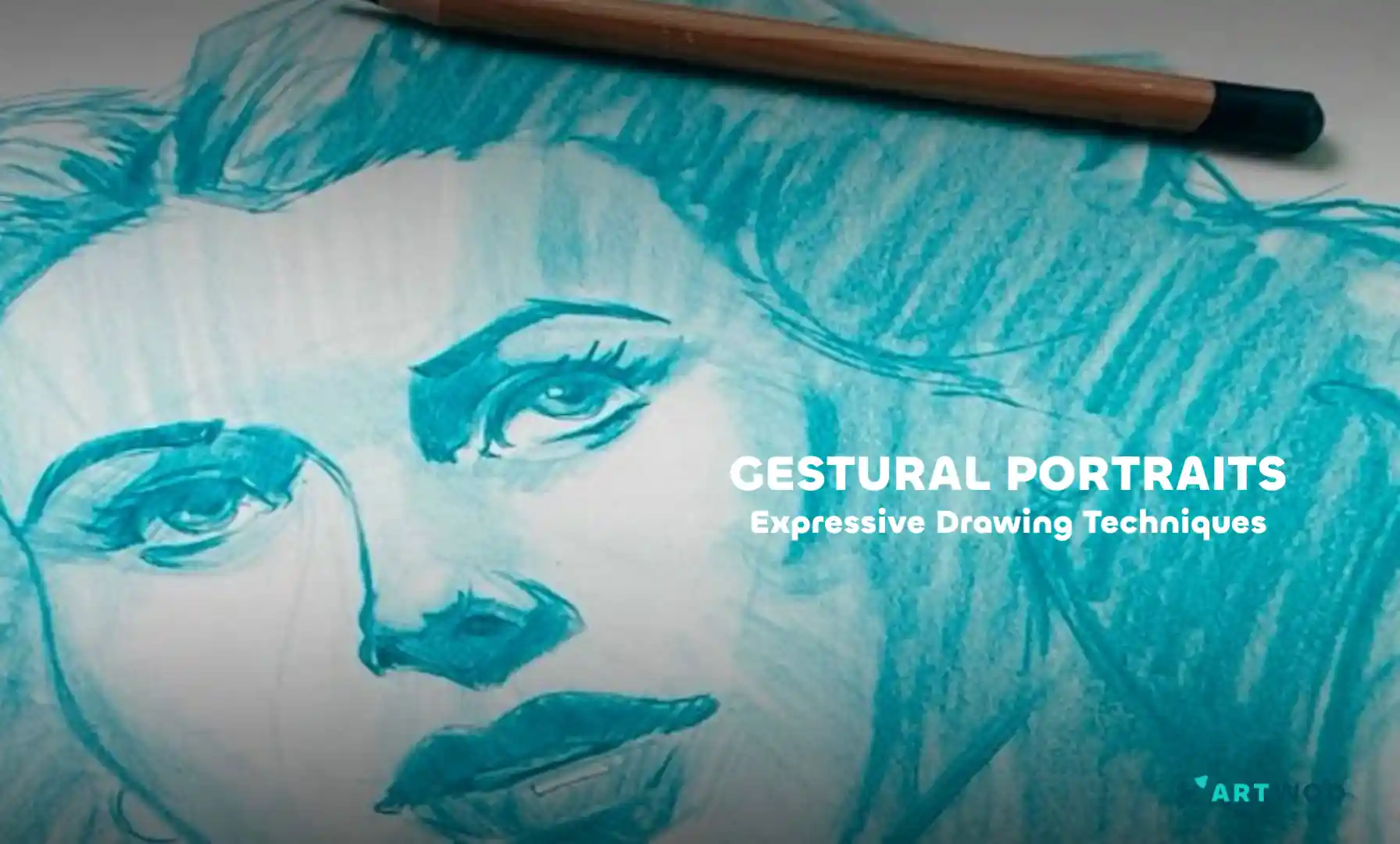
Gestural Portraits: Capturing Expression and Movement in Quick Sketches
Build expressive portraits using the Loomis head method, Reilly rhythms, and shadow mapping to establish structure, flow, and clear lighting before adding final details.
Portraits
Möchtest du jemandem helfen, der noch immer wartet?
June 30 Sketchbook Pages Challenge
Noch keine Antwort
Day 27
Concept art
vor {count}} Minuten
Ansehen
June 30 Sketchbook Pages Challenge
Noch keine Antwort
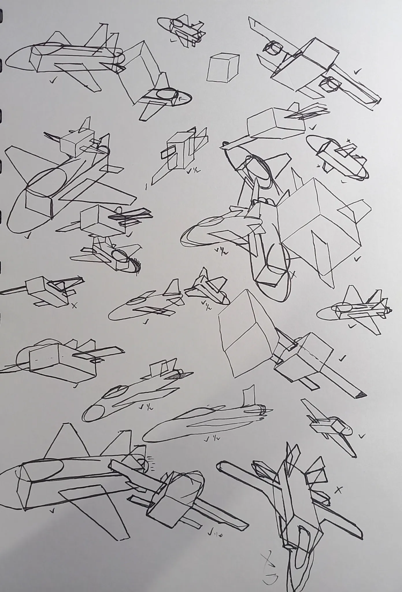
June Sketch Day 27
I decided to explore more into jet shape, from simple shapes. I still don't understand some of the perspective from below. When i draw from below, it feels like the wing sorta want to flap wings like bird. But drawing from side and top, i already comfortable. Well at least i don't get confused unlike when i draw from below. Any advices and feedback are really appreciated!
vor 1 Stunde
Ansehen
June 30 Sketchbook Pages Challenge
Noch keine Antwort
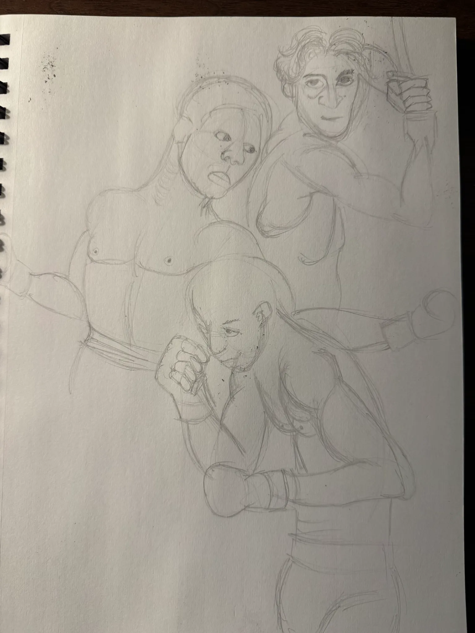
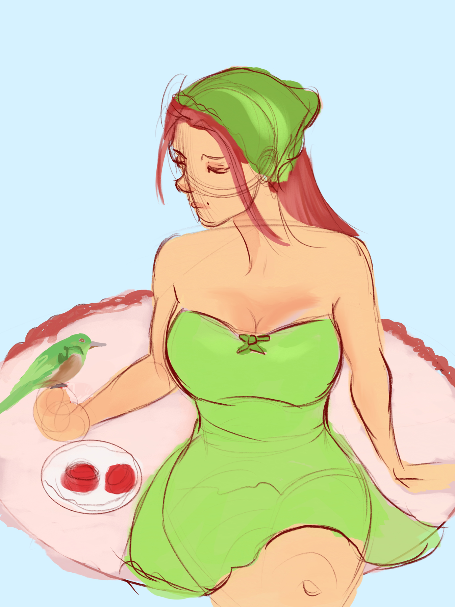
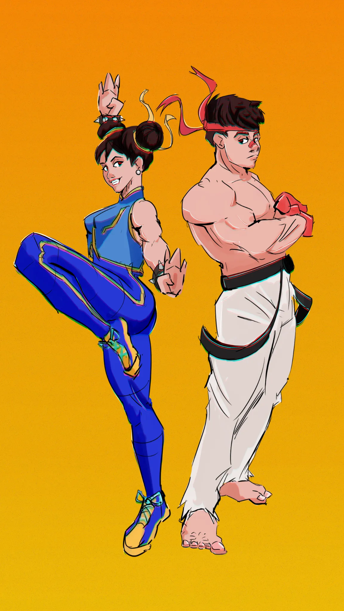
Green & Red
I can't seem to get past this stage with any of my drawings. I am not sure what's wrong with the perspective as well as the anatomy, among other things that I can't put my finger on.
vor 4 Stunden
Ansehen
June 30 Sketchbook Pages Challenge
Noch keine Antwort
Day 14
another day
vor 5 Stunden
Ansehen
Challenge of the Month
Noch keine Antwort
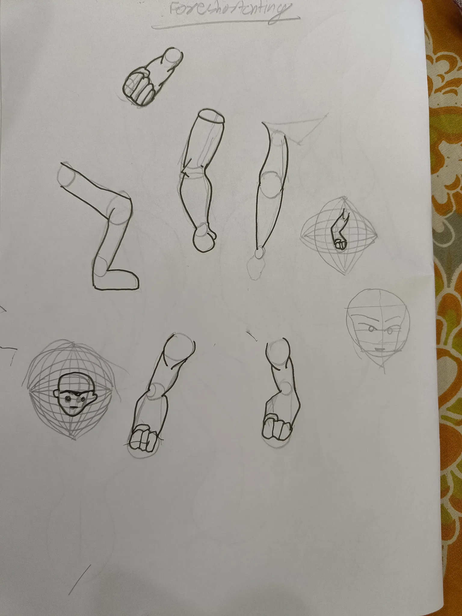
Foreshortening demo
I am suffering from foreshortening. Can you tell me how can I improve it. Also can you recommend some videos.
vor 10 Stunden
Ansehen
June 30 Sketchbook Pages Challenge
Noch keine Antwort
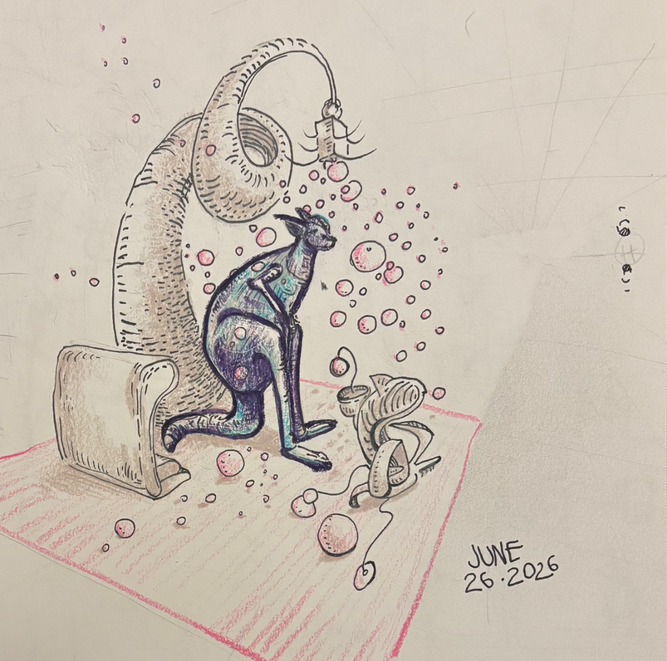
6/26/26
Day 26
vor 10 Stunden
Ansehen
Perspective and Form
Noch keine Antwort
27-06-26
Struggling with construction, perspective and foreshortening. The characters feel kinda flat and I want them to look more 3D. Any tips on improving the overall forms and depth?
vor 11 Stunden
Ansehen
Perspective and Form
Noch keine Antwort
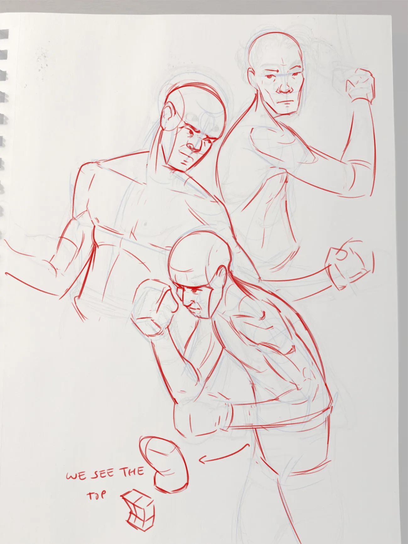
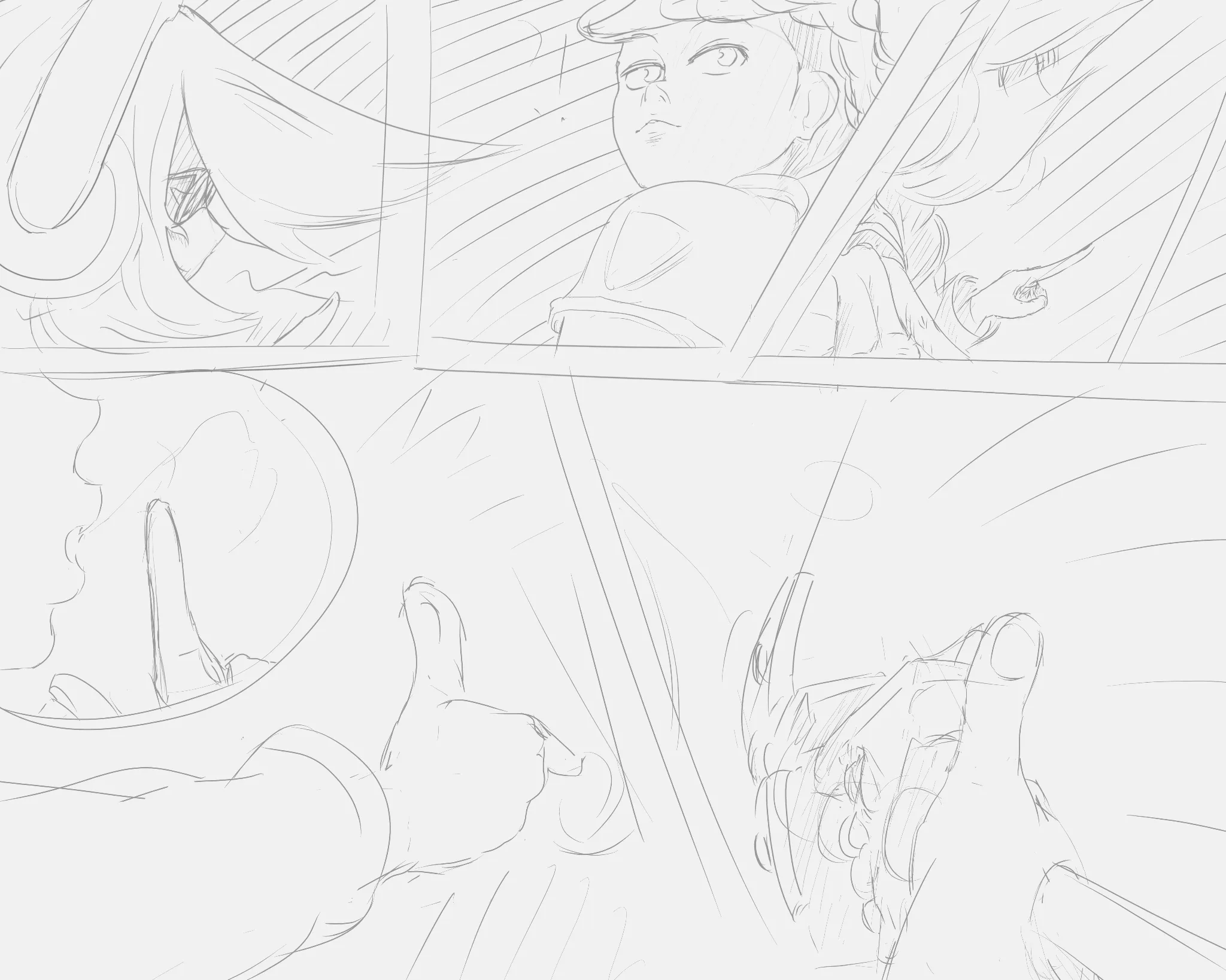
Manga panel practice
I was practicing one page comic/manga. I am trying to practice telling small stories - small event in order to slowly build up to multipage ones. the top 3 panels went well I feel like? the third panel top i like the most because I could apply the small - medium - big well from Arne's intermediate road which I have been enjoying. The bottom 2 were meant to be quick action-reaction - weapon draw to weapon/hand disabled. This evolved into what was meant to be a ricochet which I don't think really is readable. I learned a lot about perspective here. I would be grateful for any feedback - probably not understandable in terms of what was happening in bottom 2 panels I reckon?
vor 12 Stunden
Ansehen
June 30 Sketchbook Pages Challenge
Noch keine Antwort
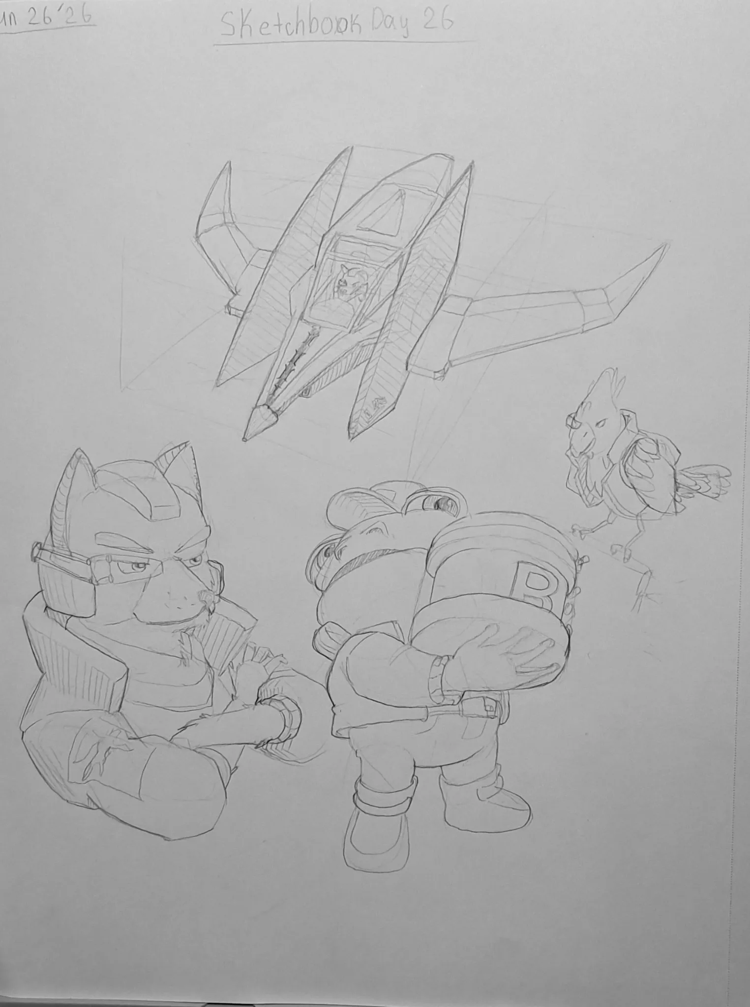
June 30 Sketchbook Pages Challenge Day 26
Just played the new Star Fox, and I had to do some fanart, because I was excited. The ship was a good challenge perspective wise, and I don't really draw animals that much so that was also interesting.
vor 12 Stunden
Ansehen