Feedback speichern?
Melde dich an, um dein Feedback an einem Ort zu haben. Ihr Feedback ist privat statt öffentlich.
Anstriche
Paintover Notes
Wähle einen Lack
Wähle einen Avatar, um seine Notizen zu sehen und zu besprechen.
Ebenfalls Schwierigkeiten beiUmgebungen?
Verbessere deine Komposition und Tiefe, Lesezeit: 3 Minuten
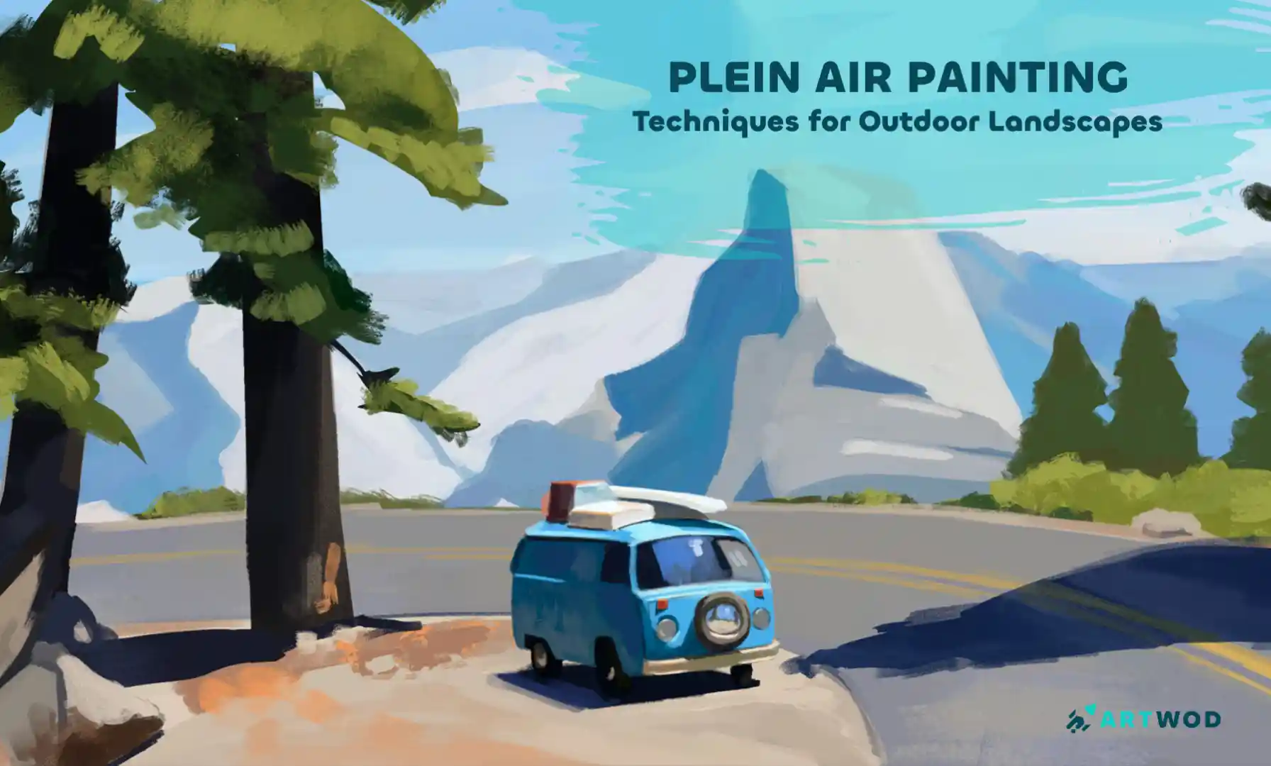
Plein Air Painting: Outdoor Techniques for Landscapes and Nature Scenes
Master plein air painting by analyzing compositions, sketching real environments, building value structures, and layering color to create immersive landscapes.
Environment
Möchtest du jemandem helfen, der noch immer wartet?
Rendering
Noch keine Antwort
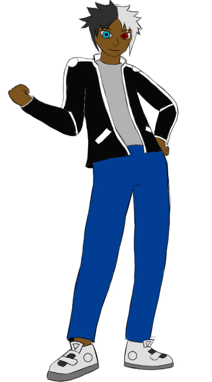
Character rendering and lighting
Hi, I am struggling to figure out how to shade my character and his clothes especially with the color black that I used for the jacket. I haven't really decided on a light source, but ideally it's coming from the left side of him. Considering the materials as well I wanted it to be a cloth like material for the jacket and regular jeans. I would appreciate any help and input on this thanks.
vor {count}} Minuten
Ansehen
Rendering
Noch keine Antwort
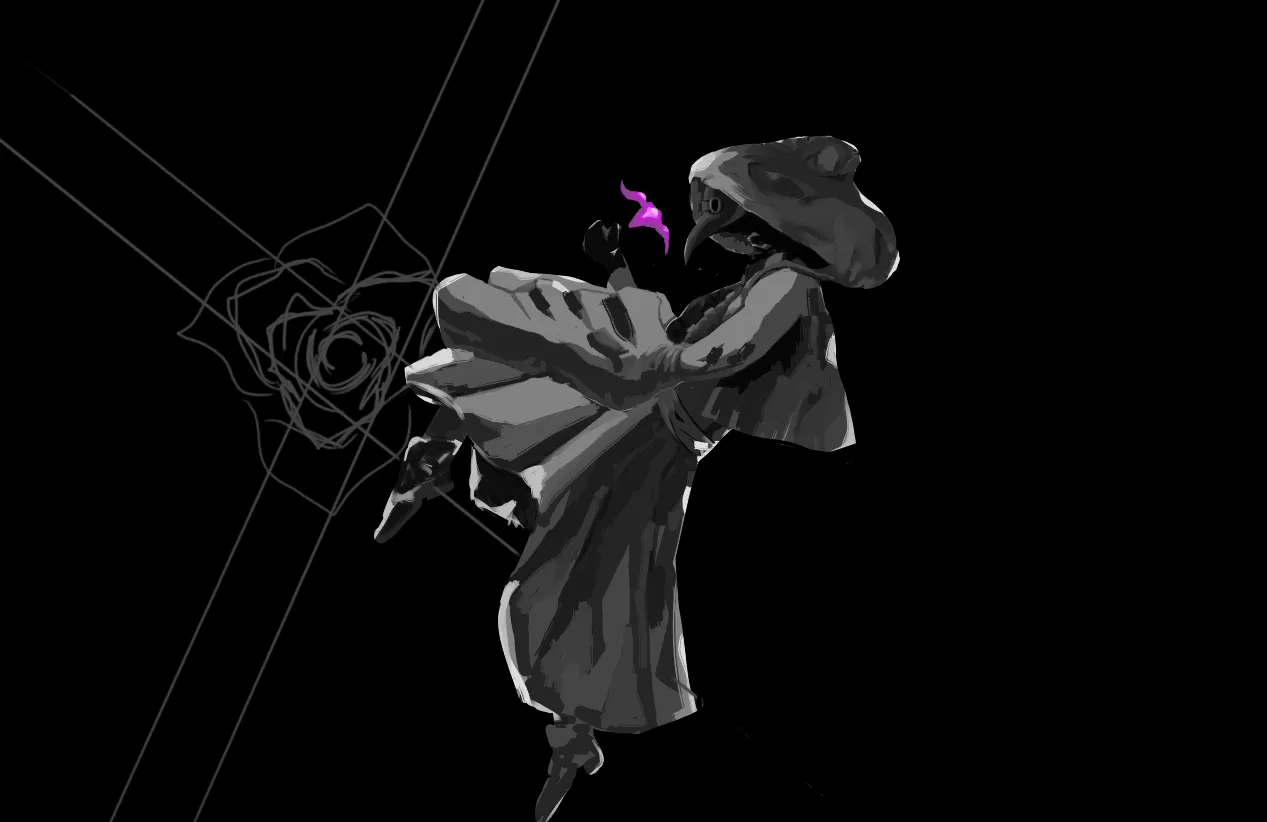
plague
i need help figuring out whats the next step, i want to render the clothes to look more refined and painted but i simply dont know how to go about it so im hoping for some advice
vor {count}} Minuten
Ansehen
Environment
Noch keine Antwort
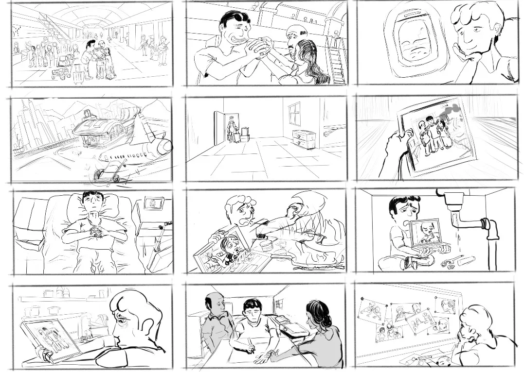
Storyboard
I've tried to convey a pretty complex story with this storyboard. I was wondering if the story is readable enough to understand the plot where a boy who has left home has found a new way to cope with the absence of his family.
vor {count}} Minuten
Ansehen
Rendering
Noch keine Antwort
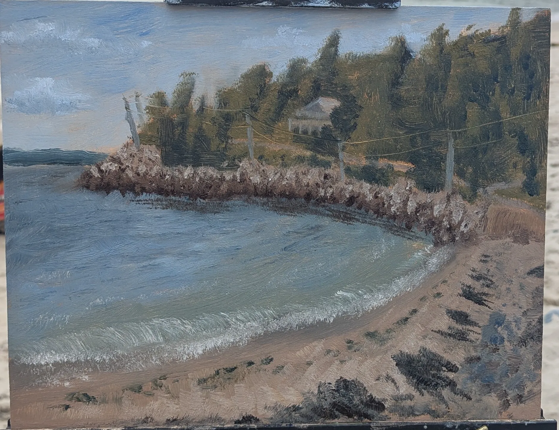
Plein Air Oil Painting
It feels more impressionist than I was intentionally going for. How do I get more real feeling textures in the water and the sand and the trees etc?
vor {count}} Minuten
Ansehen
Rendering
Noch keine Antwort
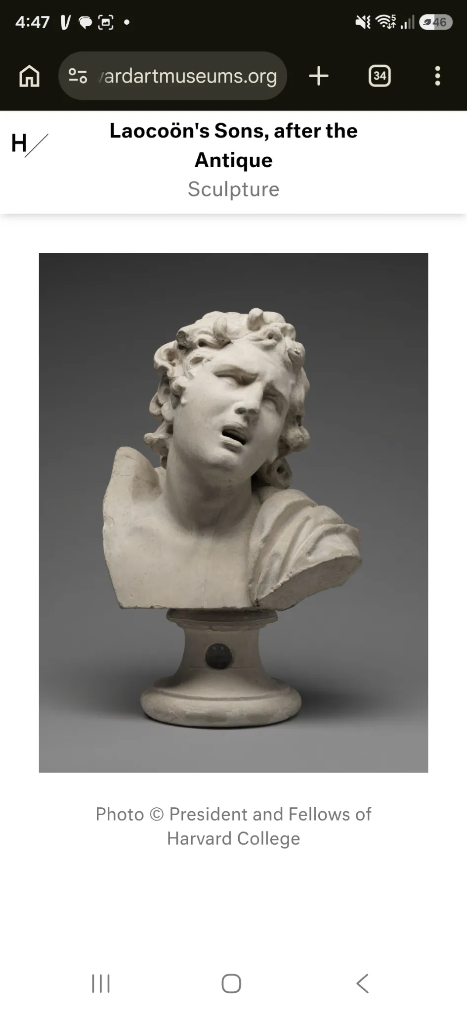
First statue drawing
The ref
vor 1 Stunde
Ansehen
Rendering
Noch keine Antwort
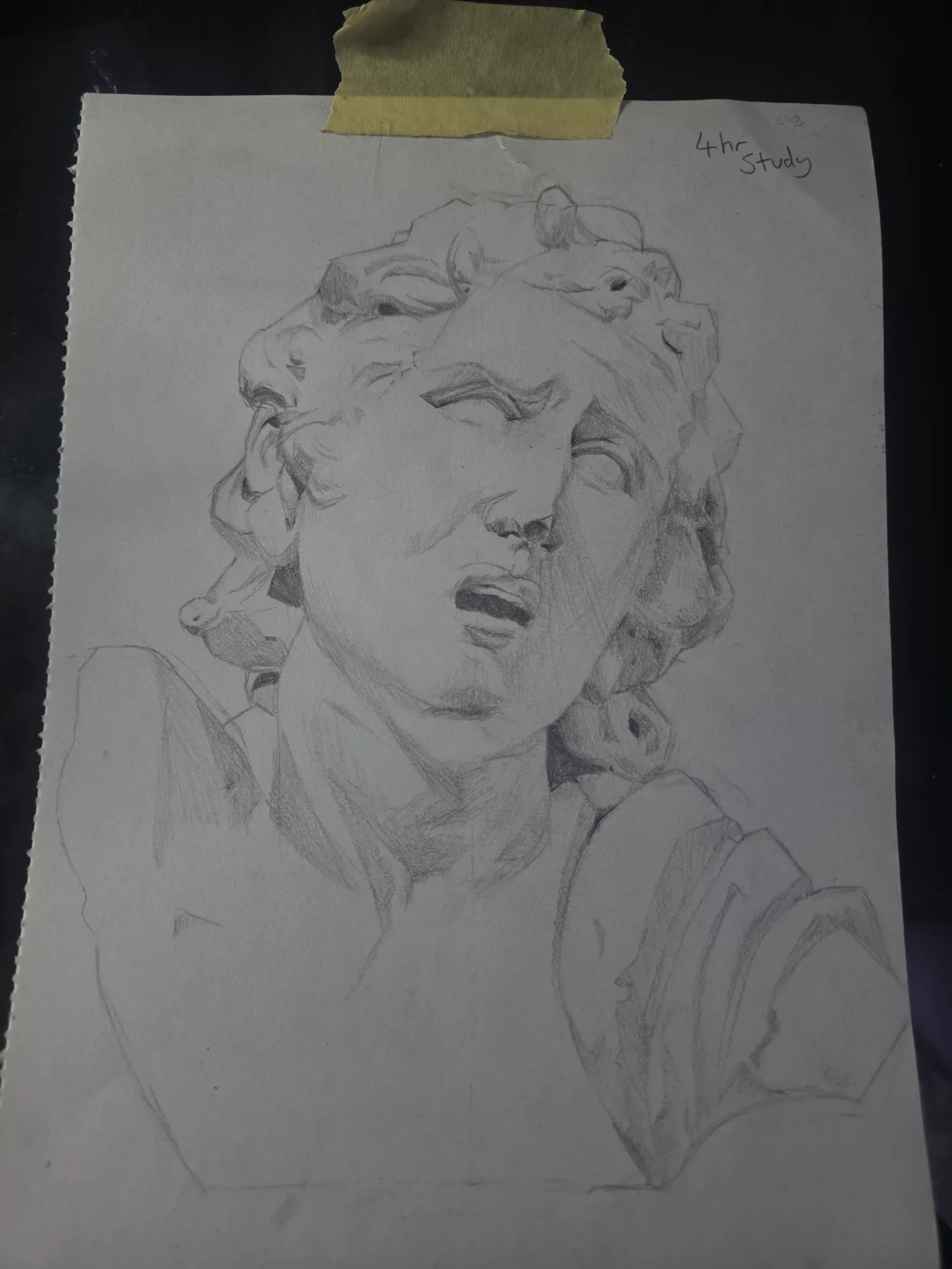
First statue drawing
First time drawing from a statue reference. Got scared of values
vor 1 Stunde
Ansehen
August Smaugust Challenge
Noch keine Antwort
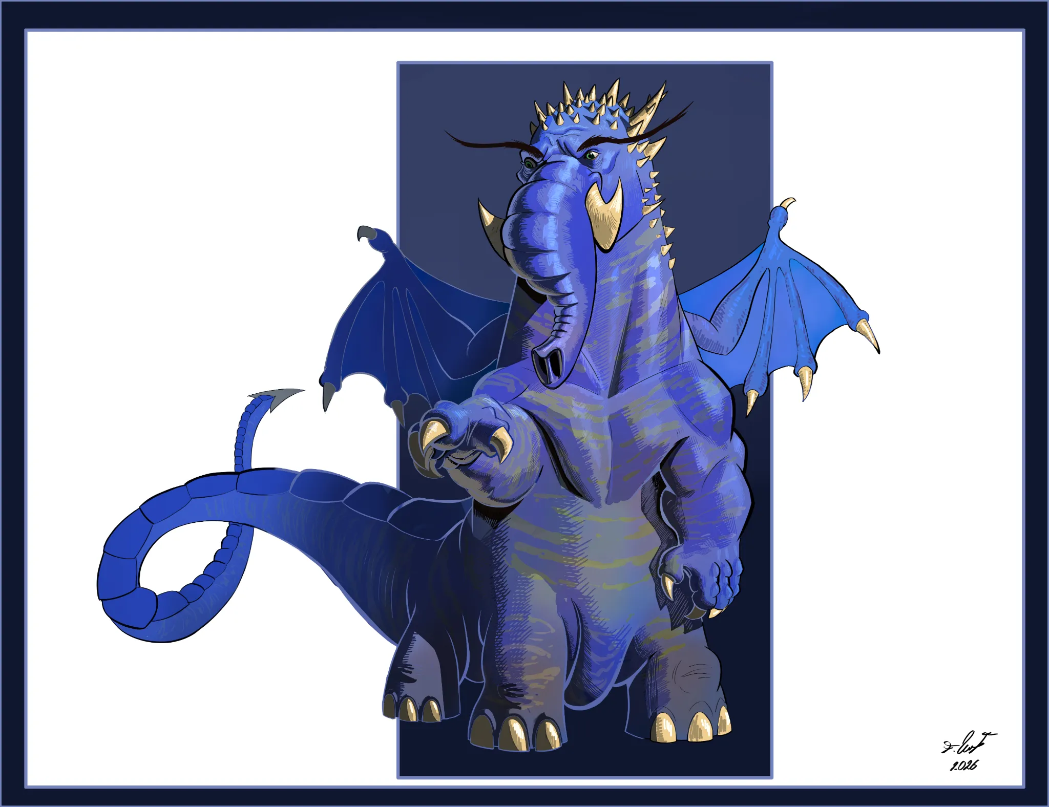
Elephantgust
...
vor 2 Stunden
Ansehen
Anatomy
Noch keine Antwort
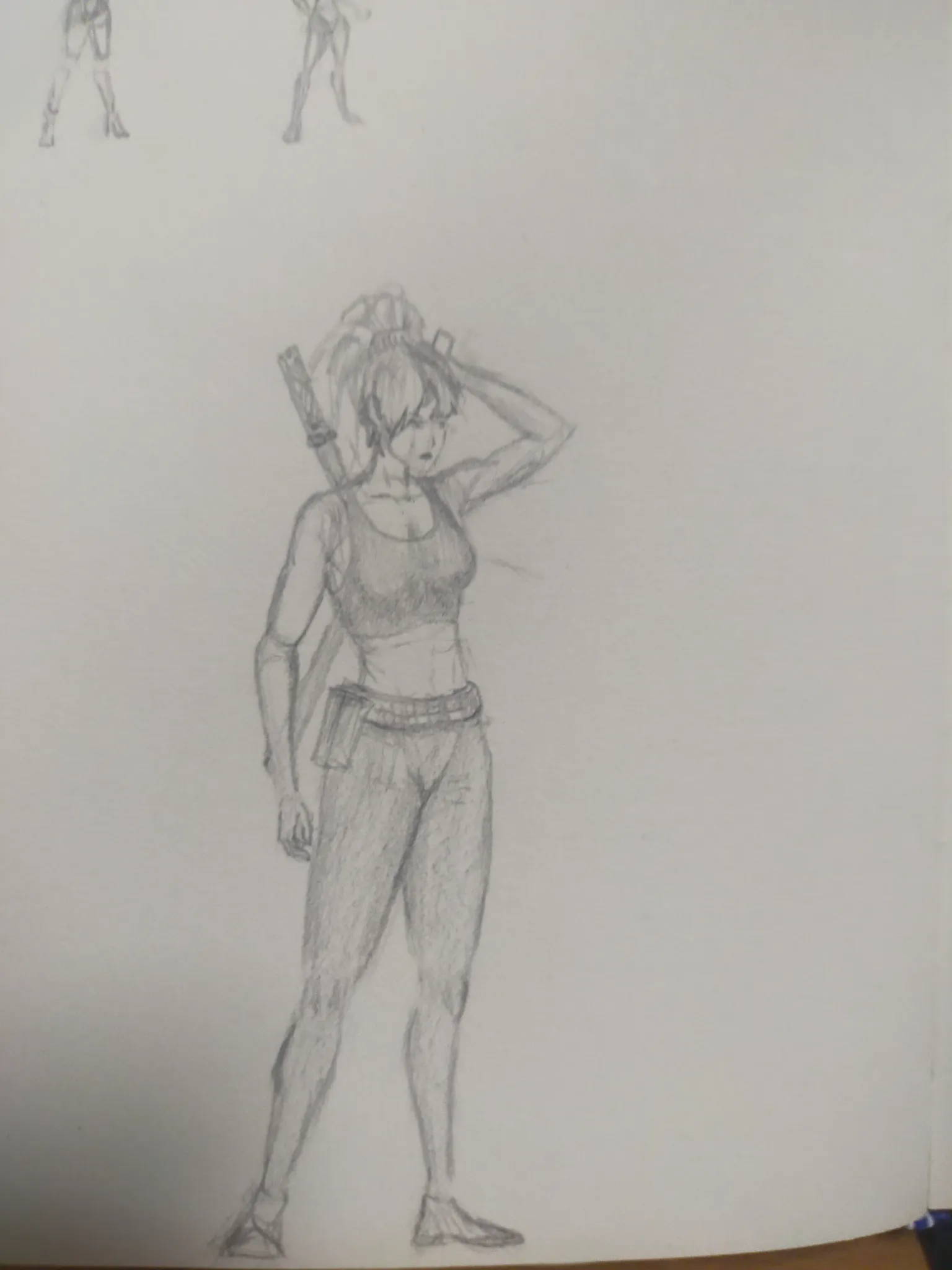
Character design
Need some advice on the anatomy, is the perspective of the leg and overall proportion
vor 2 Stunden
Ansehen
Boost Me
Noch keine Antwort
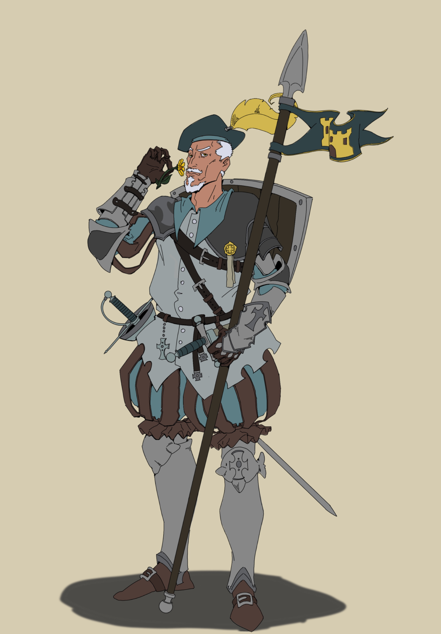
Don Quixote
Here is with the feedback i was given. I tried making the feather more interesting and resting the spear against him. I also tried the armor a more 3D look. I kept the attitude because this iteration is supposed to be smug . I tried fixing the prespective problems too, I hope it reads better and i will keep at it. Thanks everyone,
vor 2 Stunden
Ansehen