Feedback speichern?
Melde dich an, um dein Feedback an einem Ort zu haben. Ihr Feedback ist privat statt öffentlich.
Anstriche
Paintover Notes
Wähle einen Lack
Wähle einen Avatar, um seine Notizen zu sehen und zu besprechen.
Ebenfalls Schwierigkeiten beiDeine Kunst?
Verbessere deine Fähigkeiten, Lesezeit: 3 Minuten
Stylised Body Shapes: Simplify and Exaggerate Figures for Animation and Illustration
Break down stylized characters into basic shapes, experiment with silhouettes, and layer anatomy to create expressive, believable designs with personality.
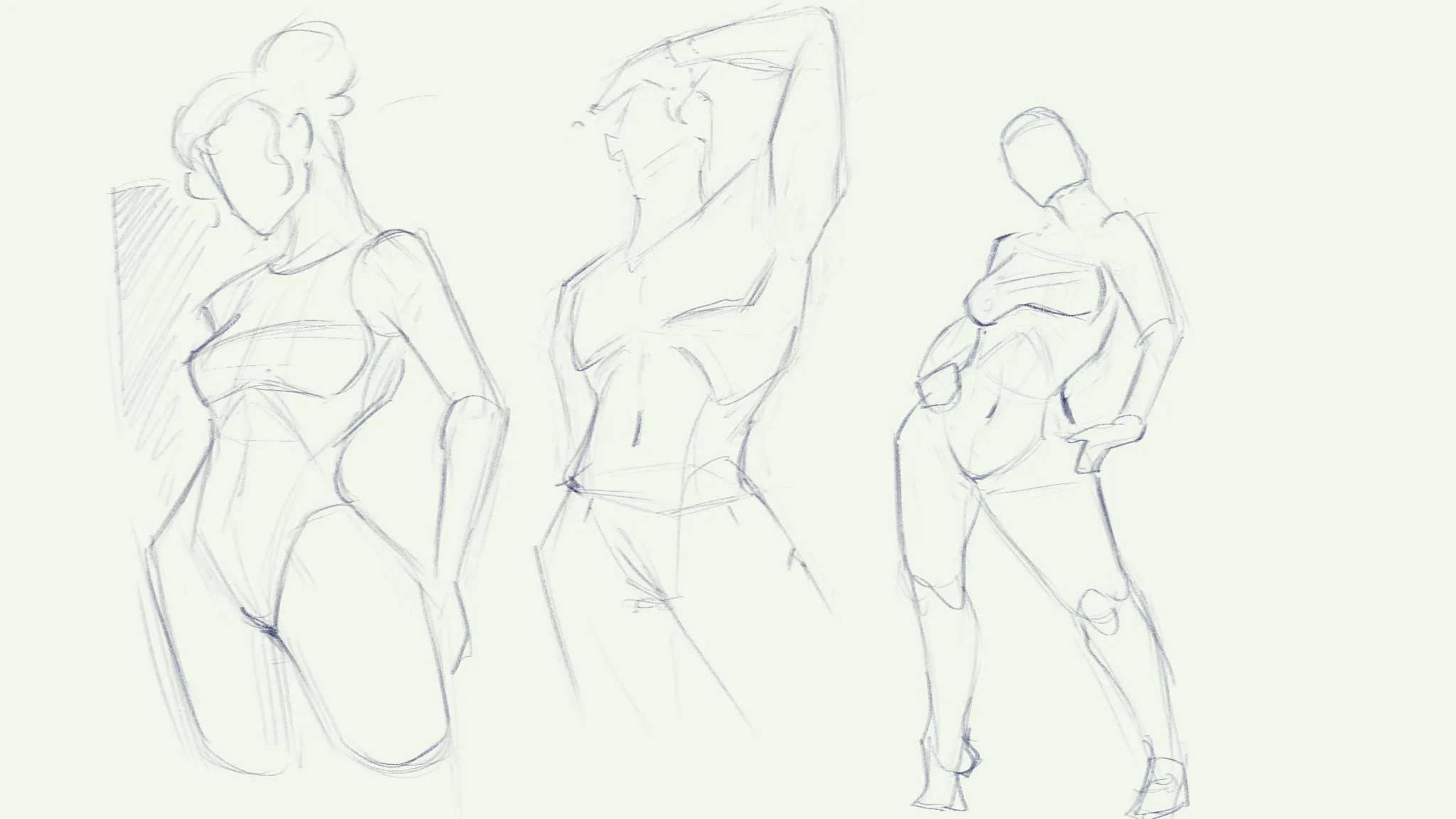
Figure
Möchtest du jemandem helfen, der noch immer wartet?
June 30 Sketchbook Pages Challenge
Noch keine Antwort
Sketch
Drawing flowy stuff and render it to feel 3D
vor {count}} Minuten
Ansehen
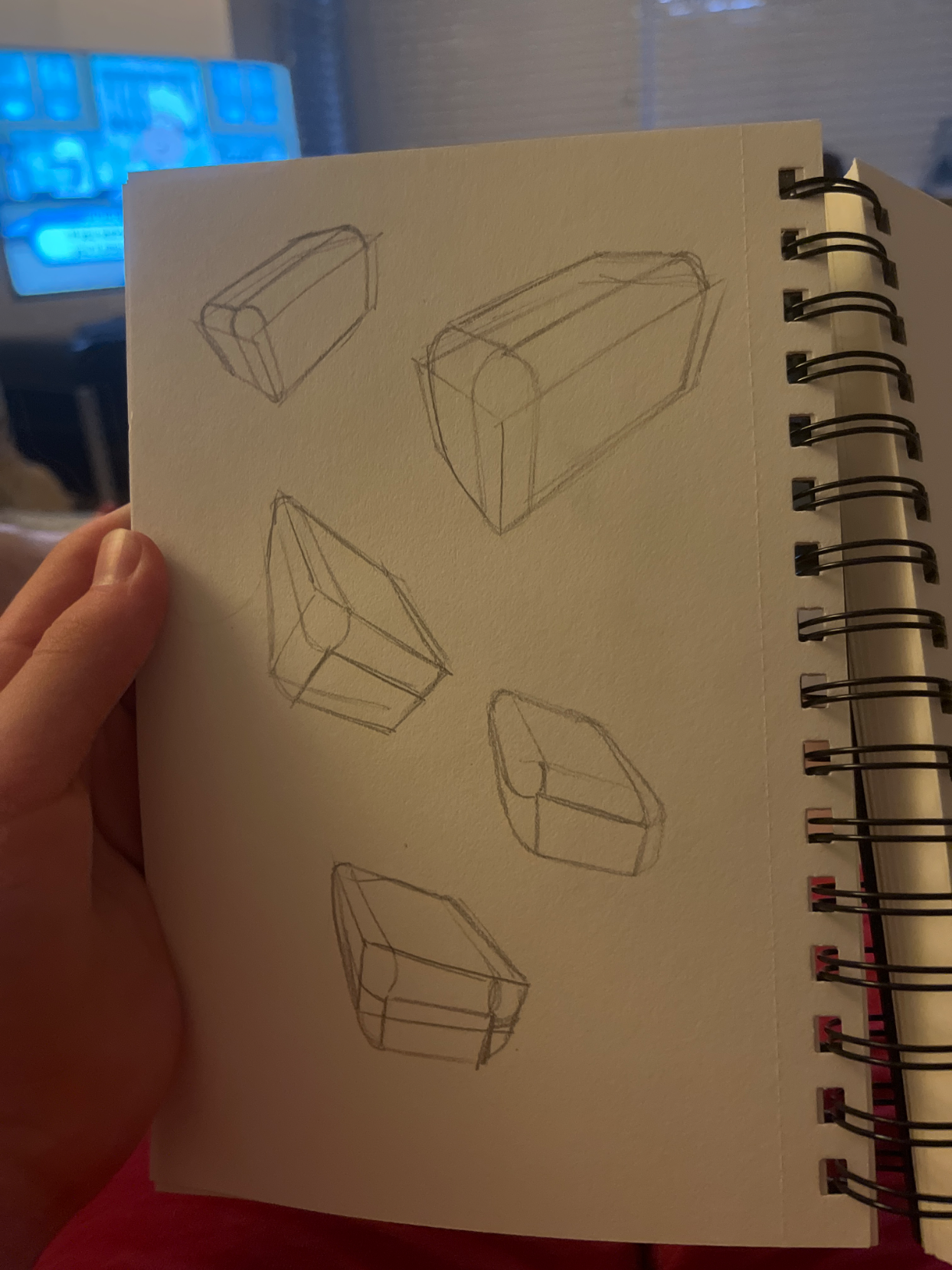
Perspective and Form
Noch keine Antwort
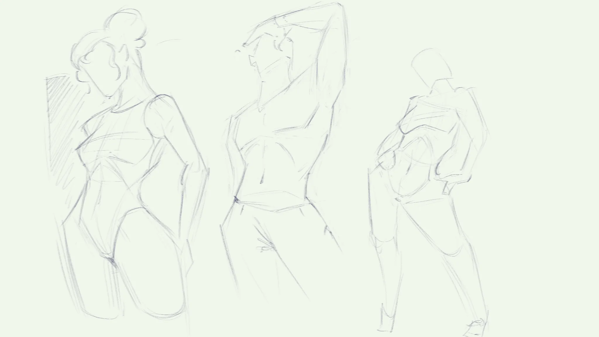
Multiple rounding
I’d say the top 2 are good but I didn’t do the best on the bottom 3 oof
vor 4 Stunden
Ansehen
June 30 Sketchbook Pages Challenge
Noch keine Antwort
25th submission
Went back and fixed it a bit
vor 4 Stunden
Ansehen
Environment
Noch keine Antwort
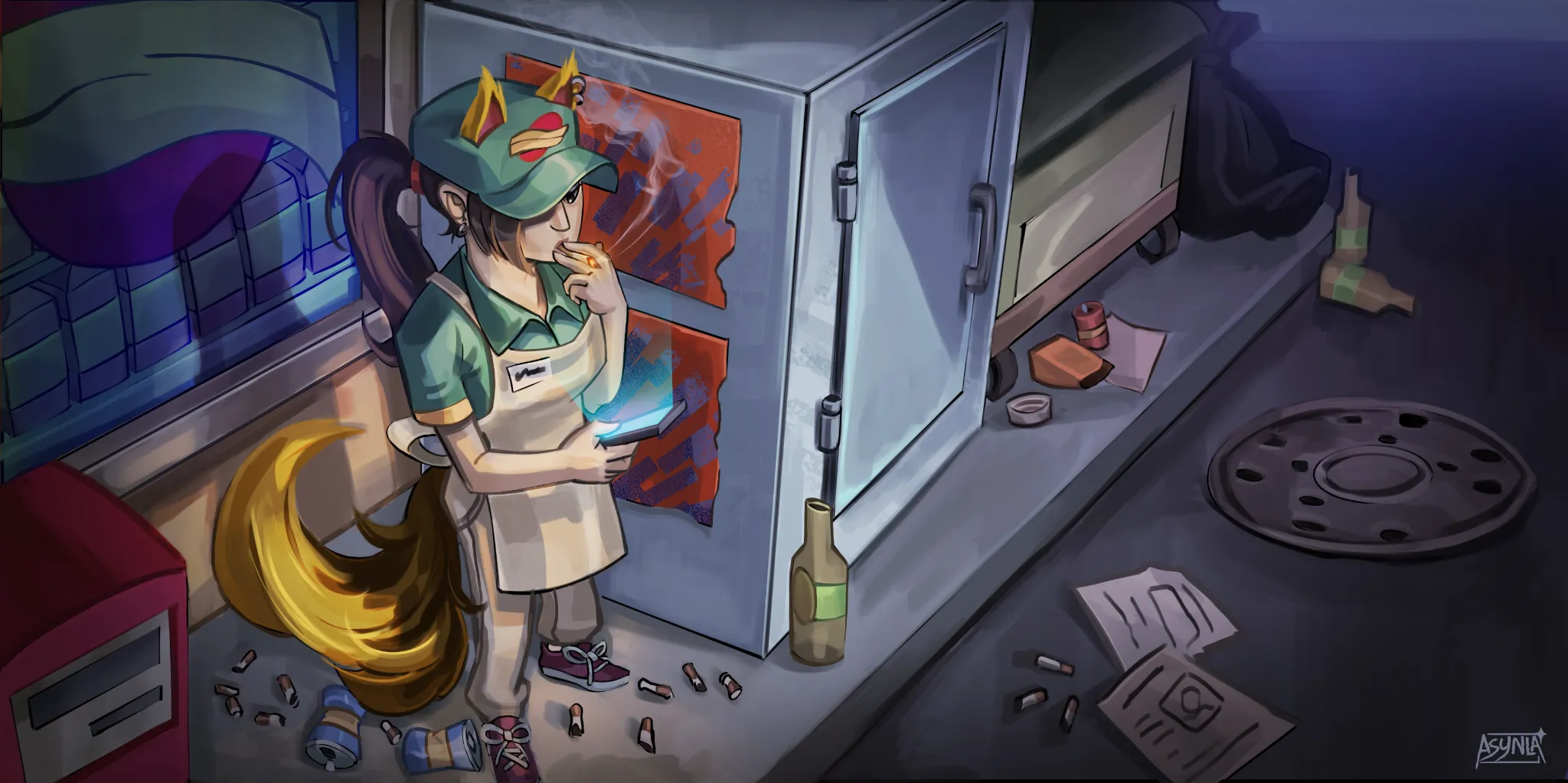
Retail worker
I'm having artblock and rendering takes too much time. I know I make some mistakes during the process but I can't put my finger on it
vor 4 Stunden
Ansehen
Portraits
Noch keine Antwort
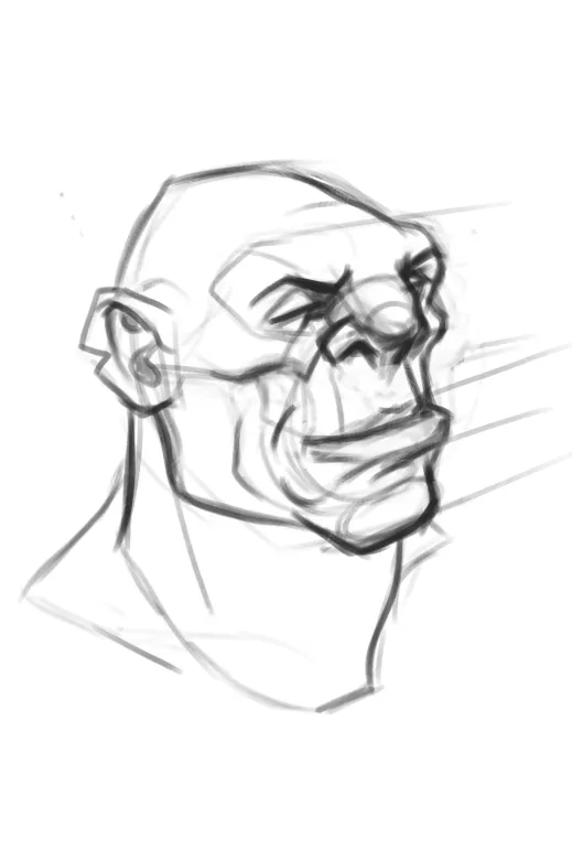
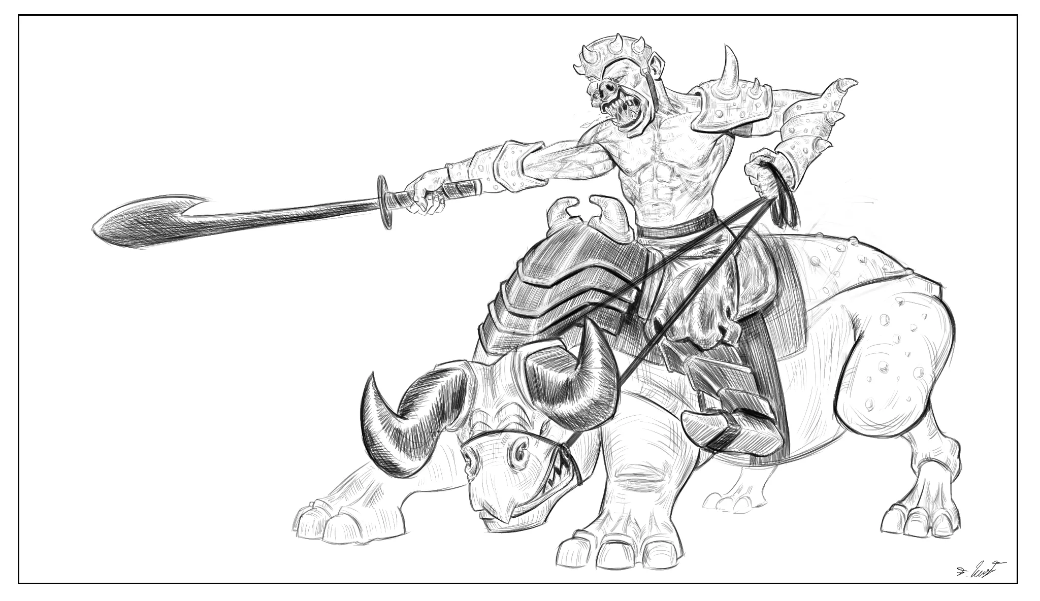
Ogre / orc design
Hi guys, I would love some feedback regarding a fantasy portrait sketch. I am struggling a bit with the whole big medium small design, and I can't never seem to design something intrigueing. Also any feedback on the line weight/quality would be appreciated, I am very weak there as well. Thank you very much guys :)
vor 4 Stunden
Ansehen
June 30 Sketchbook Pages Challenge
Noch keine Antwort
25th submission
Ran out of time
vor 5 Stunden
Ansehen
June 30 Sketchbook Pages Challenge
Noch keine Antwort
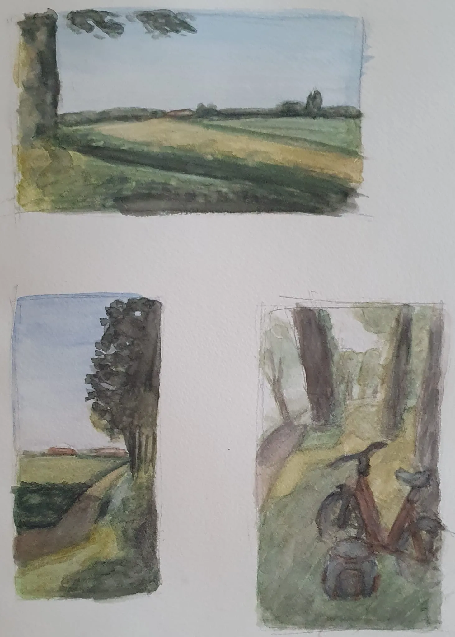
Bike trip color sketches
Hi, I took some pictures on the way and decided to make color sketch of it. It's with watercolor and a bit white gouache. I,ve struggle most with foreground details. Don't know how to better grass and other stuff with paint.
vor 6 Stunden
Ansehen
June 30 Sketchbook Pages Challenge
Noch keine Antwort
24
Hi everyone, I decided to stop at this stage because I feel like I've reached the limit of my current skills, and I don't want to keep polishing the wrong things. There are a few areas I'm struggling with, and I'd really appreciate any feedback. The biggest issue I see is the creature's anatomy. It was mainly inspired by a rhinoceros and a bison, but I feel like the head and the body don't connect naturally. They almost feel like they belong to two different animals, and I can't figure out how to make the anatomy feel more believable. I also tried to design the armor so that it would feel like one cohesive set, but I'm still not happy with it—especially the armor on the creature's head. It doesn't feel convincing to me, and I'm not sure what direction would improve it. Another goal was to push the design toward a more realistic creature rather than a stylized one. However, I feel like it still ended up looking stylized. On top of that, the creature feels much more stylized than the orc rider, so they don't seem to belong to the same world. If you notice any other issues, I'd really appreciate hearing about them as well.
vor 7 Stunden
Ansehen
June 30 Sketchbook Pages Challenge
Noch keine Antwort
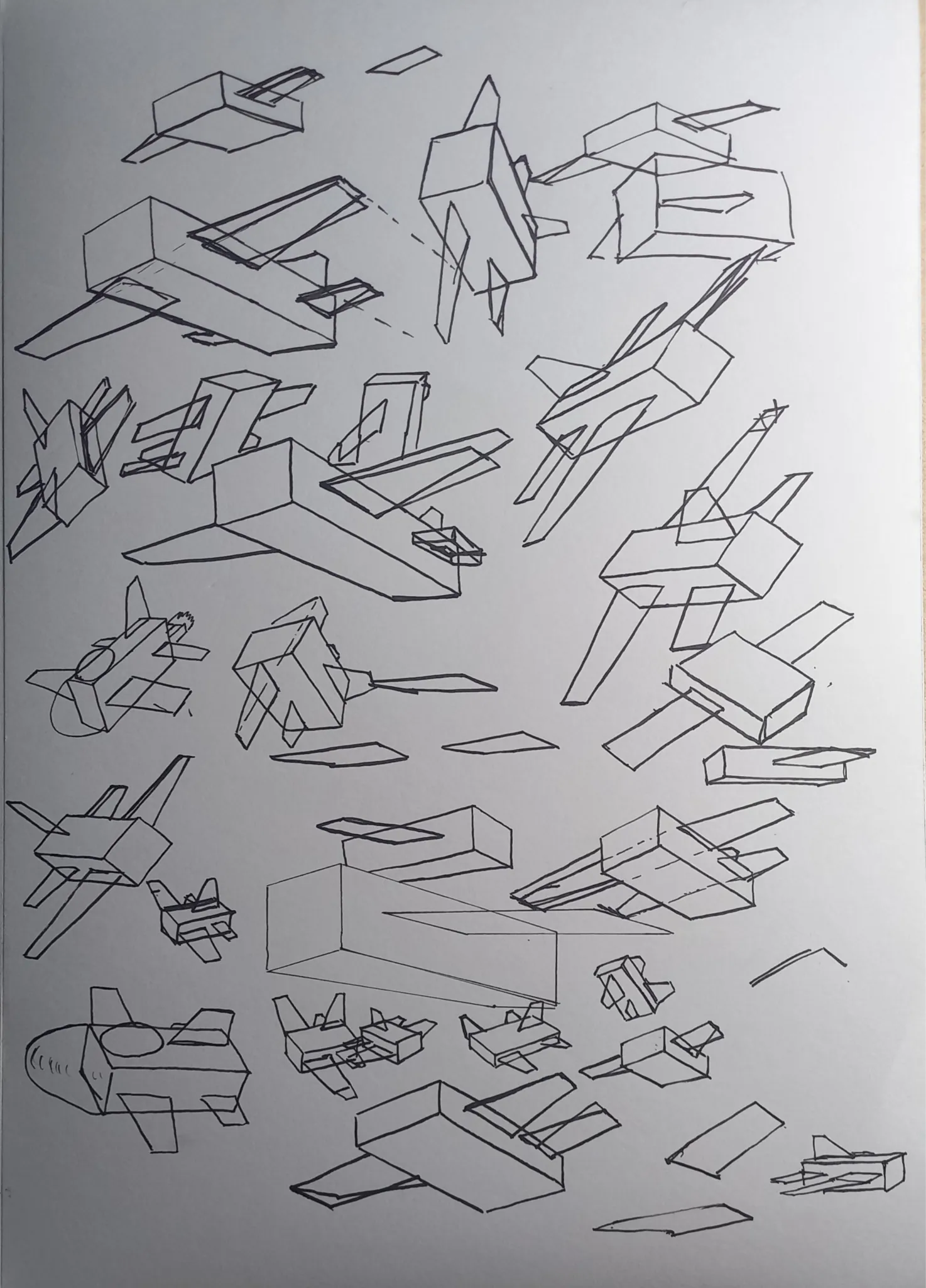
June Sketch Day 25
Blocky planes. Still struggle to draw wings from bottom angle. I already comfortable with top side angles. But bottom, it feels like the wings don't align with VP that i point it to. When attached with main block frame, it kinda being pulled upside (dont know how to explain it).
vor 7 Stunden
Ansehen